
Your landing page’s weakest score is CTA.
How Triple Whale ranks
- 1.
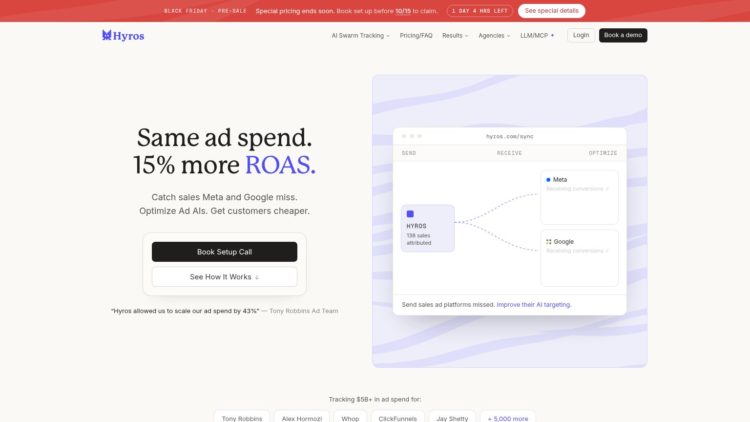
Hyros79
- 2.
Triple Whale73
- 3.
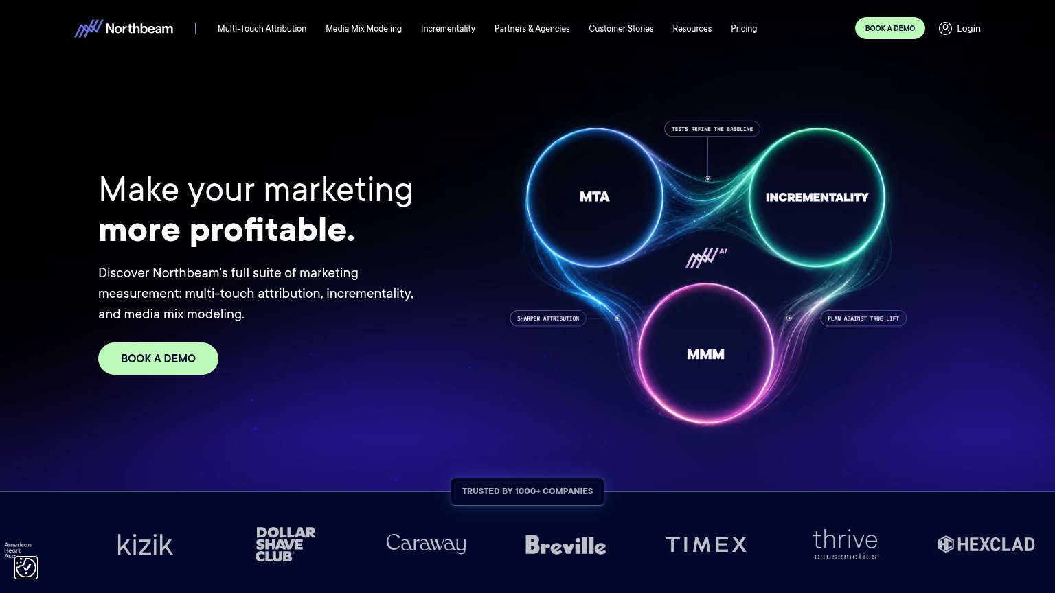
Northbeam73
- 4.
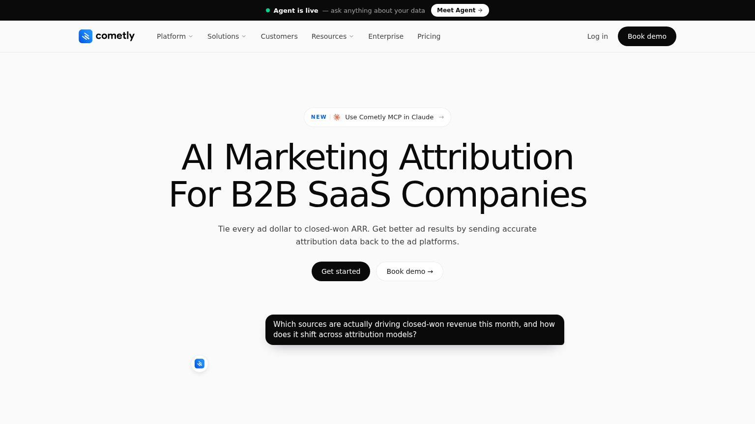
Cometly72
- 5.
mintveo.com71
- 6.
Rockerbox69
73Growth scoreupdated
category scores
category scoresShowHide
CTA
68FairCopy, size, verb, cost-feel — does the primary CTA earn the click?
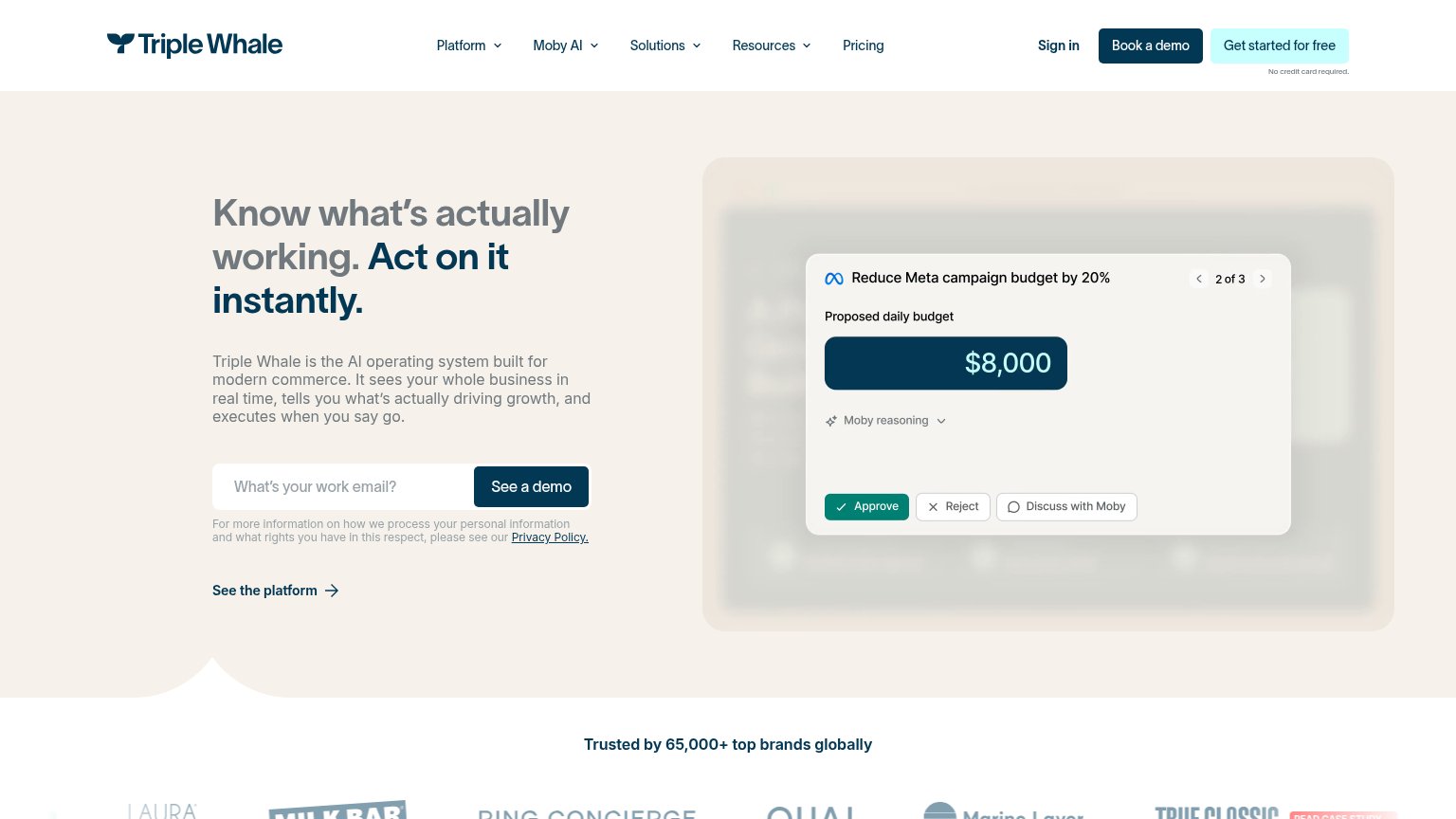
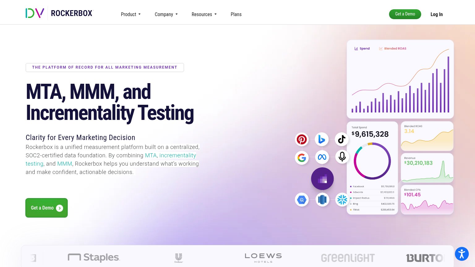
Problems
- no 'free' despite visible free offer
- demo framing feels sales-gated
- competes with 'Book a demo' in nav
- three CTA labels above the fold
Information hierarchy
72FairDoes the design help or inhibit what the page is trying to say?
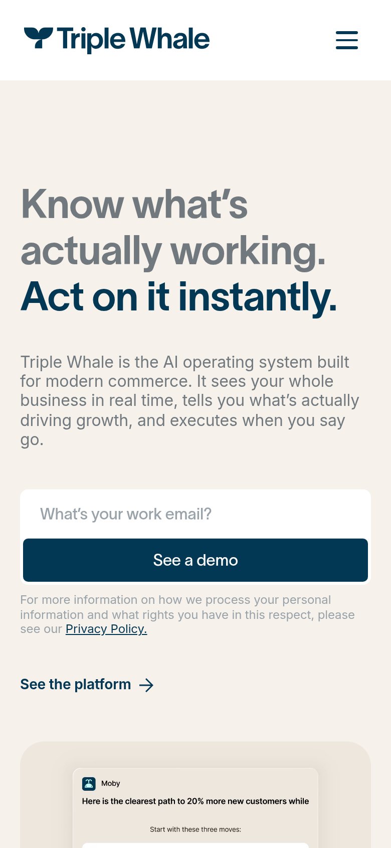
1234- Triple header CTAs — "Sign in", "Book a demo", and "Get started for free" all compete with the hero's "See a demo", splitting the primary action four ways.
- Five dropdown nav items — Platform, Moby AI, Solutions, Resources, Pricing open branching paths that leak attention before the hero ask.
- See the platform link — A second styled action directly under the demo form pulls clicks away from the email capture.
- Blurred dashboard backdrop — Illegible blurred UI behind the Moby card adds visual noise without communicating the product.
Mobile web
72FairThe phone experience as a first-class citizen.
What works
What to improve
Trust
74FairProof that the product is real, competent, and safe to try.
How Triple Whale compares
Trust read
Value props
78FairTitle, subtitle, hero — do they sell the product's true value?
Triple Whale’s headline
Know what's actually working. Act on it instantly.
Triple Whale is the AI operating system built for modern commerce. It sees your whole business in real time, tells you what's actually driving growth, and executes when you say go.
Working
Could improve