
Your landing page’s weakest score is Mobile web.
How LegalOS ranks
Mobile web
64FairThe phone experience as a first-class citizen.
 1234
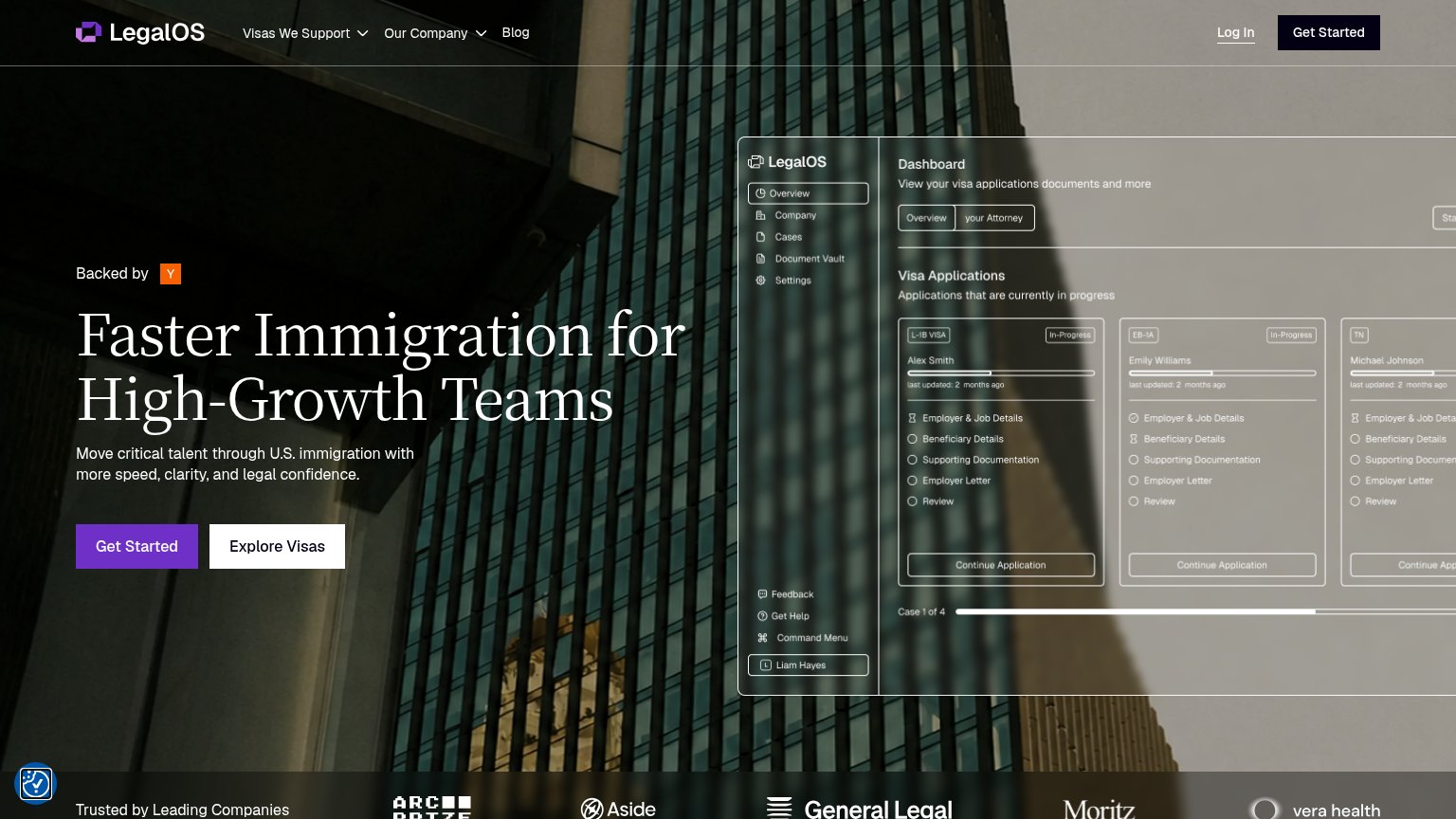
- Primary CTA row — "Get Started" and "Explore Visas" sit at the very bottom of the fold as two half-width buttons instead of one full-bleed action.
- Serif hero headline — "Faster Immigration for High-Growth Teams" barely scaled down and wraps into six tall lines, consuming most of the first viewport.
- Duplicate Get Started — Header "Get Started" pill duplicates the hero CTA below, splitting attention between two identical actions.
- Dashboard screenshot mockup — Desktop-density product UI with three tiny visa cards is illegible at phone width and adds clutter below the CTAs.
CTA
72FairCopy, size, verb, cost-feel — does the primary CTA earn the click?
Problems
- generic label, no product payoff
- no echo of headline promise
- click destination unclear
Trust
72FairProof that the product is real, competent, and safe to try.
How LegalOS compares
Trust read
Value props
74FairTitle, subtitle, hero — do they sell the product's true value?
LegalOS’s headline
Faster Immigration for High-Growth Teams
Move critical talent through U.S. immigration with more speed, clarity, and legal confidence.
Working
Could improve
Information hierarchy
76FairDoes the design help or inhibit what the page is trying to say?
What works
What to improve