
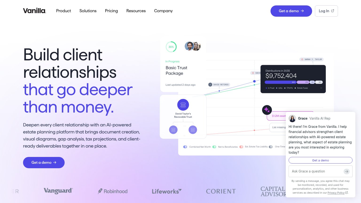
Your landing page’s weakest score is CTA.
How Vanilla ranks
CTA
72FairCopy, size, verb, cost-feel — does the primary CTA earn the click?
Problems
- demo ask feels like a sales meeting
- no self-serve or instant-value path
- click delivers a form, not the product
Trust
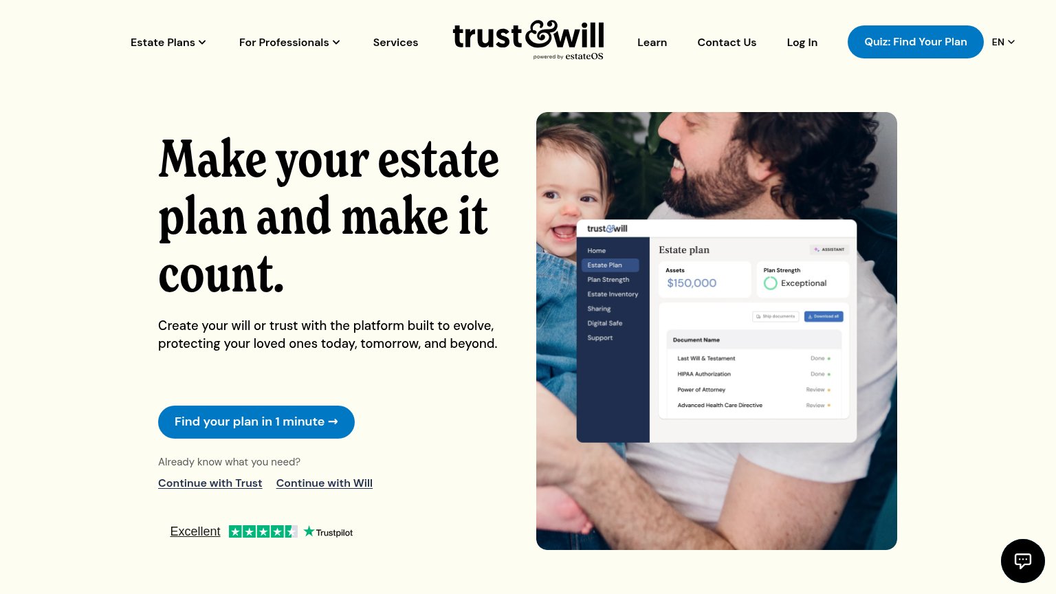
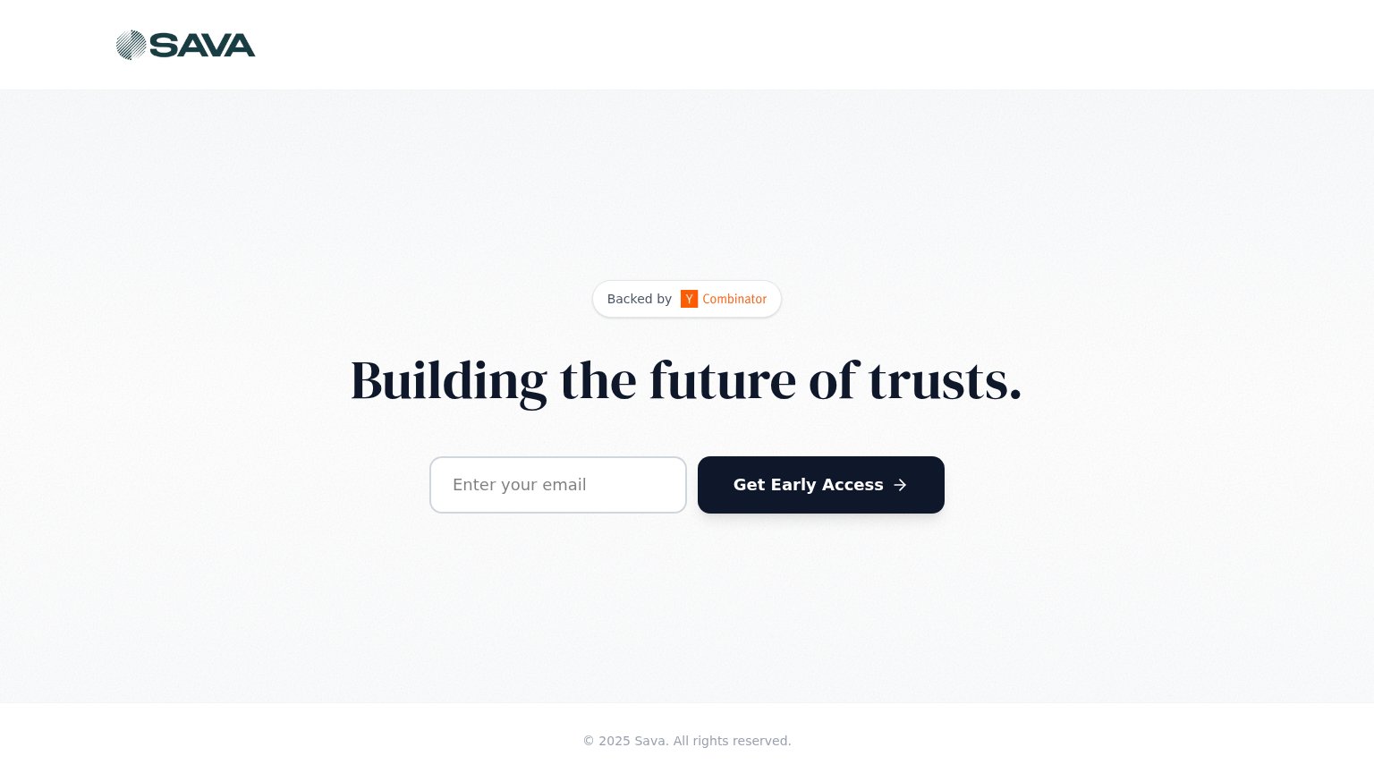
72FairProof that the product is real, competent, and safe to try.
| Trust read | |
|---|---|
| Vanilla | Customer logo strip including Vanguard and Robinhood |
| "Backed by Y Combinator" badge | |
| Banner: "Wealth.com is a launch partner for Claude for Financial Advisors." | |
| Trustpilot "Excellent" star rating badge below the hero CTA | |
| "AS SEEN IN" press bar with BBC, CBS News, Fortune, WSJ, and NerdWallet logos |
Mobile web
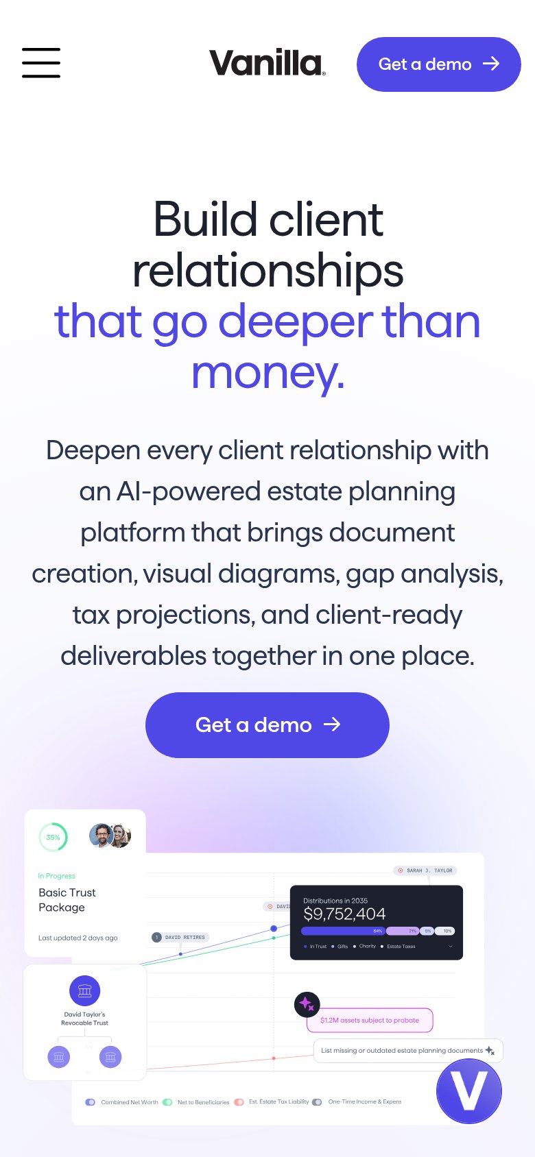
72FairThe phone experience as a first-class citizen.
What works
What to improve
Information hierarchy
76FairDoes the design help or inhibit what the page is trying to say?
What works
What to improve
Value props
76FairTitle, subtitle, hero — do they sell the product's true value?
Vanilla’s headline
Build client relationships that go deeper than money.
Deepen every client relationship with an AI-powered estate planning platform that brings document creation, visual diagrams, gap analysis, tax projections, and client-ready deliverables together in one place.
Working
Could improve