
Your landing page’s weakest score is Trust.
How item ranks
Trust
42PoorProof that the product is real, competent, and safe to try.
| Trust read | |
|---|---|
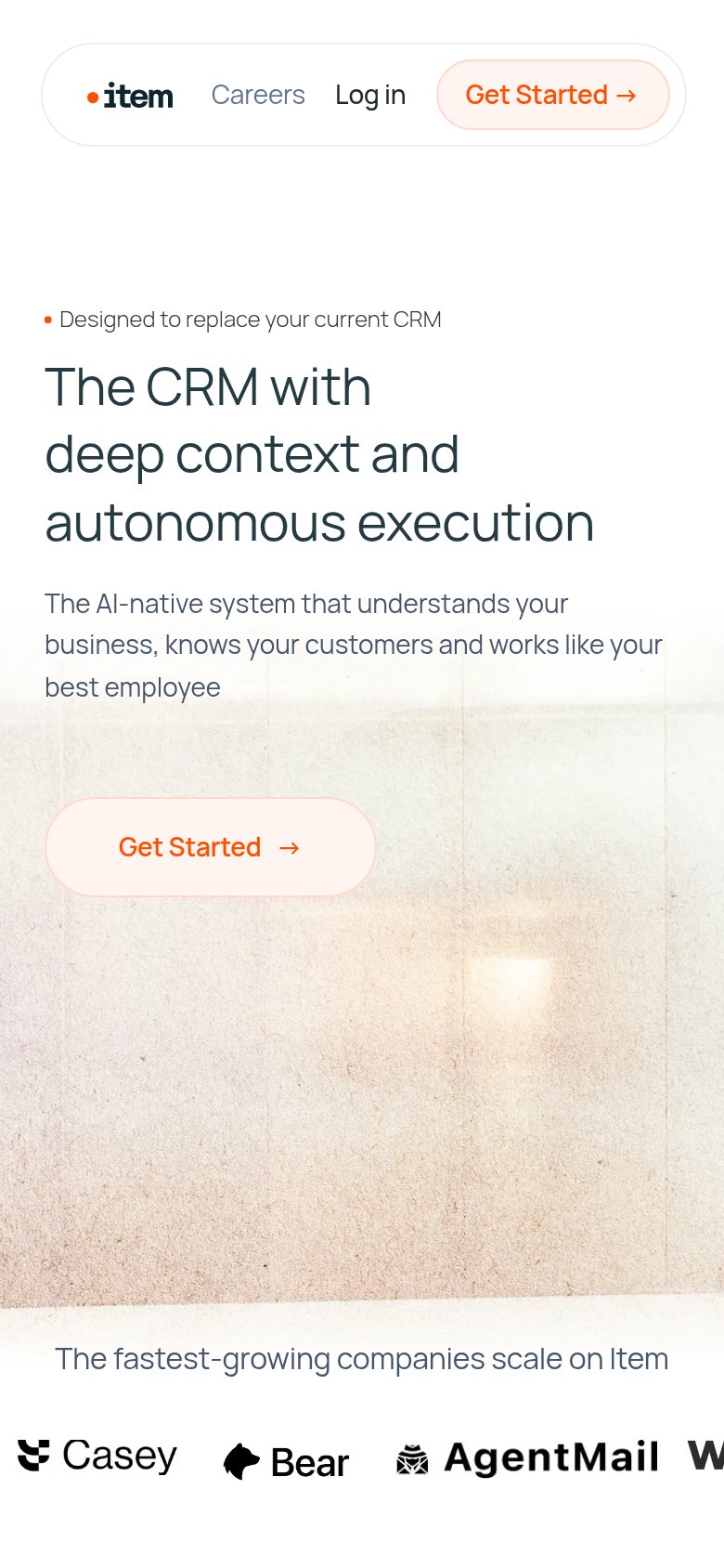
| item | Customer logo strip "The fastest-growing companies scale on Item" (Casey, Bear, AgentMail) on mobile |
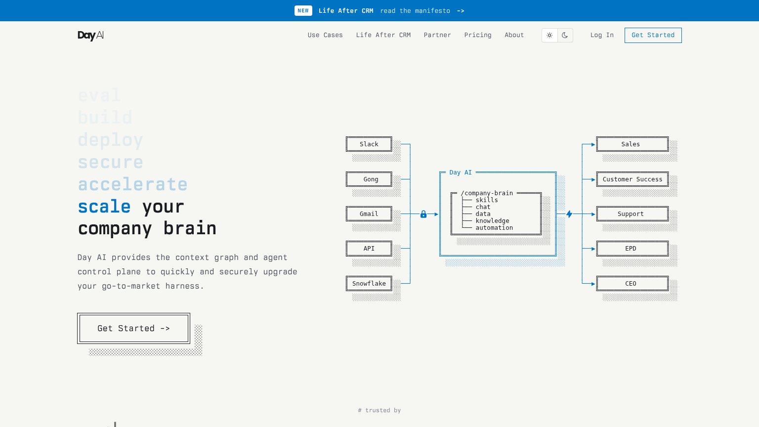
| Integration diagram naming Slack, Gong, Gmail, API, and Snowflake feeding the Day AI /company-brain | |
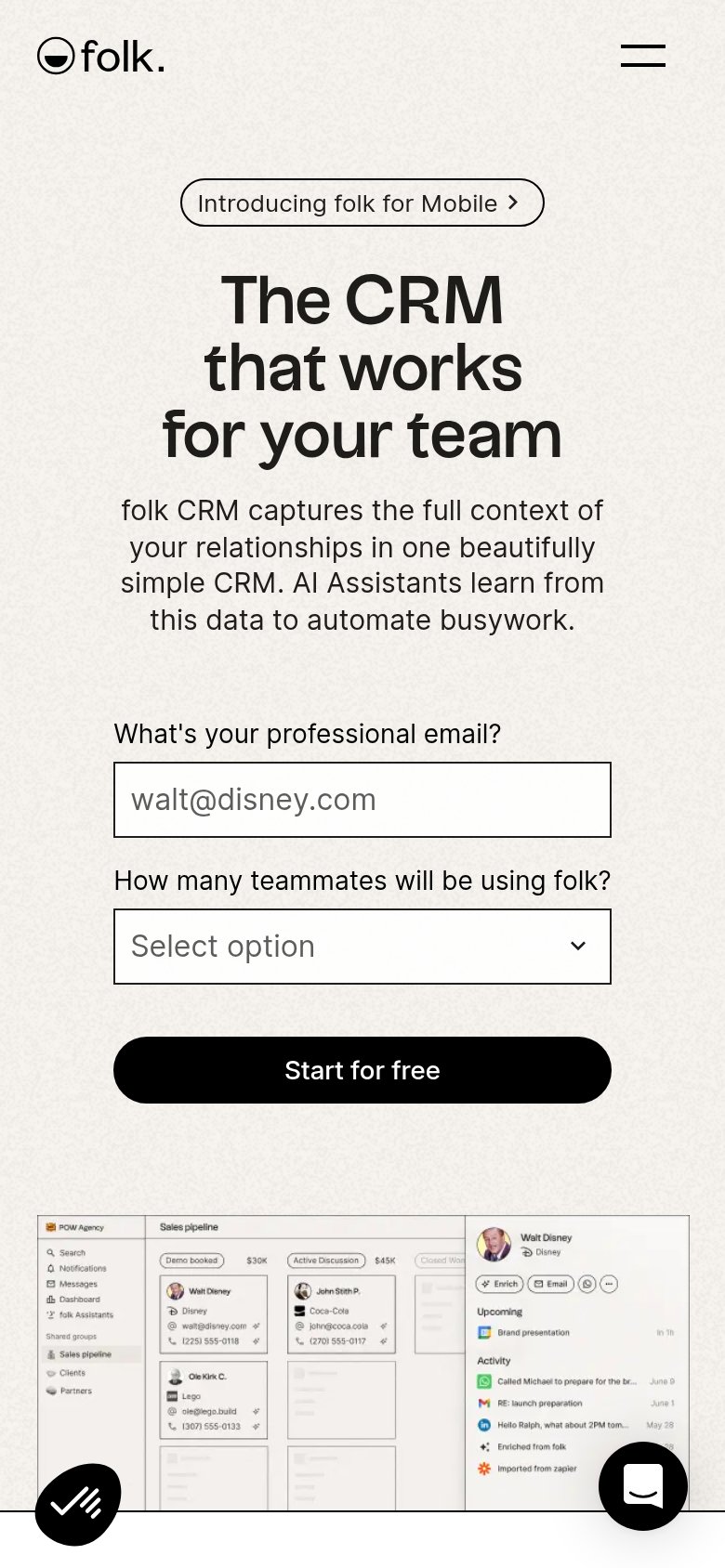
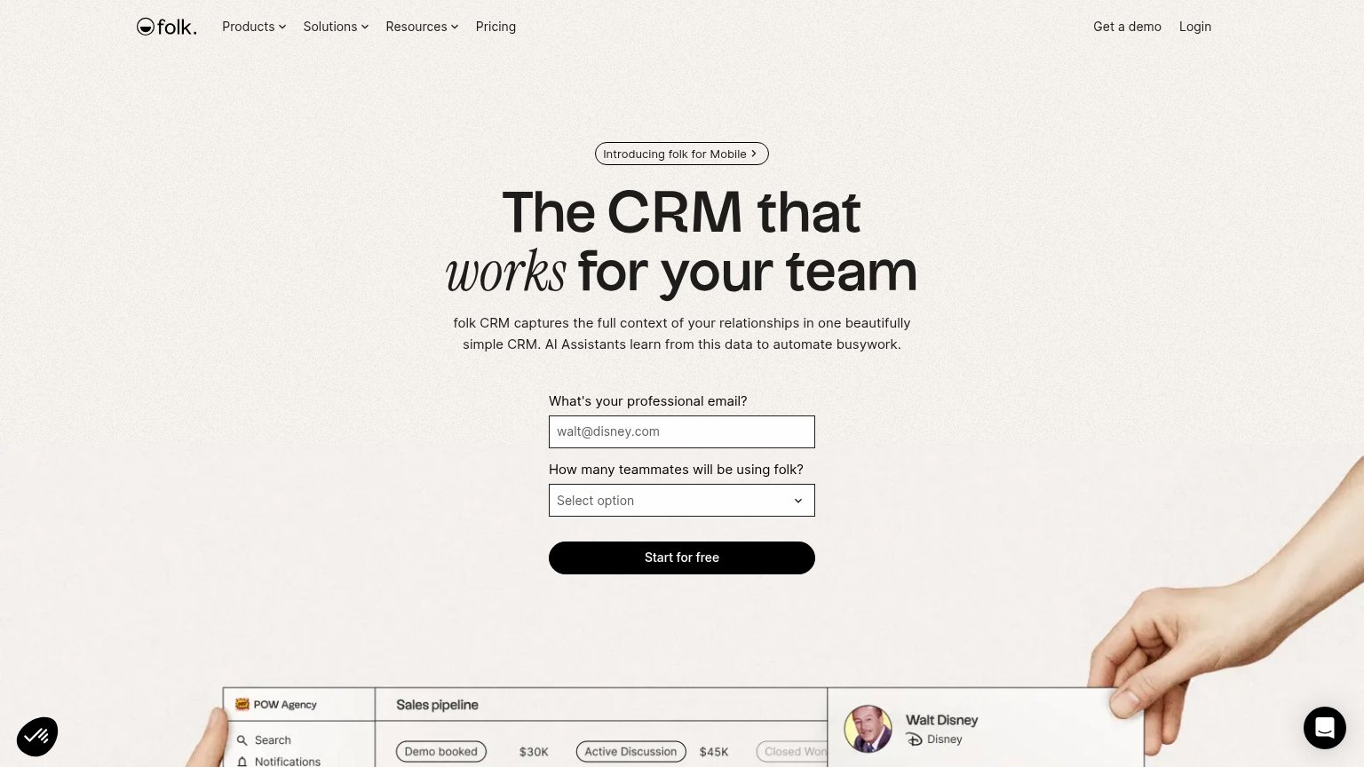
| Sales pipeline product UI with named contacts, deal stages, and dollar values ($30K, $45K) | |
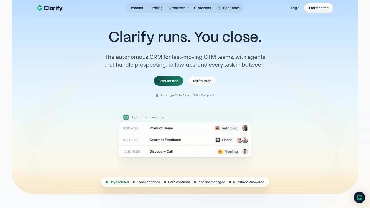
| SOC 2 Type 2, HIPAA, and GDPR Compliant | |
| "Recommended for Google Workspace" badge with Gmail/Calendar/Drive icons (mobile) | |
| No visible trust signal identified. |
CTA
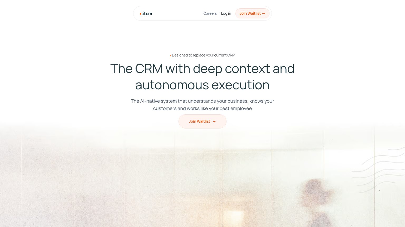
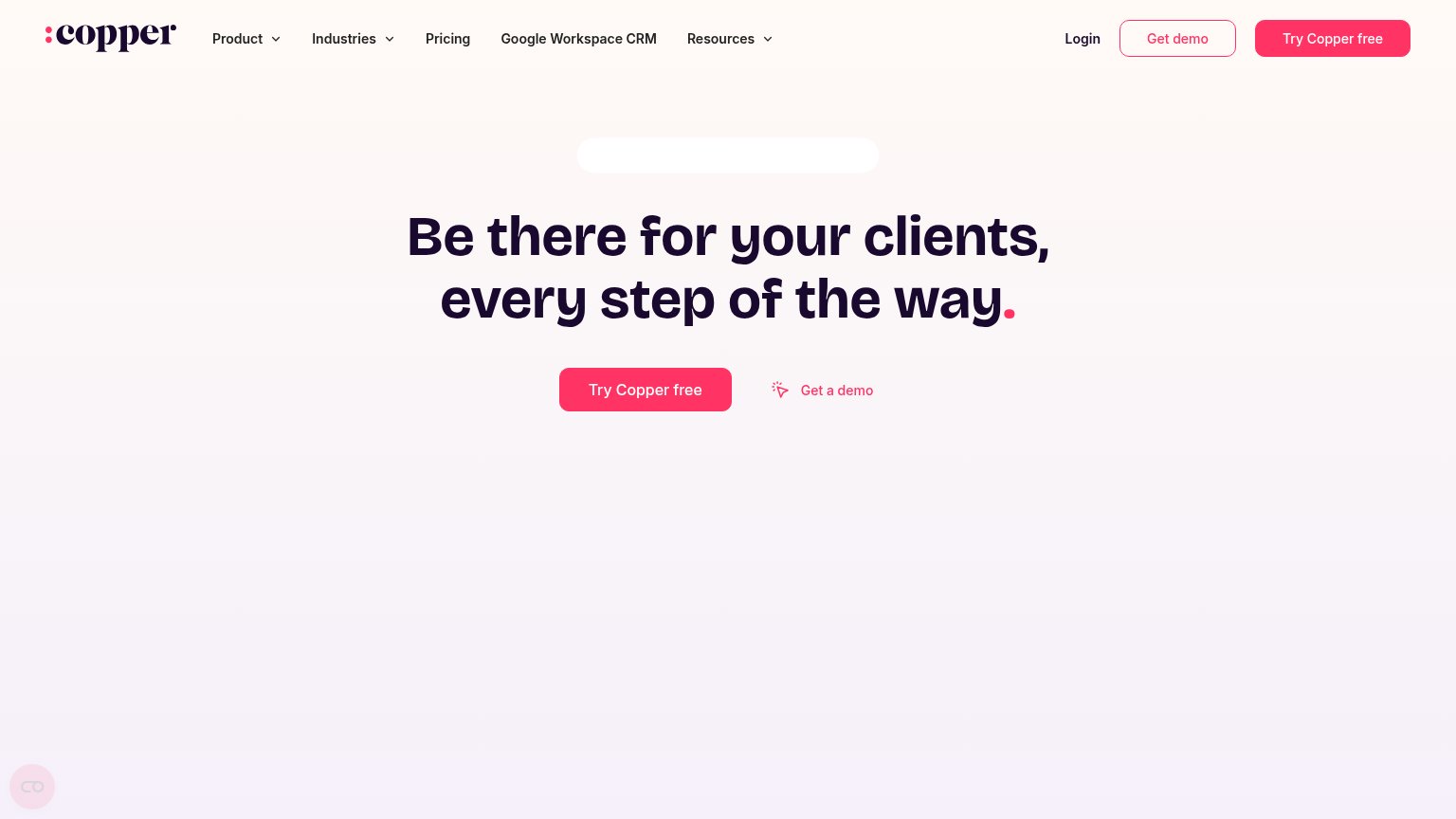
62FairCopy, size, verb, cost-feel — does the primary CTA earn the click?
Problems
- desktop/mobile labels differ
- 'waitlist' signals delayed value
- mobile 'Get Started' likely misleads
- no payoff hinted in label
Value props
62FairTitle, subtitle, hero — do they sell the product's true value?
item’s headline
The CRM with deep context and autonomous execution
The AI-native system that understands your business, knows your customers and works like your best employee
Working
Could improve
Mobile web
62FairThe phone experience as a first-class citizen.
What works
What to improve
Information hierarchy
84StrongDoes the design help or inhibit what the page is trying to say?
What works
What to improve