
Your landing page’s weakest score is Trust.
How Clarify ranks
Trust
64FairProof that the product is real, competent, and safe to try.
| Trust read | |
|---|---|
| Clarify | SOC 2 Type 2, HIPAA, and GDPR Compliant |
| Customer logo strip "The fastest-growing companies scale on Item" (Casey, Bear, AgentMail) on mobile | |
| Integration diagram naming Slack, Gong, Gmail, API, and Snowflake feeding the Day AI /company-brain | |
| Sales pipeline product UI with named contacts, deal stages, and dollar values ($30K, $45K) | |
| "Recommended for Google Workspace" badge with Gmail/Calendar/Drive icons (mobile) | |
| No visible trust signal identified. |
Mobile web
76FairThe phone experience as a first-class citizen.
 123
- Side-by-side CTA pair — "Start for free" and "Talk to sales" keep desktop proportions instead of stacking near-full-width for the thumb.
- Clipped ticker text — "Questions answered" and "Leads enriched" are cut off mid-word at both edges — a desktop marquee not adapted for the phone.
- Chat bubble overlaps ticker — The floating Clarify bubble sits over page content near the fold edge, adding a tap hazard with no conversion CTA.
Information hierarchy
78FairDoes the design help or inhibit what the page is trying to say?
What works
What to improve
Value props
78FairTitle, subtitle, hero — do they sell the product's true value?
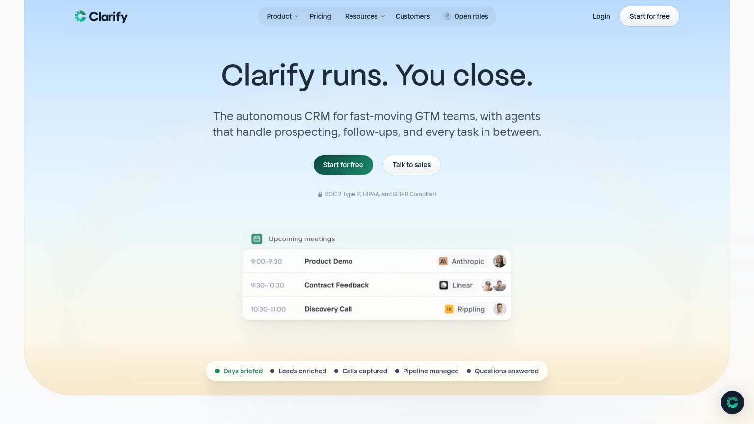
Clarify’s headline
Clarify runs. You close.
The autonomous CRM for fast-moving GTM teams, with agents that handle prospecting, follow-ups, and every task in between.
Working
Could improve
CTA
88StrongCopy, size, verb, cost-feel — does the primary CTA earn the click?
How Clarify compares
Recommended rewrites