
Your landing page’s weakest score is Mobile web.
How Interfaze ranks
Mobile web
62FairThe phone experience as a first-class citizen.
 123
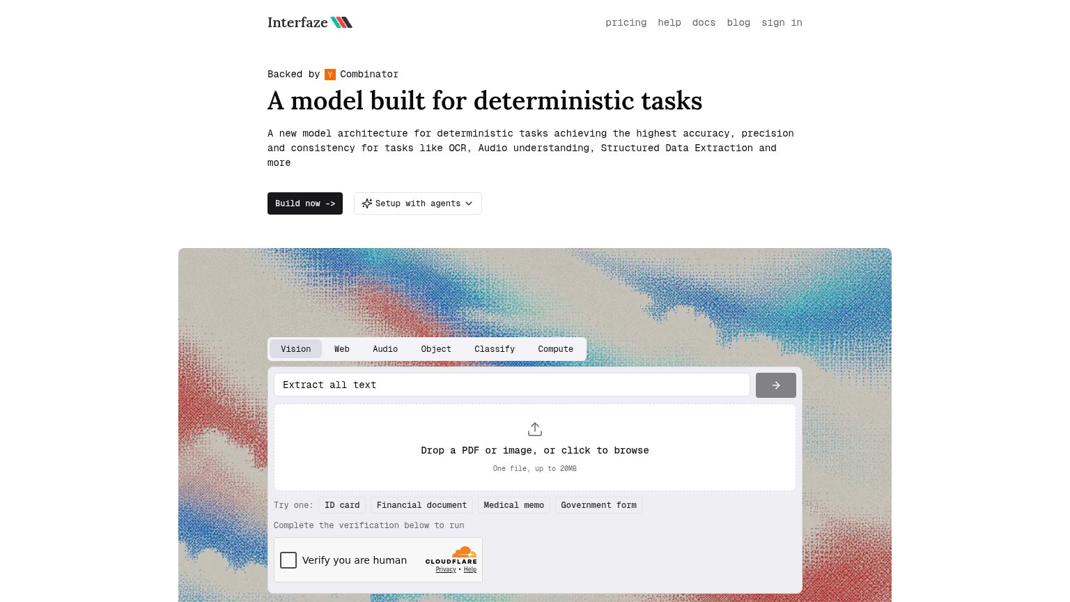
- Uncollapsed nav link row — Full desktop link row (pricing, help, docs, blog, sign in) eats hero space instead of collapsing to a menu.
- Unlabeled gray arrow button — Full-width submit control has no text label and its gray fill reads as disabled.
- Six-line monospace subhead — Body copy barely scaled down, wrapping into six dense lines that push the CTAs to the fold's edge.
Trust
64FairProof that the product is real, competent, and safe to try.
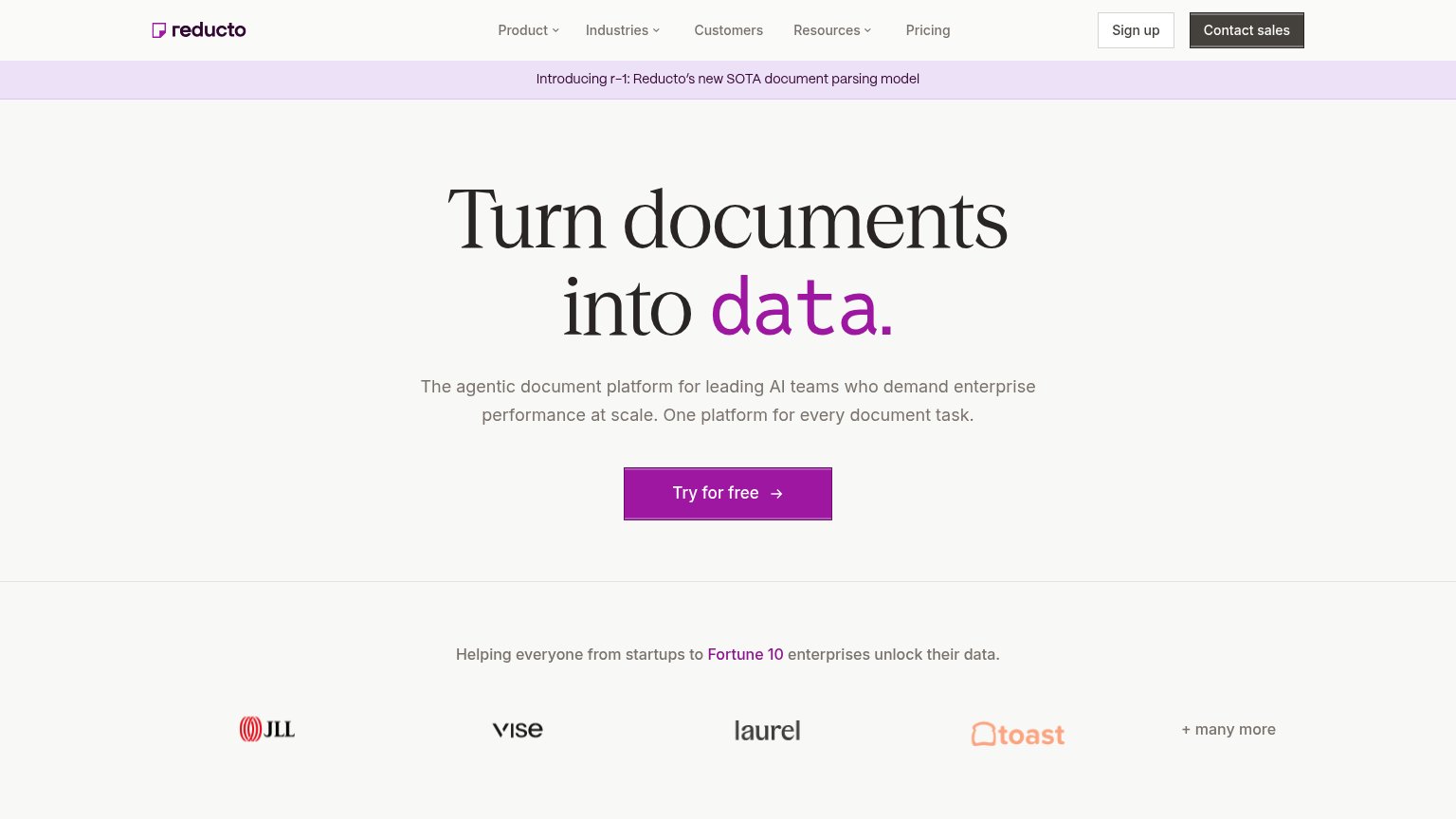
| Trust read | |
|---|---|
| Interfaze | Interactive live demo playground with "Drop a PDF or image, or click to browse" upload and Vision/Web/Audio/Classify/Com |
| Customer logo bar (JLL, Vise, Laurel, Toast) under "Helping everyone from startups to Fortune 10 enterprises unlock thei | |
| GitHub and Discord icons in the header navigation | |
| "Trusted by the Fortune 500" heading at the bottom of the fold | |
| pip install extend-ai code snippet with Python/TypeScript/Java/Go/CLI tabs and "View docs" link | |
| Featured News card: "Mistral raises €3B to make sovereign, open-weight AI the…" |
CTA
72FairCopy, size, verb, cost-feel — does the primary CTA earn the click?
How Interfaze compares
Recommended rewrites
Value props
72FairTitle, subtitle, hero — do they sell the product's true value?
Interfaze’s headline
A model built for deterministic tasks
A new model architecture for deterministic tasks achieving the highest accuracy, precision and consistency for tasks like OCR, Audio understanding, Structured Data Extraction and more
Working
Could improve
Information hierarchy
74FairDoes the design help or inhibit what the page is trying to say?
What works
What to improve