
Your landing page’s weakest score is Trust.
How Extend ranks
Trust
52FairProof that the product is real, competent, and safe to try.

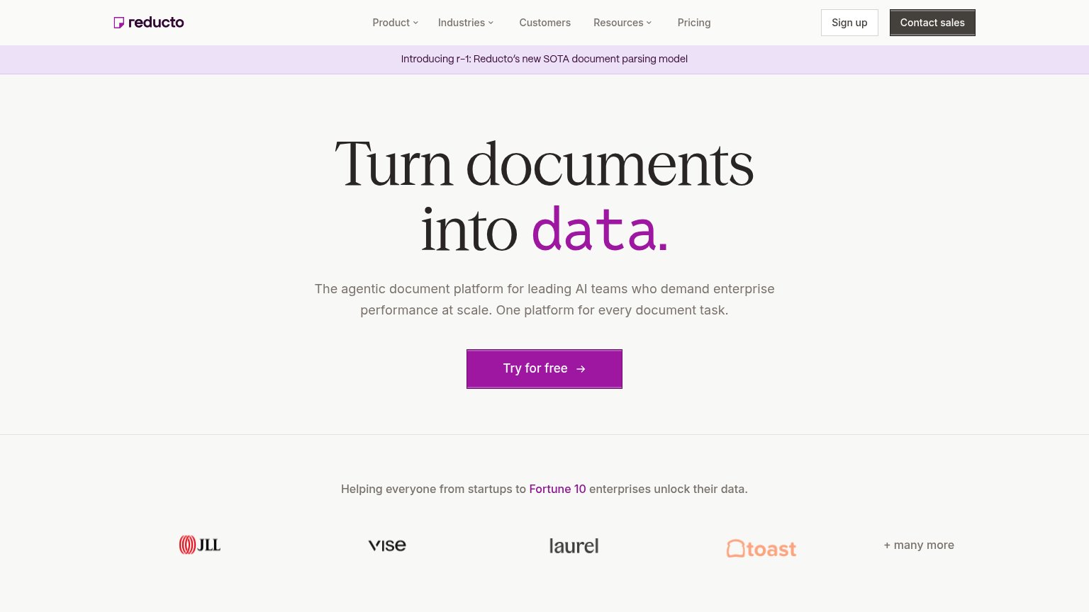
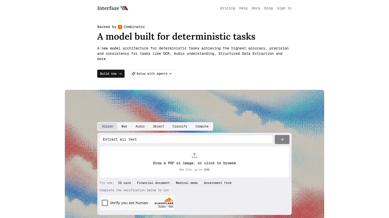
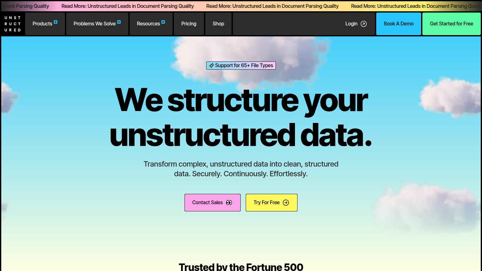
| Trust read | |
|---|---|
| Extend | pip install extend-ai code snippet with Python/TypeScript/Java/Go/CLI tabs and "View docs" link |
| Interactive live demo playground with "Drop a PDF or image, or click to browse" upload and Vision/Web/Audio/Classify/Com | |
| Customer logo bar (JLL, Vise, Laurel, Toast) under "Helping everyone from startups to Fortune 10 enterprises unlock thei | |
| GitHub and Discord icons in the header navigation | |
| "Trusted by the Fortune 500" heading at the bottom of the fold | |
| Featured News card: "Mistral raises €3B to make sovereign, open-weight AI the…" |
Mobile web
72FairThe phone experience as a first-class citizen.
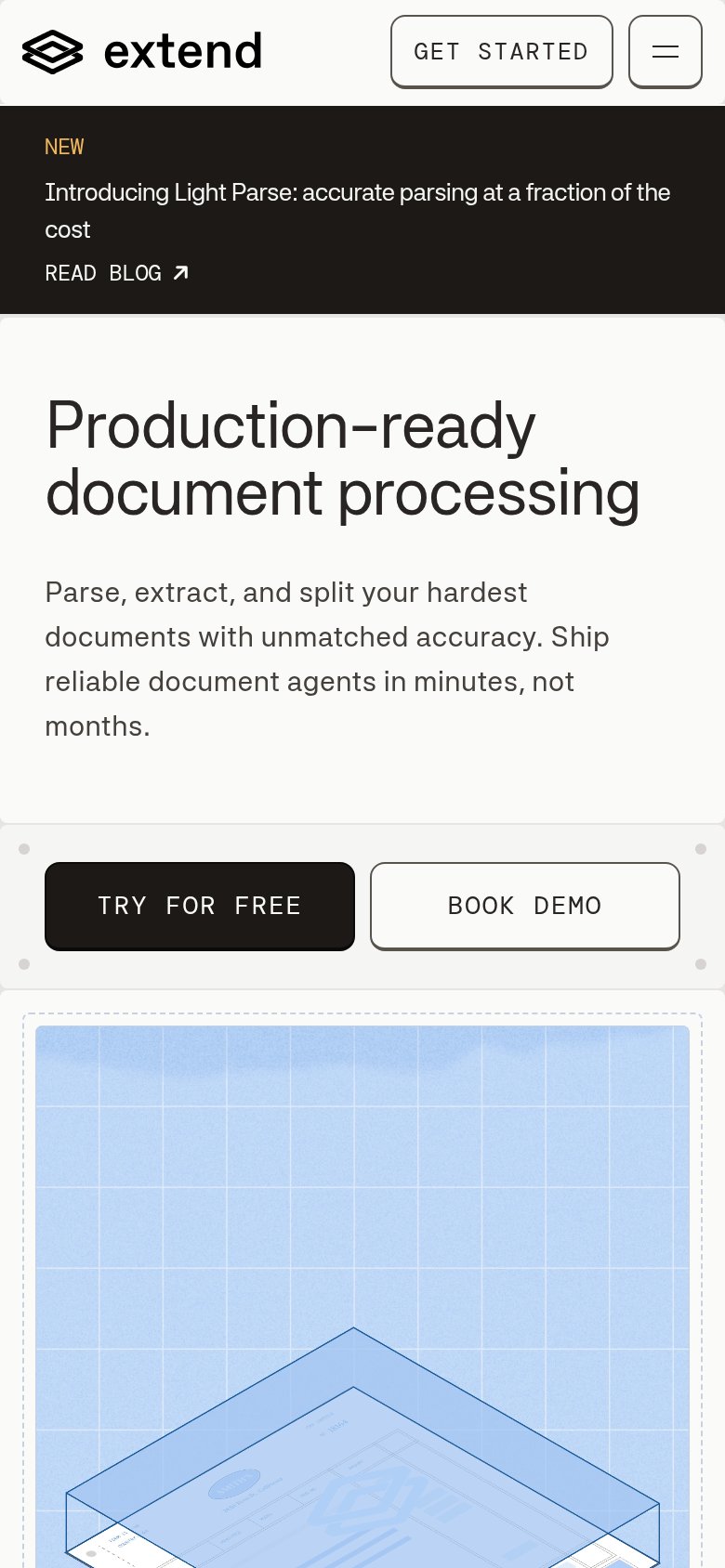
Extend's mobile fold reads cleanly: the "Production-ready document processing" headline scales well, the nav collapses to a hamburger plus a "GET STARTED" pill, and there are no pop-ups or chat bubbles. The primary "TRY FOR FREE" CTA is visible and tappable in the first viewport, but the tall black "Introducing Light Parse" announcement banner stacks three lines and eats roughly 20% of the fold, pushing the CTA pair to the very bottom edge. "TRY FOR FREE" and "BOOK DEMO" also sit side-by-side at half-width each instead of one dominant full-bleed button, splitting the tap target. Shrinking the promo banner to a single line is the biggest lever — it would lift both CTAs comfortably into the fold.
Value props
78FairTitle, subtitle, hero — do they sell the product's true value?
Production-ready document processing
Parse, extract, and split your hardest documents with unmatched accuracy. Ship reliable document agents in minutes, not months.
Working
Could improve
Information hierarchy
80StrongDoes the design help or inhibit what the page is trying to say?
What works
What to improve
CTA
82StrongCopy, size, verb, cost-feel — does the primary CTA earn the click?
How Extend compares
Recommended rewrites