
Your landing page’s weakest score is Trust.
How Instaread ranks
62Growth scoreupdated
category scores
category scoresShowHide
Trust
48PoorProof that the product is real, competent, and safe to try.


| Trust read | |
|---|---|
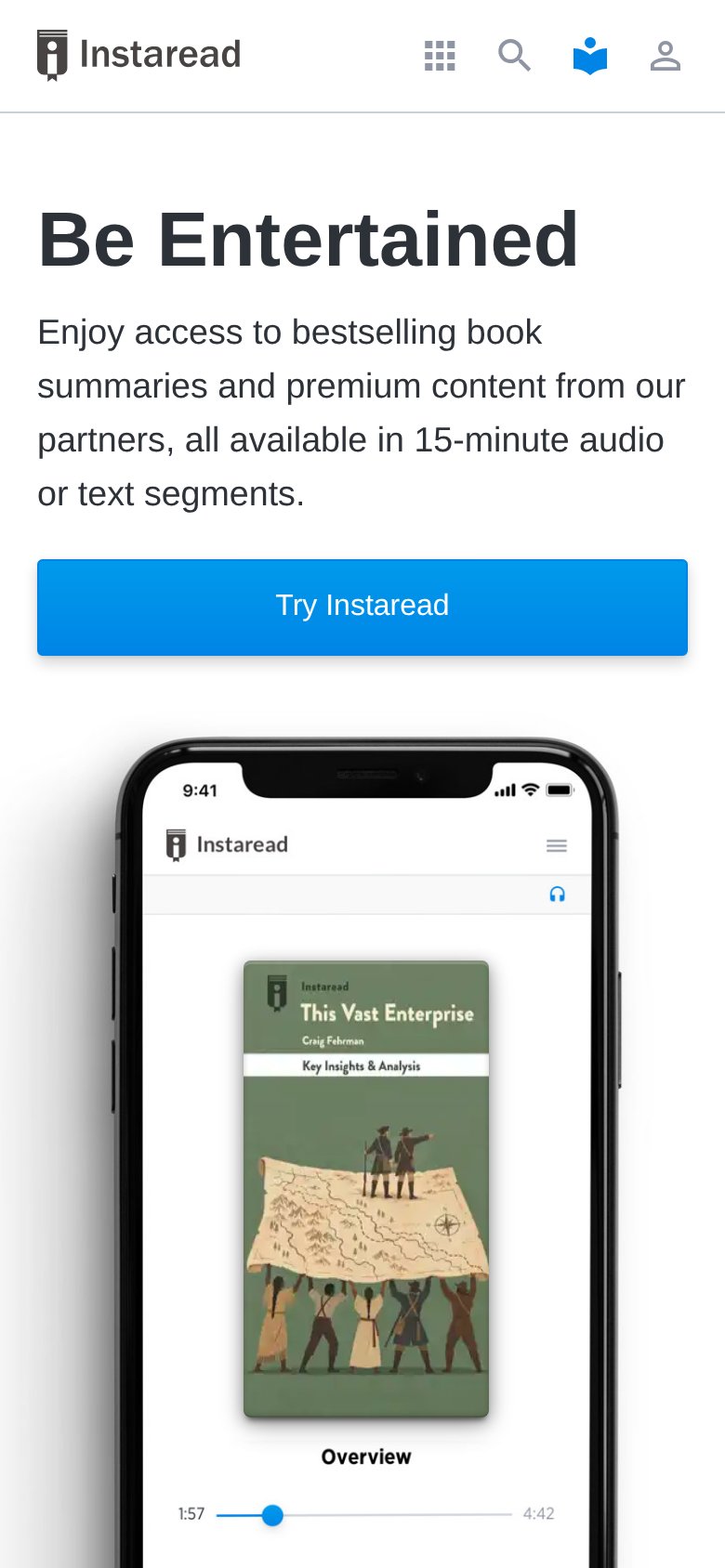
| Instaread | Real product UI in the hero: phone screen showing the "This Vast Enterprise" summary with audio player scrubber (1:57 / |
| No visible trust signal identified. | |
| "55M+ downloads · 172K+ reviews · 2,500+ summaries" stat bar under "#1 most downloaded book summary app" (mobile capture | |
| Grid of real book covers (Atomic Habits, Principles, Deep Work) backing the "summaries of over 10,000 books" claim | |
| "27+ years of experience" / "Content in 8 languages" / "100% rights-cleared" stats block (mobile) | |
| "GDPR-compliant, on EU servers, with no training on your data" subheadline claim |
Information hierarchy
58FairDoes the design help or inhibit what the page is trying to say?
 123
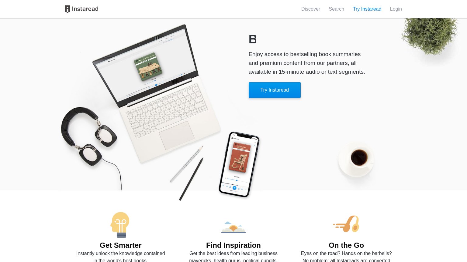
- Truncated hero headline — Desktop headline renders only as "B" — the core message "Be Entertained" is cut off, so the fold leads with no readable promise.
- Nav duplicate Try Instaread — "Try Instaread" appears in the nav at the same label as the hero button, splitting attention between two identical actions.
- Discover/Search/Login links — Three exit links sit at the same weight as the nav CTA, giving visitors paths away before the value prop lands.
Value props
58FairTitle, subtitle, hero — do they sell the product's true value?
Instaread’s headline
Be Entertained
Enjoy access to bestselling book summaries and premium content from our partners, all available in 15-minute audio or text segments.
Working
Could improve
CTA
68FairCopy, size, verb, cost-feel — does the primary CTA earn the click?
How Instaread compares
Recommended rewrites
Mobile web
78FairThe phone experience as a first-class citizen.
What works
What to improve