
Your landing page’s weakest score is Information hierarchy.
How Insilico Medicine ranks
- 1.
Recursion66
- 2.
Insilico Medicine54
- 3.
Atlas Discovery54
- 4.
Pharos iBio / Standigm50
- 5.
Every Cure46
- 6.
Healx46
54Growth scoreupdated
category scores
category scoresShowHide
Information hierarchy
42PoorDoes the design help or inhibit what the page is trying to say?
 1234
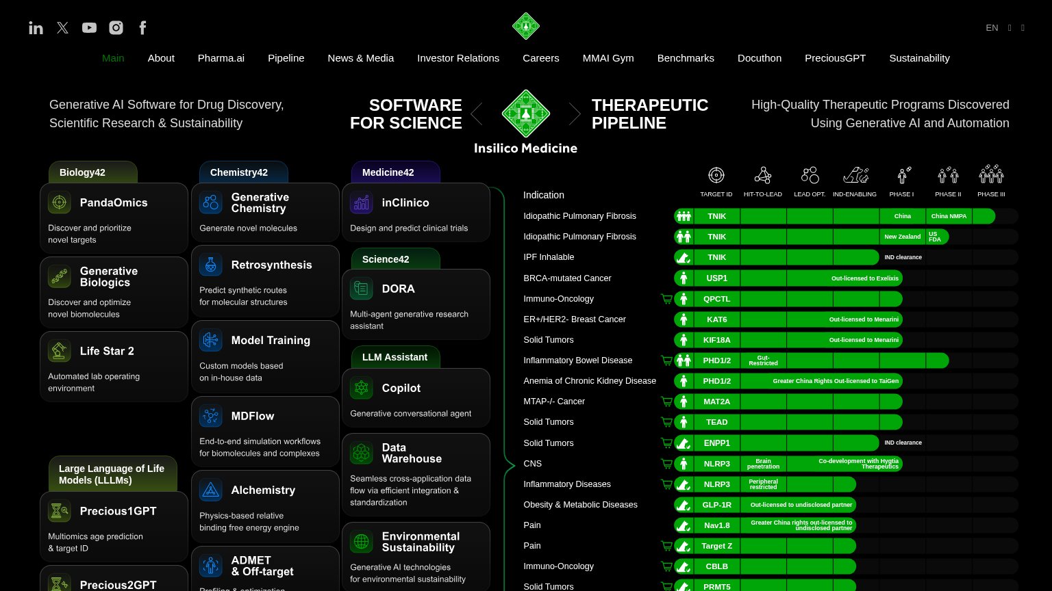
- Pipeline chart above fold — A dense 20-row clinical pipeline table with icons, phase bars, and micro-labels sits in the hero, forcing enterprise-report-level parsing before any message lands.
- Product card grid — Ten-plus same-weight cards (PandaOmics, inClinico, DORA, Copilot...) shout simultaneously with no visual ranking, turning the fold into a feature index.
- 14-item nav bar — Fourteen equal-weight nav links plus five social icons create nearly twenty exit paths before any conversion action exists.
- Split dual headline — 'SOFTWARE FOR SCIENCE' and 'THERAPEUTIC PIPELINE' compete as two co-equal value props flanking the logo, so no single message wins the first glance.
CTA
44PoorCopy, size, verb, cost-feel — does the primary CTA earn the click?

Problems
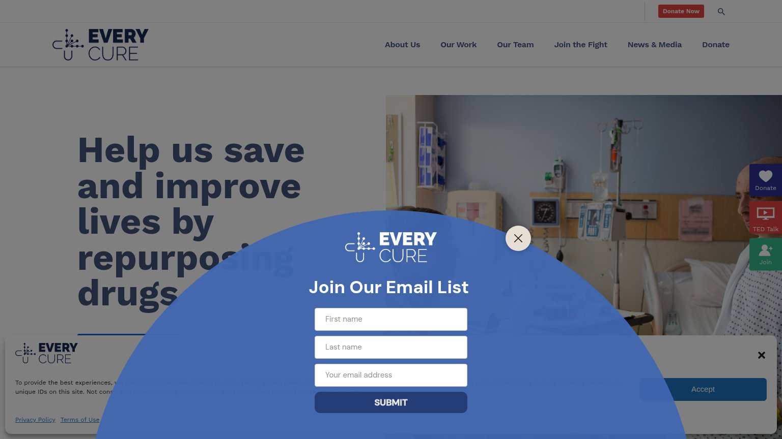
- no CTA on desktop fold at all
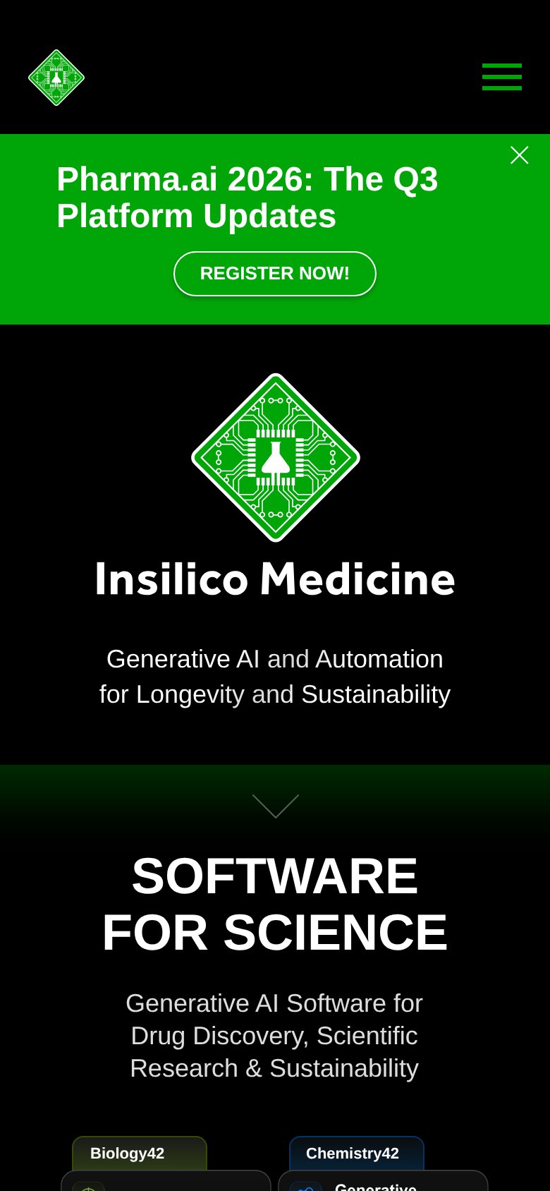
- banner promo, not a product CTA
- dismissible — vanishes on close
- 'Register' feels committal
Mobile web
48PoorThe phone experience as a first-class citizen.
What works
What to improve
Value props
64FairTitle, subtitle, hero — do they sell the product's true value?
Insilico Medicine’s headline
SOFTWARE FOR SCIENCE
Generative AI Software for Drug Discovery, Scientific Research & Sustainability
Working
Could improve
Trust
72FairProof that the product is real, competent, and safe to try.
How Insilico Medicine compares
Trust read