
Your landing page’s weakest score is Mobile web.
How Every Cure ranks
46Growth scoreupdated
category scores
category scoresShowHide
Mobile web
38PoorThe phone experience as a first-class citizen.
 1234
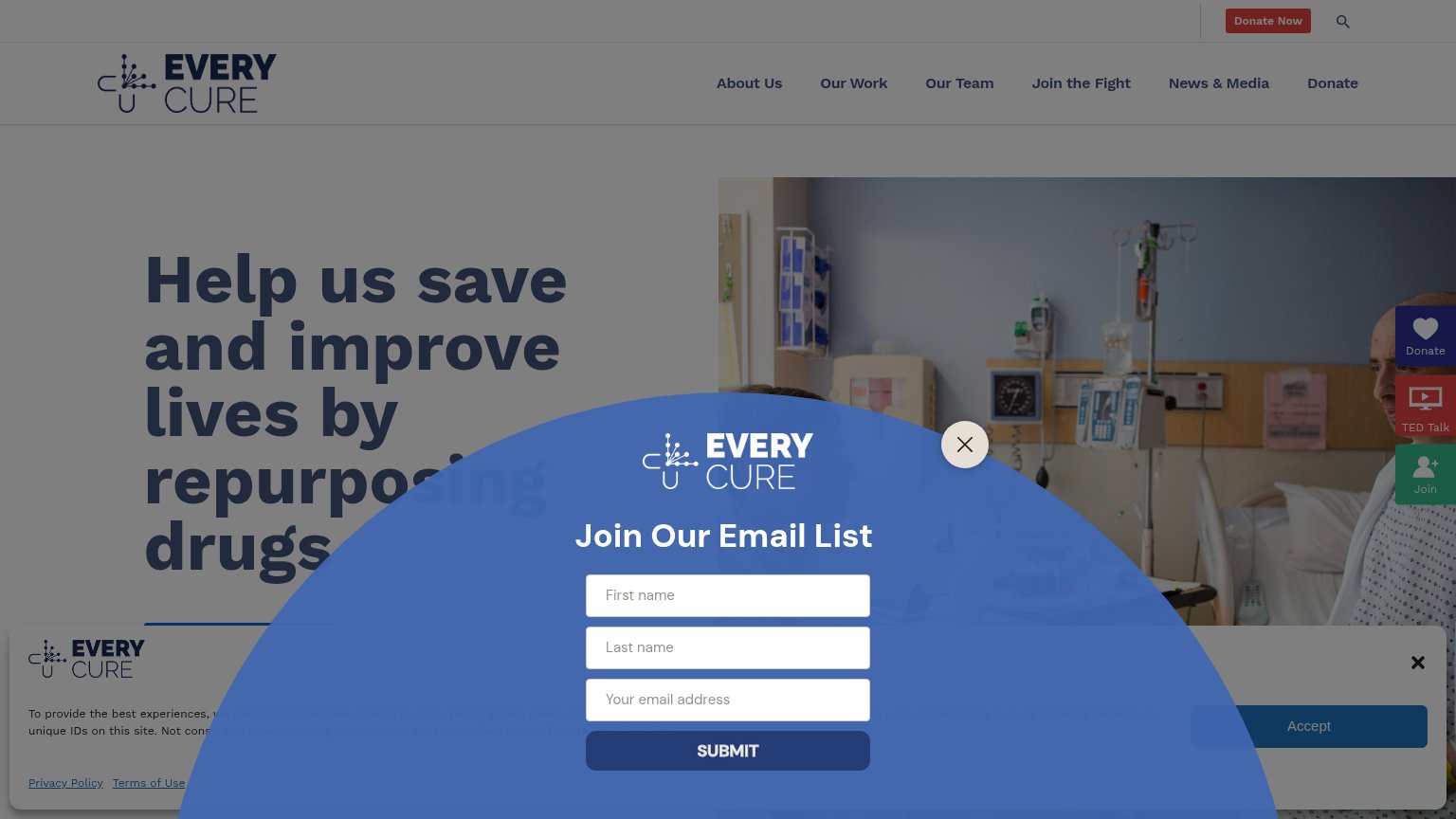
- Email list modal — A generic newsletter overlay covers the entire lower half of the mobile fold and buries the hero and its CTA behind two stacked pop-ups.
- Cookie consent banner — A second overlay sits underneath the email modal, so dismissing one blocker still leaves another between the visitor and the page.
- Truncated hero headline — "Help us save and improve lives by repurposing" is cut off mid-sentence by the modal, so the value statement never finishes.
- Submit button — The only tappable full-width CTA in the fold is "SUBMIT" for a newsletter, not the page's donate or mission action.
Information hierarchy
42PoorDoes the design help or inhibit what the page is trying to say?
 1234
- Email popup modal — Popup interrupts the fold, covers the hero CTA area, and diverts attention from donation before the headline finishes.
- Cookie consent banner — Second overlay stacked under the popup — two simultaneous interruptions bury the page's actual content.
- Right-edge widget stack — Donate/TED Talk/Join floating buttons duplicate the header Donate and add three more competing actions.
- Headline overlapped by popup — 'Help us save and improve lives by repurposing' is partially covered — the value prop cannot be read whole.
Trust
44PoorProof that the product is real, competent, and safe to try.
How Every Cure compares
Trust read
CTA
48PoorCopy, size, verb, cost-feel — does the primary CTA earn the click?
How Every Cure compares
Recommended rewrites
Value props
58FairTitle, subtitle, hero — do they sell the product's true value?
Every Cure’s headline
Help us save and improve lives by repurposing drugs
Working
Could improve