
Your landing page’s weakest score is Trust.
How Infinite ranks
- 1.
Infinite72
- 2.
Bridge72
- 3.
Conduit72
- 4.
Fern61
Trust
44PoorProof that the product is real, competent, and safe to try.

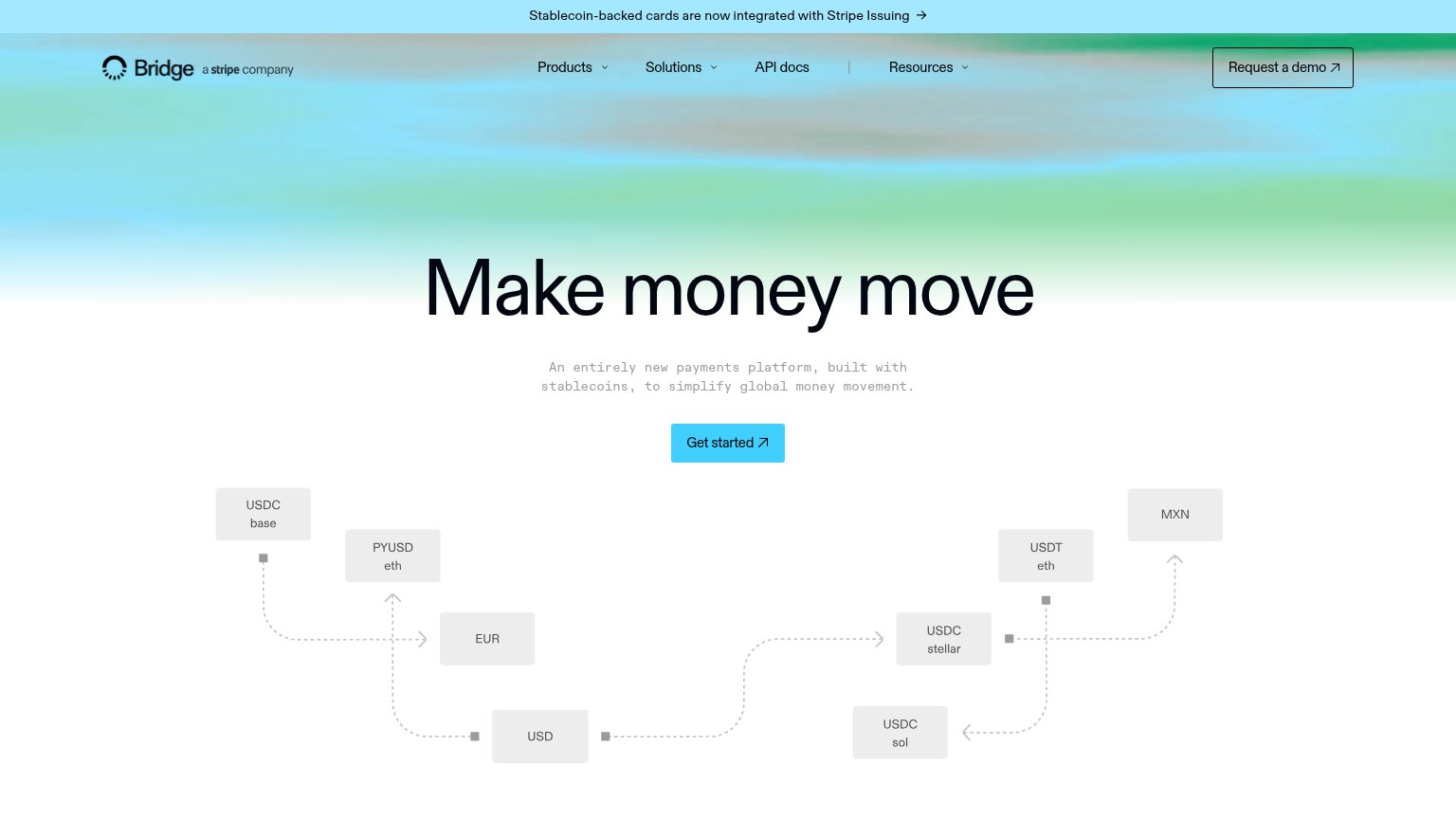

| Trust read | |
|---|---|
| Infinite | Subheadline claim "First review: 1–2 days, not 30. Accounts and every payment rail are built in." |
| "a stripe company" mark next to the Bridge logo, reinforced by the banner "Stablecoin-backed cards are now integrated wi | |
| "OUR CLIENTS" section label visible at the bottom of the mobile fold | |
| Customer logo row (Slope, OTOCO, Para, Ansa Research) |
CTA
72FairCopy, size, verb, cost-feel — does the primary CTA earn the click?
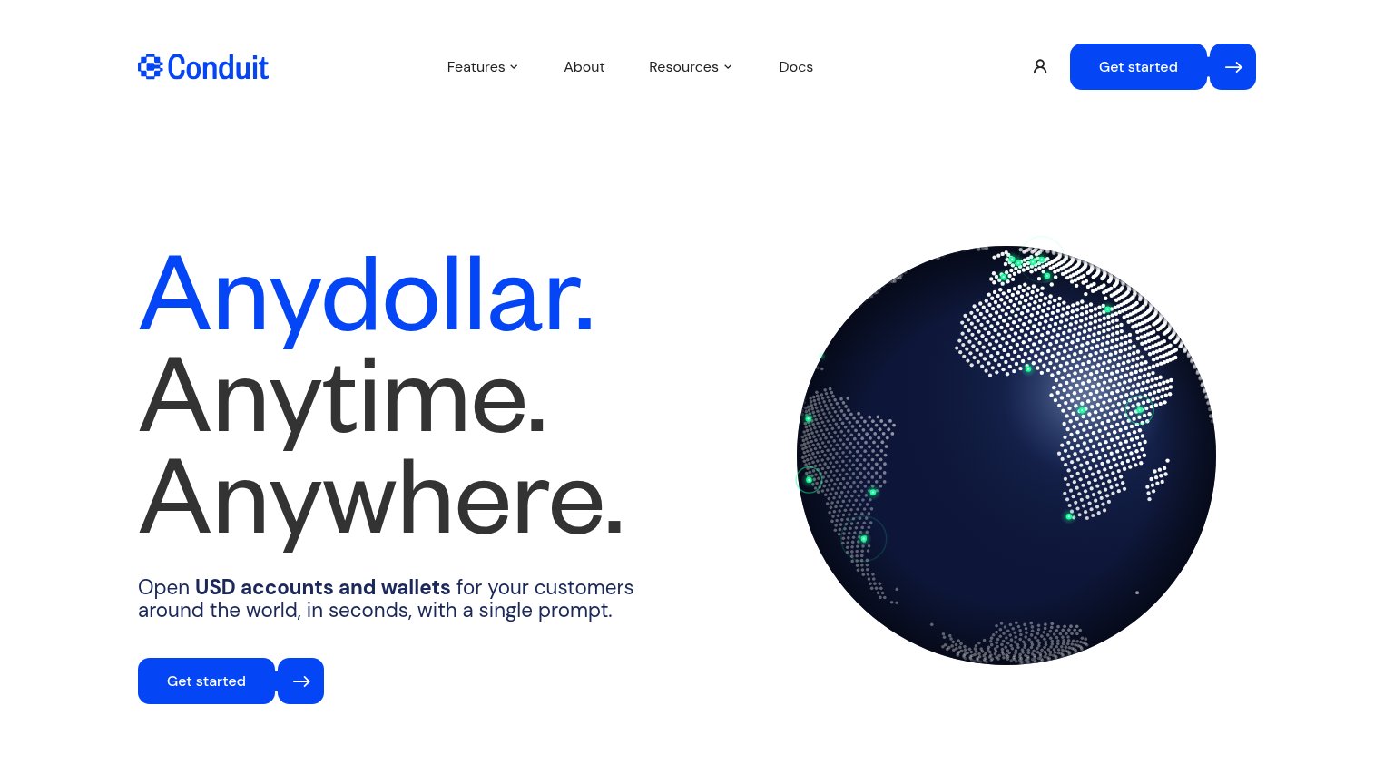
Problems
- 'Book a demo' feels costly/committal
- mobile nav shortens label to 'Demo'
- no self-serve or in-product path
Information hierarchy
78FairDoes the design help or inhibit what the page is trying to say?
What works
What to improve
Value props
82StrongTitle, subtitle, hero — do they sell the product's true value?
Infinite’s headline
The global financial network with a memory.
Clear a business once, then carry that context across the network. First review: 1–2 days, not 30. Accounts and every payment rail are built in.
Working
Could improve
Mobile web
86StrongThe phone experience as a first-class citizen.
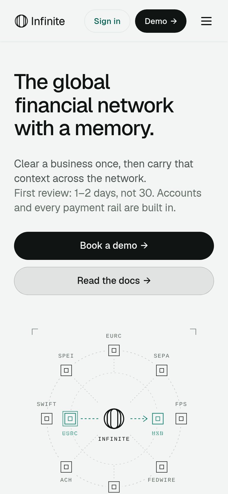
What works
What to improve