
Your landing page’s weakest score is Trust.
How Conduit ranks
- 1.
Conduit72
- 2.
Infinite72
- 3.
Bridge72
- 4.
Fern61
72Growth scoreupdated
category scores
category scoresShowHide
Trust
42PoorProof that the product is real, competent, and safe to try.
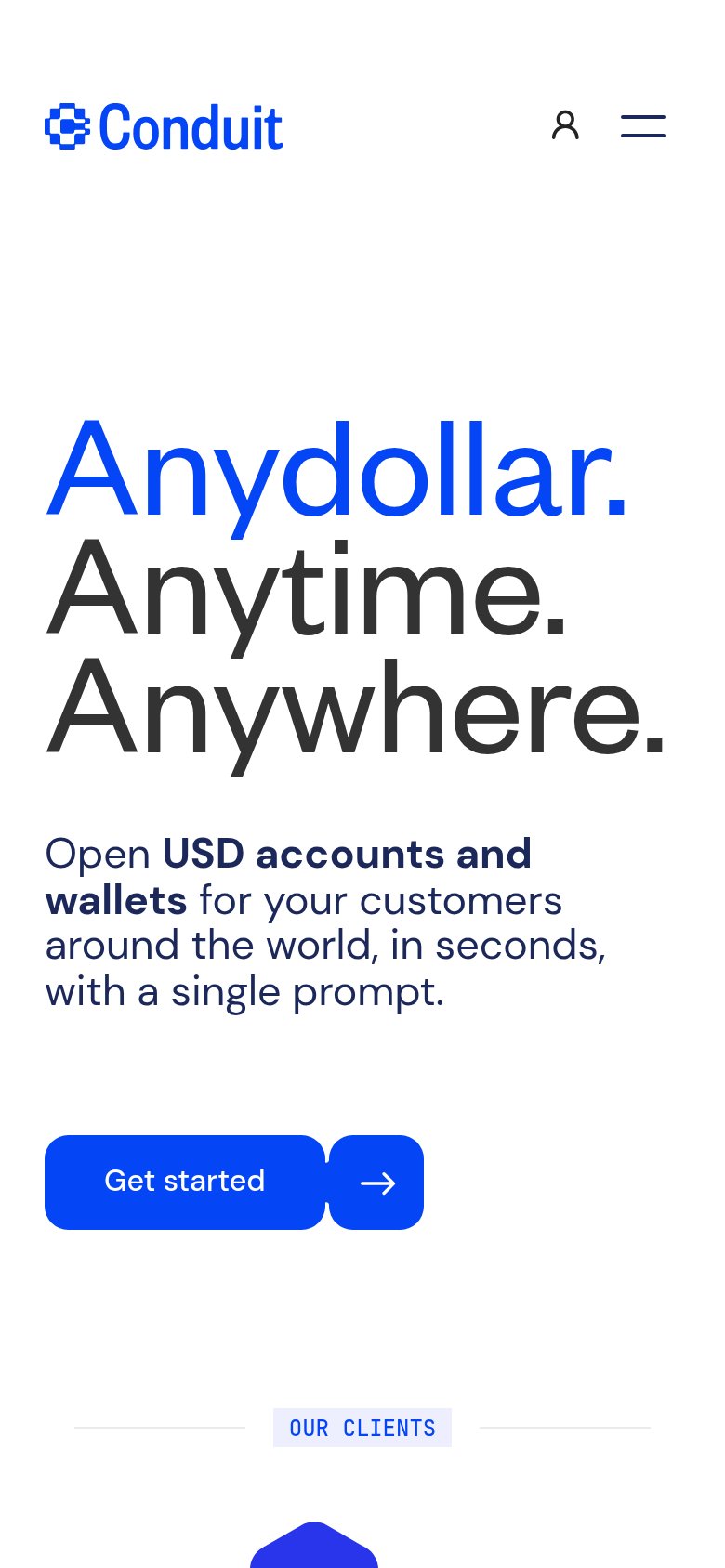
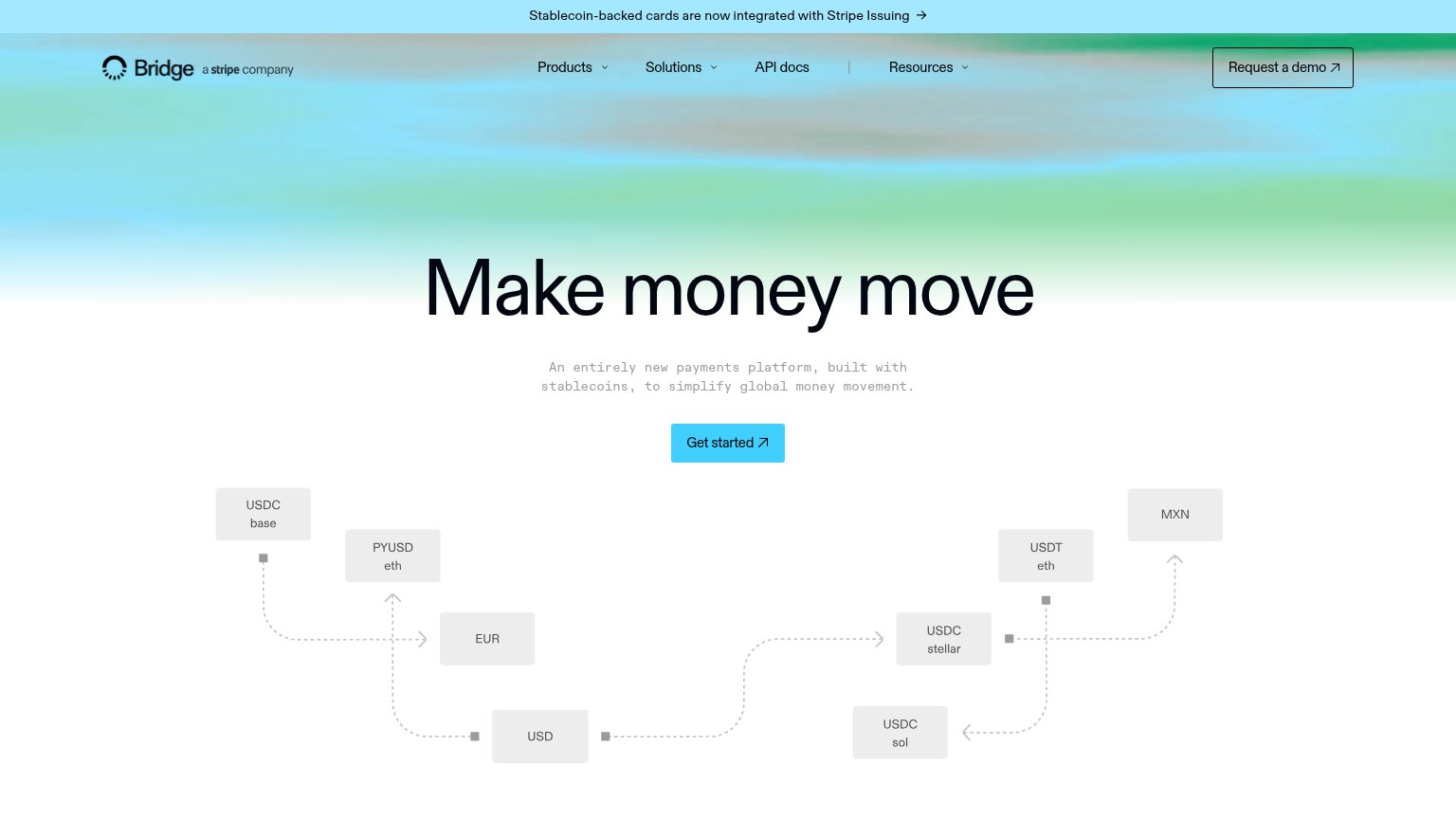


| Trust read | |
|---|---|
| Conduit | "OUR CLIENTS" section label visible at the bottom of the mobile fold |
| Subheadline claim "First review: 1–2 days, not 30. Accounts and every payment rail are built in." | |
| "a stripe company" mark next to the Bridge logo, reinforced by the banner "Stablecoin-backed cards are now integrated wi | |
| Customer logo row (Slope, OTOCO, Para, Ansa Research) |
Value props
72FairTitle, subtitle, hero — do they sell the product's true value?
Conduit’s headline undersells
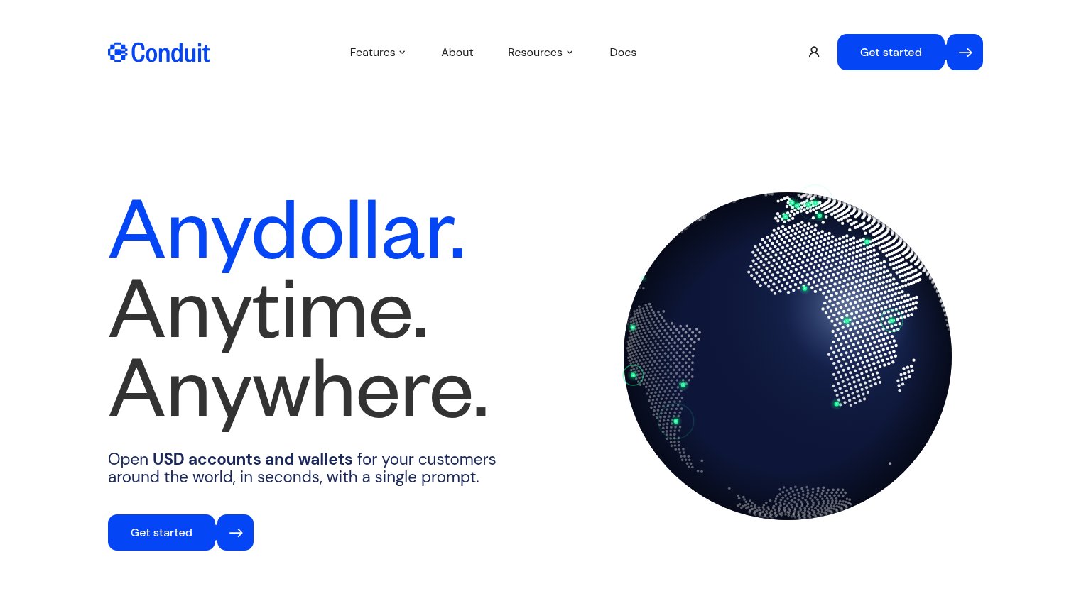
Anydollar. Anytime. Anywhere.
Open USD accounts and wallets for your customers around the world, in seconds, with a single prompt.
Working
- Subhead names deliverable: USD accounts
- Speed claim: 'in seconds, single prompt'
- Memorable, confident headline rhythm
Could improve
- Headline is vague without subhead
- Globe decorates, doesn't demonstrate
- No proof points or numbers in fold
CTA
76FairCopy, size, verb, cost-feel — does the primary CTA earn the click?
How Conduit compares
Recommended rewrites
Information hierarchy
84StrongDoes the design help or inhibit what the page is trying to say?
What works
What to improve
Mobile web
84StrongThe phone experience as a first-class citizen.
What works
What to improve