
Your landing page’s weakest score is Trust.
How Hypatos ranks
Trust
38PoorProof that the product is real, competent, and safe to try.

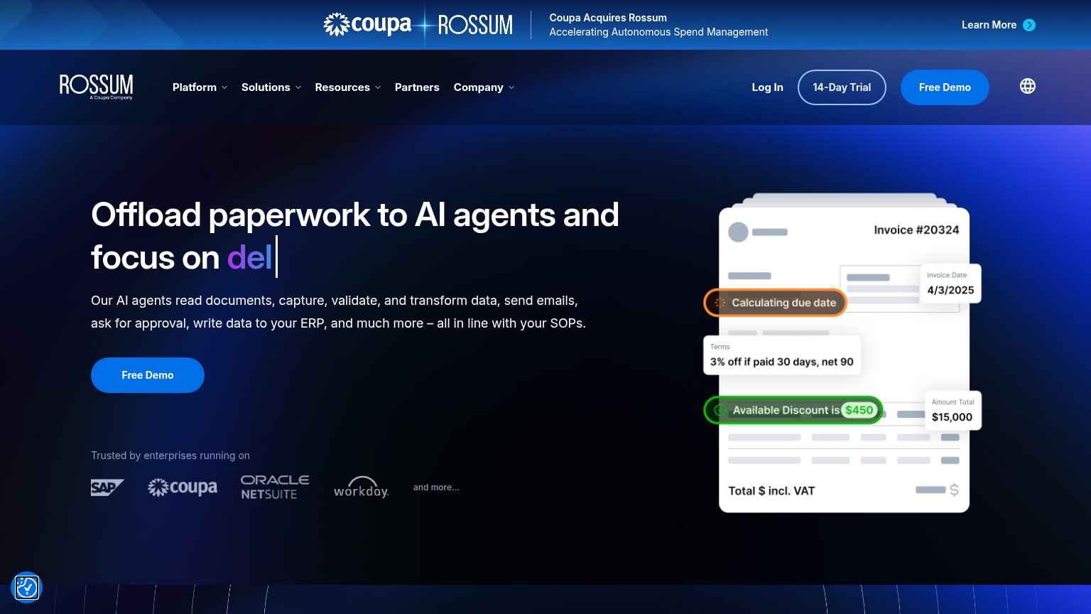
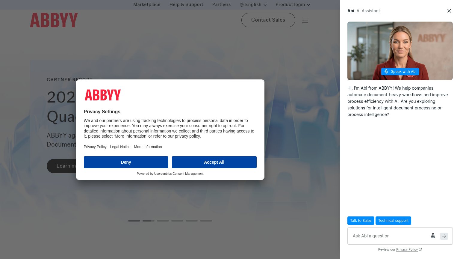

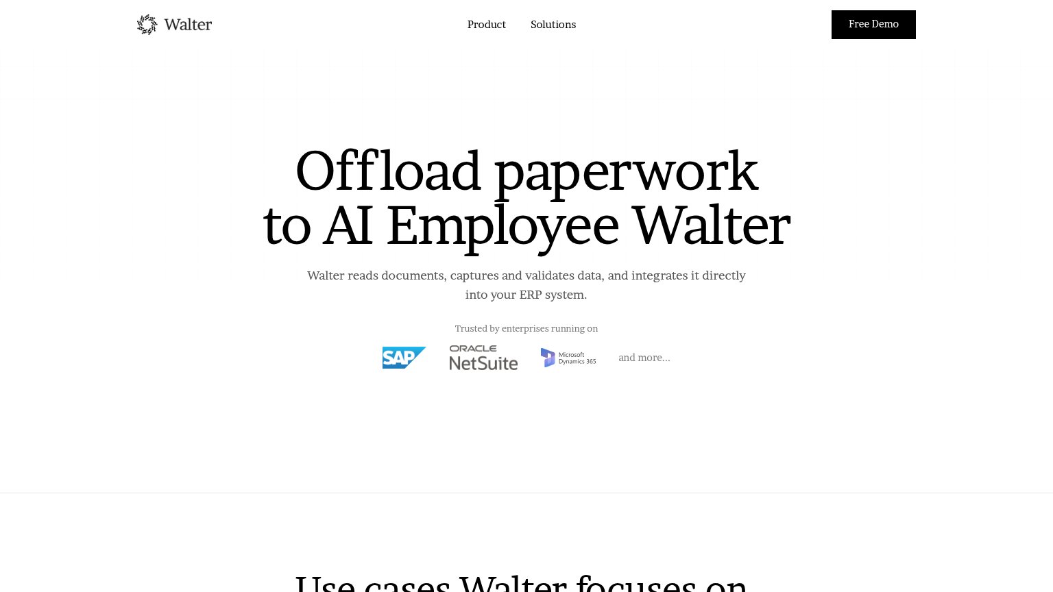
| Trust read | |
|---|---|
| Hypatos | No visible trust signal identified. |
| "Trusted by enterprises running on" strip with SAP, Oracle NetSuite, and Microsoft Dynamics 365 logos | |
| "Trusted by enterprises running on" logo strip (SAP, Coupa, Oracle NetSuite, Workday) | |
| Real product UI screenshots: expense dashboard with itemized expenses and a JSON extraction panel showing parsed invoice | |
| "Used by 35% of the Fortune 500 and 10,000+ enterprises" above a logo wall including P&G, Roche, Bayer, and Ryanair | |
| "ABBYY again recognized by Gartner as a Leader in Intelligent Document Processing" hero subhead |
Mobile web
38PoorThe phone experience as a first-class citizen.
 123
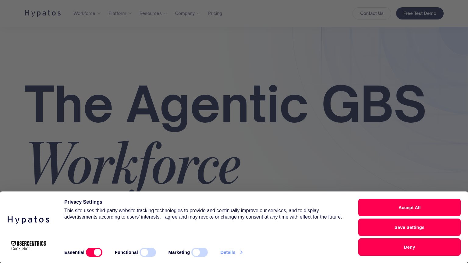
- Three stacked consent buttons — Accept All, Save Settings, and Deny share identical full-width pink styling, giving pure friction three CTAs while the product has none.
- Clipped Marketing toggle — The Marketing row is cut off mid-label by the button bar, signaling an unchecked mobile layout.
- Truncated hero headline — Only the word "The" survives above the overlay, so visitors get zero value statement on landing.
Value props
42PoorTitle, subtitle, hero — do they sell the product's true value?
Hypatos’s headline
The Agentic GBS Workforce
Working
Could improve
Information hierarchy
48PoorDoes the design help or inhibit what the page is trying to say?
What works
What to improve
CTA
68FairCopy, size, verb, cost-feel — does the primary CTA earn the click?
How Hypatos compares
Recommended rewrites