
Your landing page’s weakest score is Trust.
How Hotjar ranks
73Growth scoreupdated
category scores
category scoresShowHide
Trust
62FairProof that the product is real, competent, and safe to try.
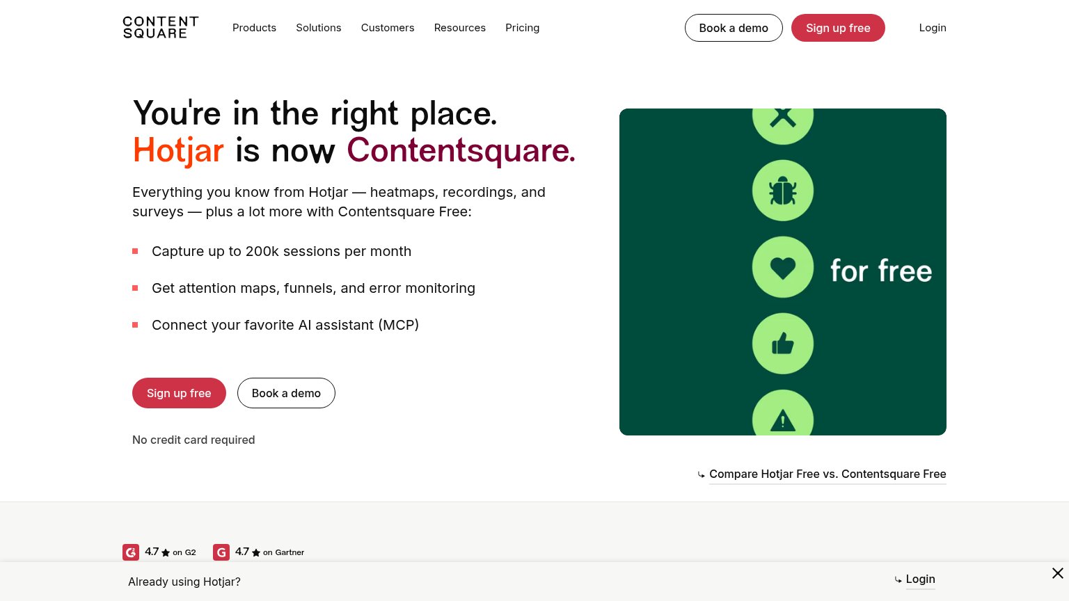
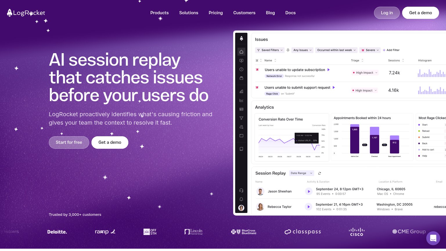

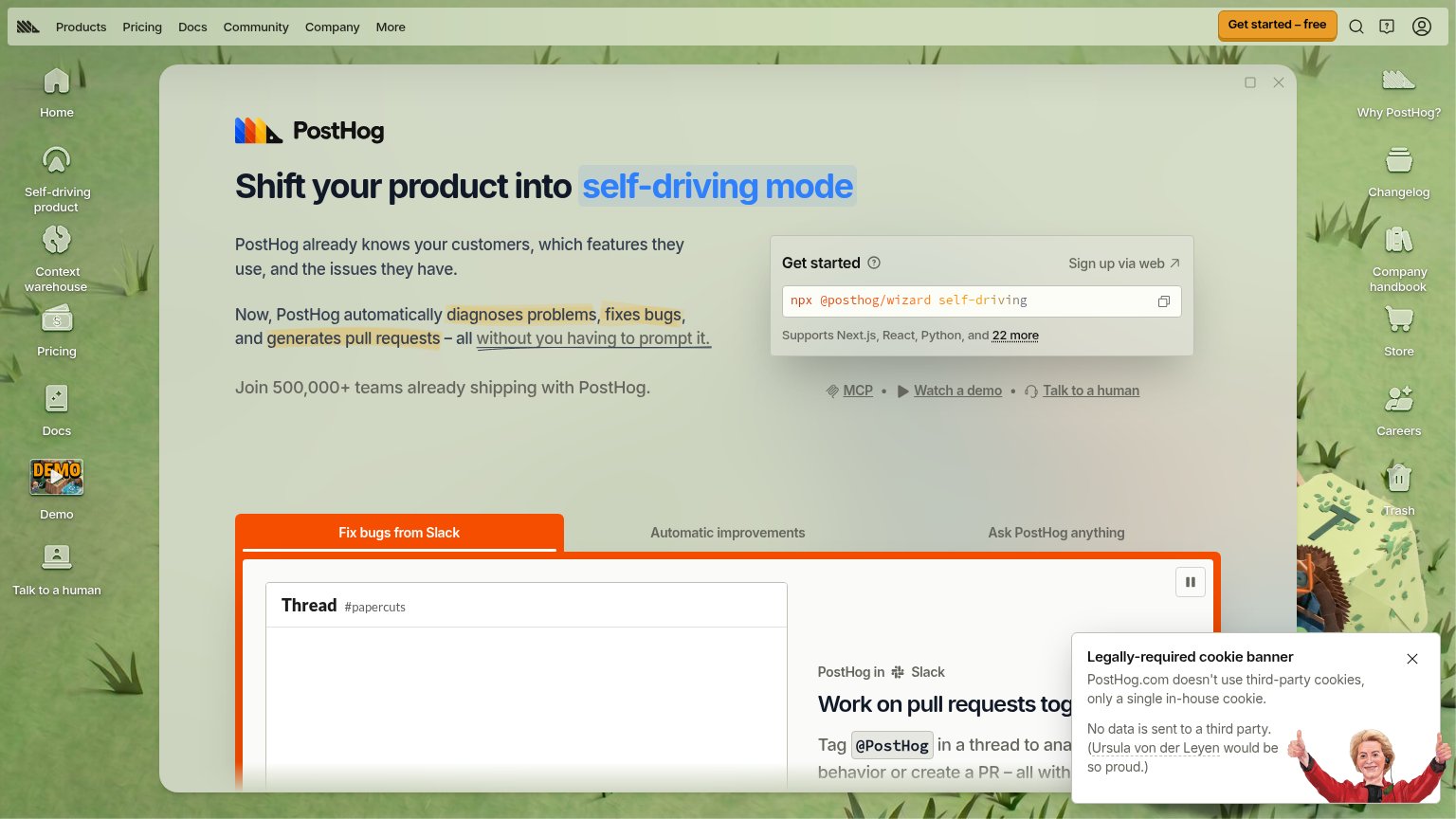
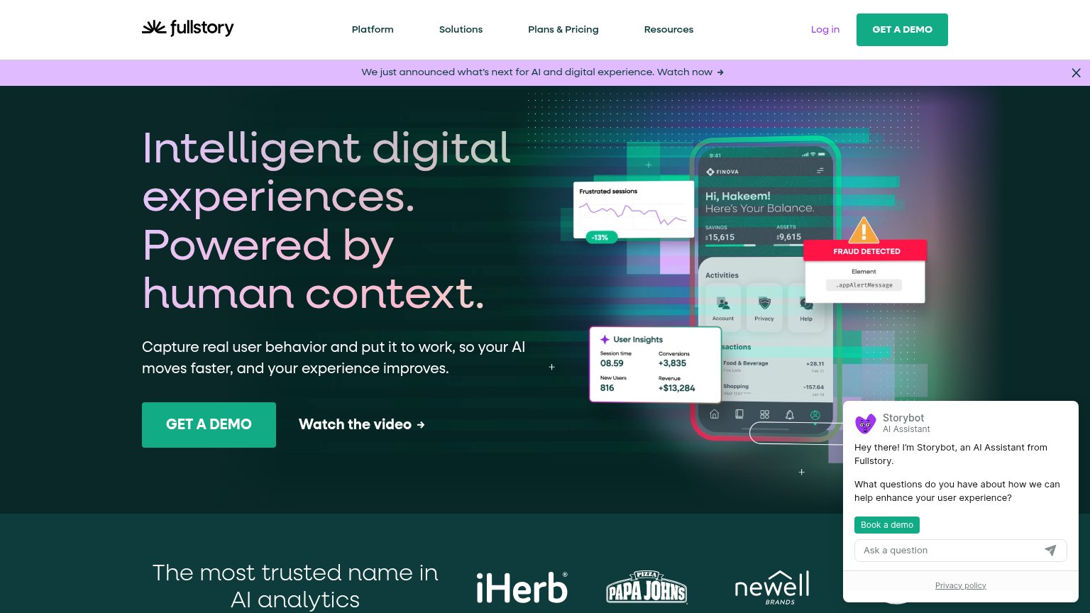
| Trust read | |
|---|---|
| Hotjar | "4.7 on G2" and "4.7 on Gartner" review badges |
| "Backed by Y Combinator" badge above the headline | |
| Join 500,000+ teams already shipping with PostHog. | |
| "Trusted by 3,000+ customers" line above a logo wall including Deloitte, Cisco, BlueCross BlueShield, ClassPass, and CME | |
| Customer logo strip: iHerb, Papa John's, Newell Brands | |
| "Smartlook has joined Cisco!" headline with the Smartlook + Cisco logo lockup |
Information hierarchy
72FairDoes the design help or inhibit what the page is trying to say?
1234- Header CTA pair — Duplicates the hero's 'Sign up free' and 'Book a demo' at equal weight, splitting attention across four buttons in one viewport.
- Already using Hotjar banner — Sticky bottom bar pushes a 'Login' exit into the fold on both desktop and mobile, competing with signup.
- Compare Free link — Underlined exit link sits right under the brand panel at the end of the scan path, siphoning clicks from the CTA.
- Five-item nav row — Products through Pricing plus Login give six leak points before the visitor reaches the headline.
Value props
72FairTitle, subtitle, hero — do they sell the product's true value?
Hotjar’s headline
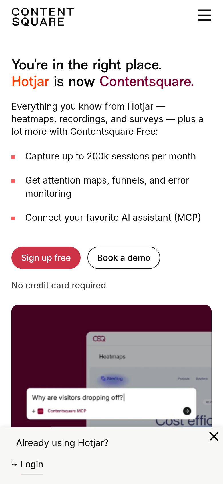
You're in the right place. Hotjar is now Contentsquare.
Everything you know from Hotjar — heatmaps, recordings, and surveys — plus a lot more with Contentsquare Free:
Working
Could improve
Mobile web
72FairThe phone experience as a first-class citizen.
What works
What to improve
CTA
86StrongCopy, size, verb, cost-feel — does the primary CTA earn the click?
How Hotjar compares
Recommended rewrites