
Your landing page’s weakest score is Mobile web.
How Honeycomb ranks
62Growth scoreupdated
category scores
category scoresShowHide
Mobile web
48PoorThe phone experience as a first-class citizen.
 12
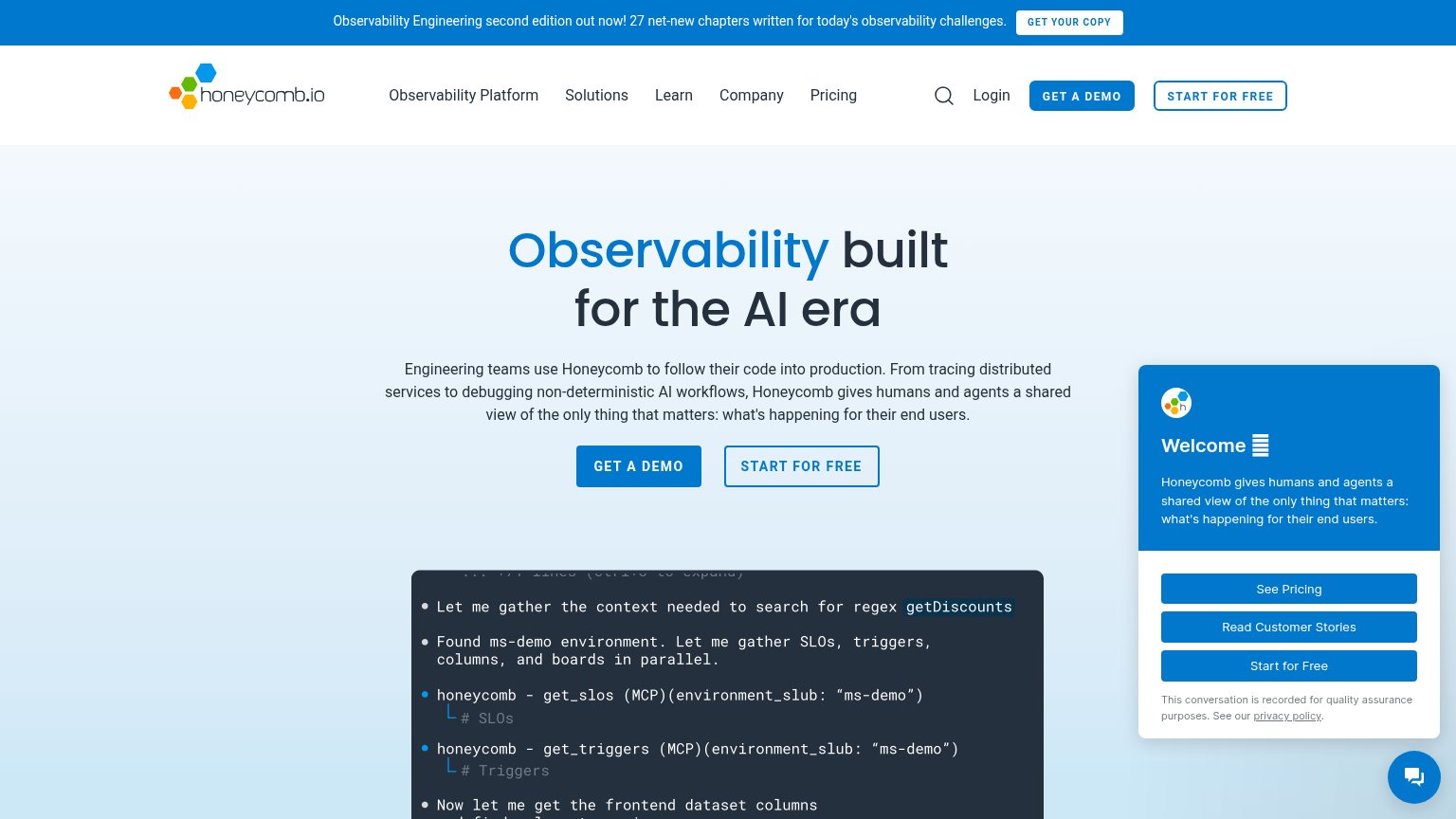
- Welcome chat overlay — Chat widget expands into a giant modal covering the hero copy and both primary CTAs — only a sliver of one button peeks out.
- Promo banner block — The 'GET Honeycomb's COPY' announcement bar takes roughly 10% of the viewport before the logo even appears, stacking a second message above the hero.
Information hierarchy
58FairDoes the design help or inhibit what the page is trying to say?
 1234
- Auto-open chat widget — Adds three more blue buttons (See Pricing, Customer Stories, Start for Free) that dilute the hero CTAs — and on mobile it fully covers the hero CTA.
- Duplicate nav CTA pair — GET A DEMO and START FOR FREE repeat at equal weight in nav and hero, so no single action reads as primary.
- Book promo banner — GET Honeycomb's COPY is the first button in the scan path and routes attention away from the product conversion.
- Hero CTA pair — Two side-by-side buttons of near-equal weight force a choice before the visitor knows which path Honeycomb prefers.
Trust
58FairProof that the product is real, competent, and safe to try.
How Honeycomb compares
Trust read
CTA
72FairCopy, size, verb, cost-feel — does the primary CTA earn the click?
How Honeycomb compares
Recommended rewrites
Value props
72FairTitle, subtitle, hero — do they sell the product's true value?
Honeycomb’s headline
Observability built for the AI era
Engineering teams use Honeycomb to follow their code into production. From tracing distributed services to debugging non-deterministic AI workflows, Honeycomb gives humans and agents a shared view of the only thing that matters: what's happ
Working
Could improve