
Your landing page’s weakest score is Information hierarchy.
How Dynatrace ranks
74Growth scoreupdated
category scores
category scoresShowHide
Information hierarchy
68FairDoes the design help or inhibit what the page is trying to say?
 1234
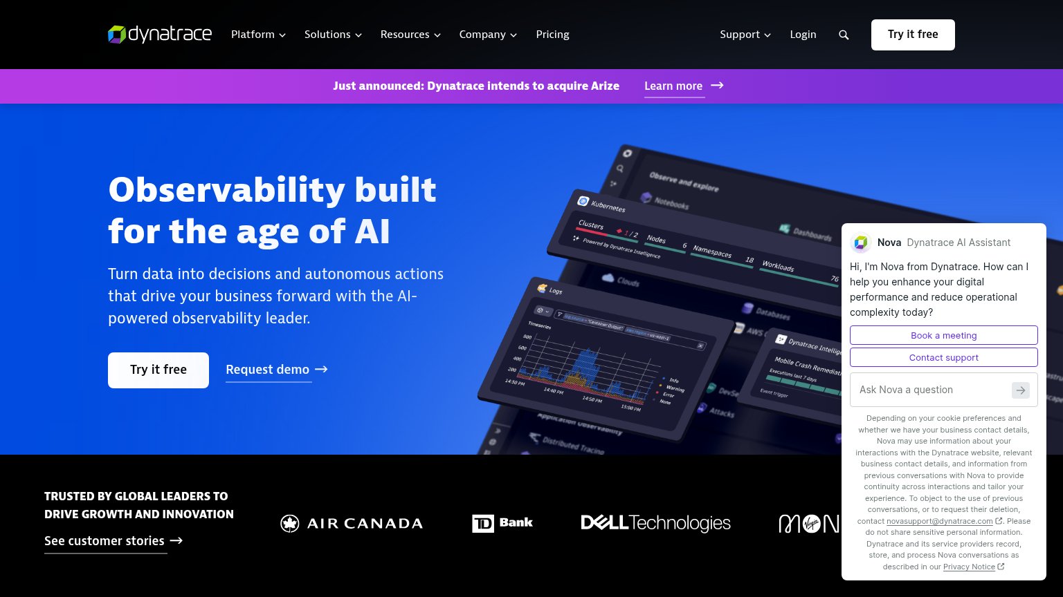
- Auto-opened Nova panel — Chat widget with two purple CTAs, an input, and a privacy text wall outweighs the hero's Try it free button.
- Arize announcement banner — Bright purple bar with Learn more link sits above the headline and pulls first attention to an exit.
- Nav plus header CTA — Six dropdowns, Login, search, and a duplicate Try it free create a dozen leaks before the hero action.
- Cropped Virgin logo — Trust strip's last logo is cut off behind the chat panel, weakening the social-proof row.
Value props
72FairTitle, subtitle, hero — do they sell the product's true value?
Dynatrace’s headline sells
Observability built for the age of AI
Turn data into decisions and autonomous actions that drive your business forward with the AI-powered observability leader.
Working
- Names the category clearly: observability
- Hero image shows real product dashboards
- Logo strip proves enterprise trust
Could improve
- No numbers or measurable outcomes
- 'Drive Dynatrace's business forward' is generic
- Emotion of outage relief never touched
Mobile web
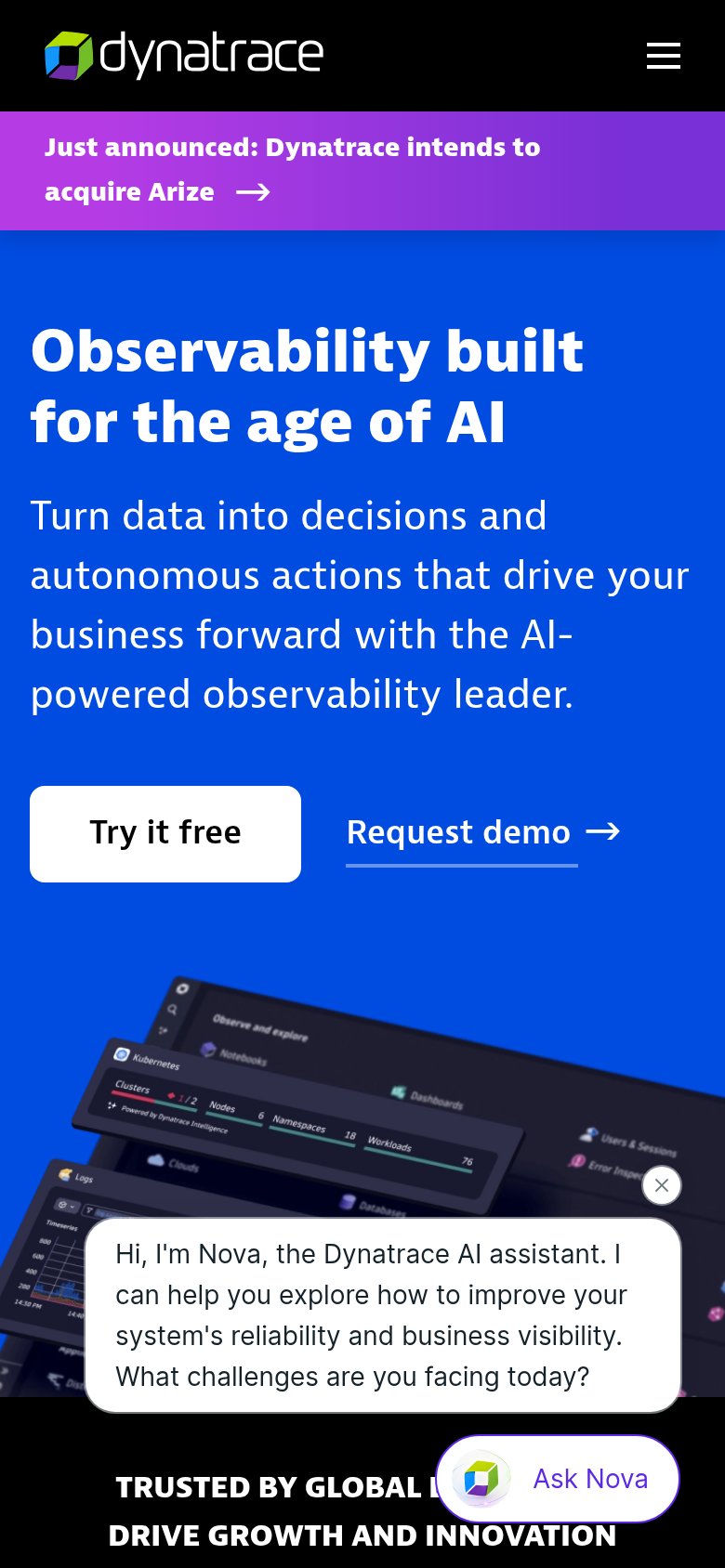
72FairThe phone experience as a first-class citizen.
What works
What to improve
Trust
76FairProof that the product is real, competent, and safe to try.
How Dynatrace compares
Trust read
CTA
82StrongCopy, size, verb, cost-feel — does the primary CTA earn the click?
How Dynatrace compares
Recommended rewrites