
Your landing page’s weakest score is Value props.
How Graphite ranks
- 1.
Graphite78
- 2.
Cubic75
- 3.
CodeRabbit73
- 4.
Greptile70
- 5.
/dev/fast65
78Growth scoreupdated
category scores
category scoresShowHide
Value props
72FairTitle, subtitle, hero — do they sell the product's true value?
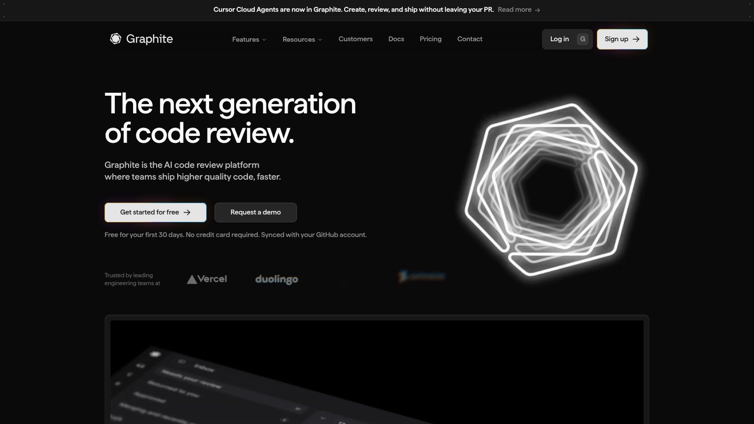
Graphite’s headline undersells
The next generation of code review.
Graphite is the AI code review platform where teams ship higher quality code, faster.
Working
- Subhead names category and outcome
- Free 30 days, no card — real friction cut
- Vercel/Duolingo logos back the claim
Could improve
- 'Next generation' is empty positioning
- No numbers to back 'faster'
- Hexagon art decorates, doesn't demo
Information hierarchy
76FairDoes the design help or inhibit what the page is trying to say?
 123
- Announcement banner Read more — The Cursor Cloud Agents banner with 'Read more' link is the first element in the scan path and routes attention off the conversion story before the headline is read.
- Faded logo strip — The trust logos render at near-invisible contrast — the fourth logo is illegible — so the social proof beat contributes noise instead of credibility.
- Nav link row — Six nav items plus Log in sit at similar visual weight to the hero CTAs, adding seven exit paths above the fold.
Trust
76FairProof that the product is real, competent, and safe to try.
How Graphite compares
Trust read
Mobile web
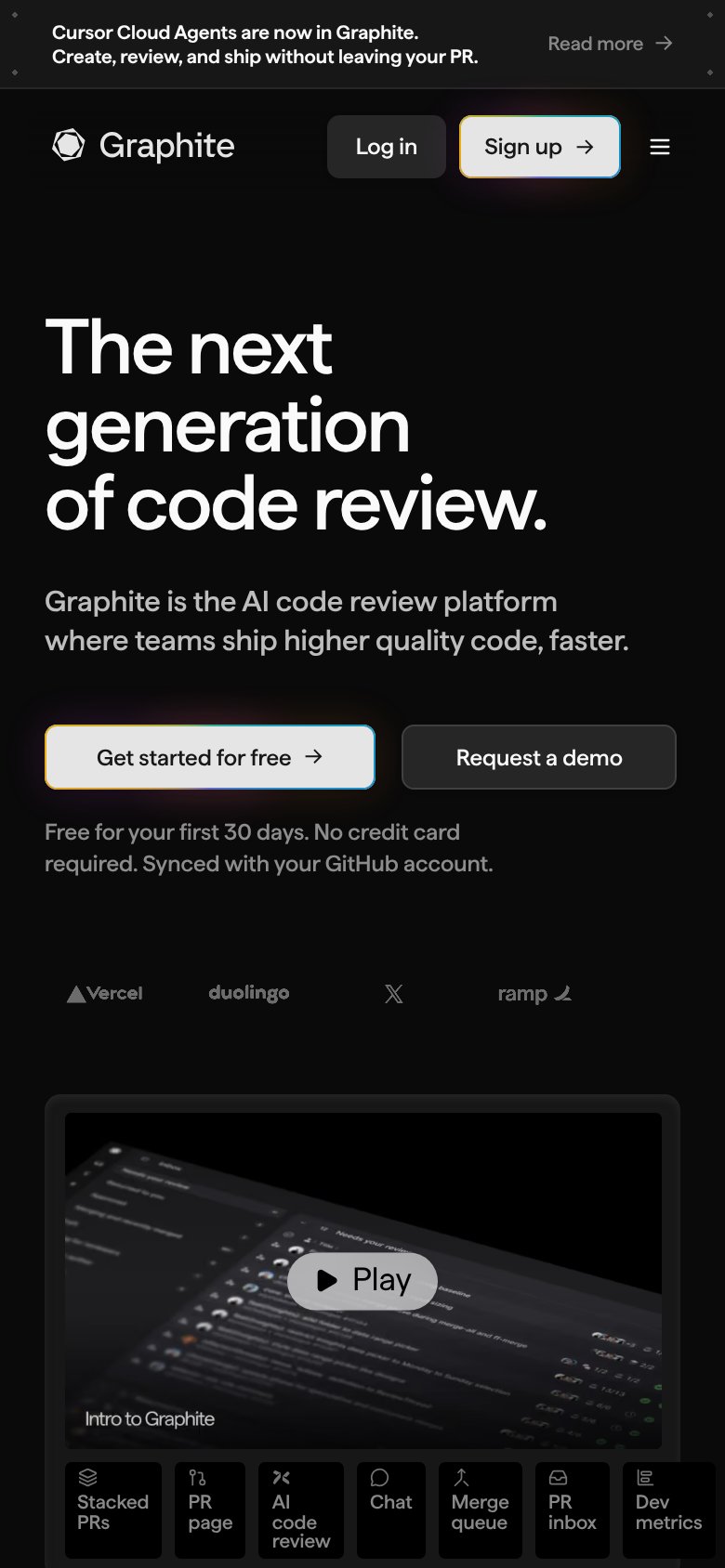
80StrongThe phone experience as a first-class citizen.
What works
What to improve
CTA
84StrongCopy, size, verb, cost-feel — does the primary CTA earn the click?
How Graphite compares
Recommended rewrites