
Your landing page’s weakest score is Trust.
How Cubic ranks
75Growth scoreupdated
category scores
category scoresShowHide
Trust
62FairProof that the product is real, competent, and safe to try.

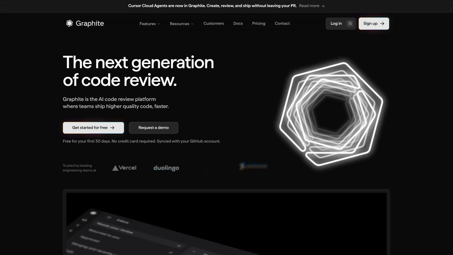
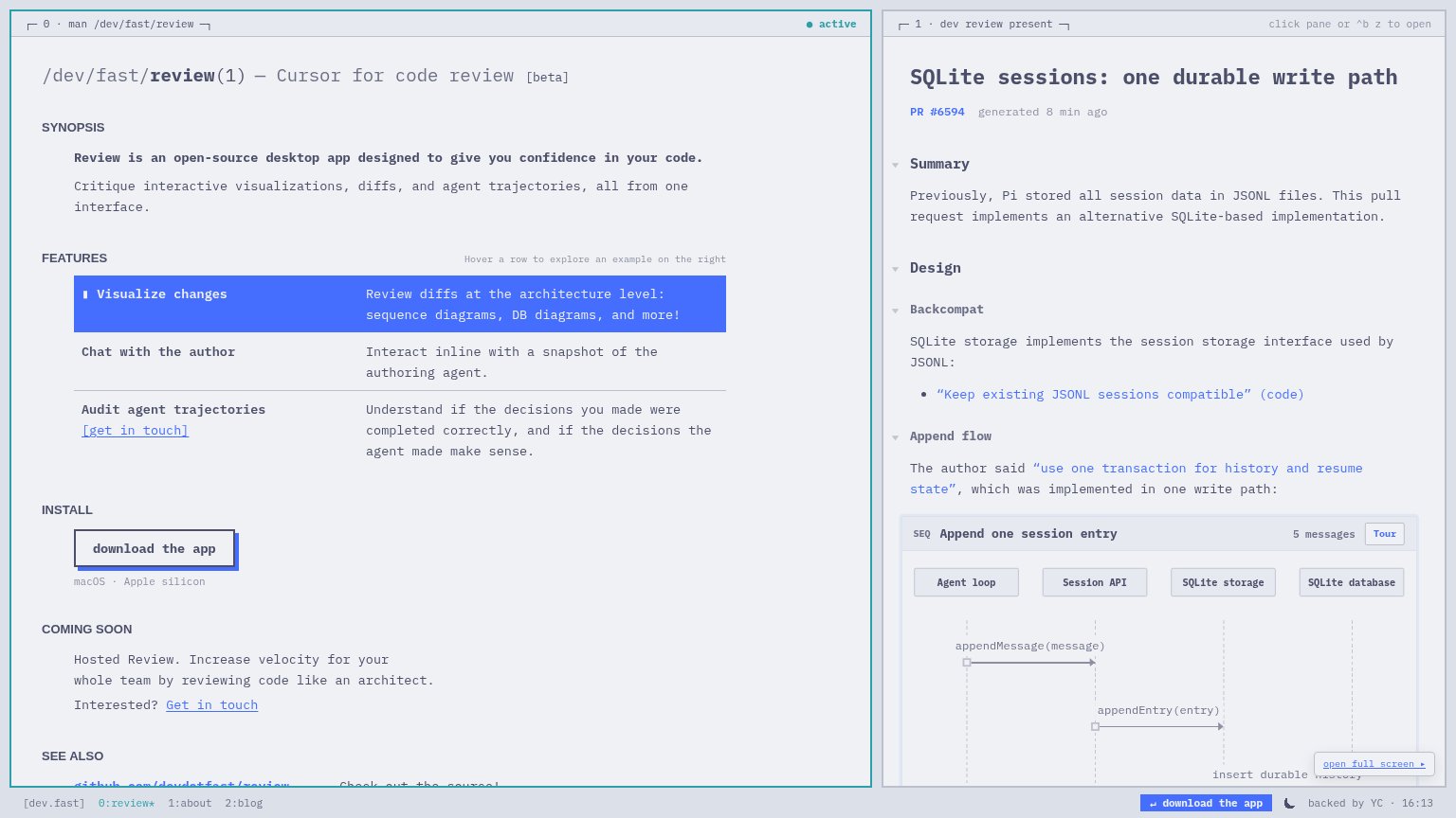
| Trust read | |
|---|---|
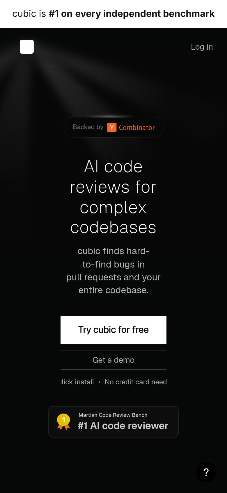
| Cubic | "Martian Code Review Bench — #1 AI code reviewer" benchmark badge below the CTA |
| Live interactive product pane rendering PR #6594 with an "Append one session entry" sequence diagram | |
| "Trusted by leading engineering teams at" logo strip with Vercel and Duolingo | |
| Detailed "Pull requests" product UI with P0/P1/P2 priority rows and risk/reward/effort columns | |
| "OVER 22,000+ TEAMS USE GREPTILE" usage banner |
Information hierarchy
72FairDoes the design help or inhibit what the page is trying to say?
1234- Start free trial button — White-filled nav button matches the hero CTA's weight, splitting the primary action across two locations.
- Get a demo button — Sits at nearly the same size directly beside 'Try cubic for free', diluting the single-action scan path.
- Benchmark banner link — 'Read the report →' is the first clickable element on the page and pulls attention off-site before the hero.
- Blank white logo — The wordmark renders as an empty white square, leaving the brand anchor unidentifiable at the fold's center.
Mobile web
76FairThe phone experience as a first-class citizen.
What works
What to improve
Value props
78FairTitle, subtitle, hero — do they sell the product's true value?
Cubic’s headline
AI code reviews for complex codebases
cubic finds hard-to-find bugs in pull requests and your entire codebase.
Working
Could improve
CTA
86StrongCopy, size, verb, cost-feel — does the primary CTA earn the click?
How Cubic compares
Recommended rewrites