
Your landing page’s weakest score is Trust.
How Shippo ranks
72Growth scoreupdated
category scores
category scoresShowHide
Trust
62FairProof that the product is real, competent, and safe to try.

| Trust read | |
|---|---|
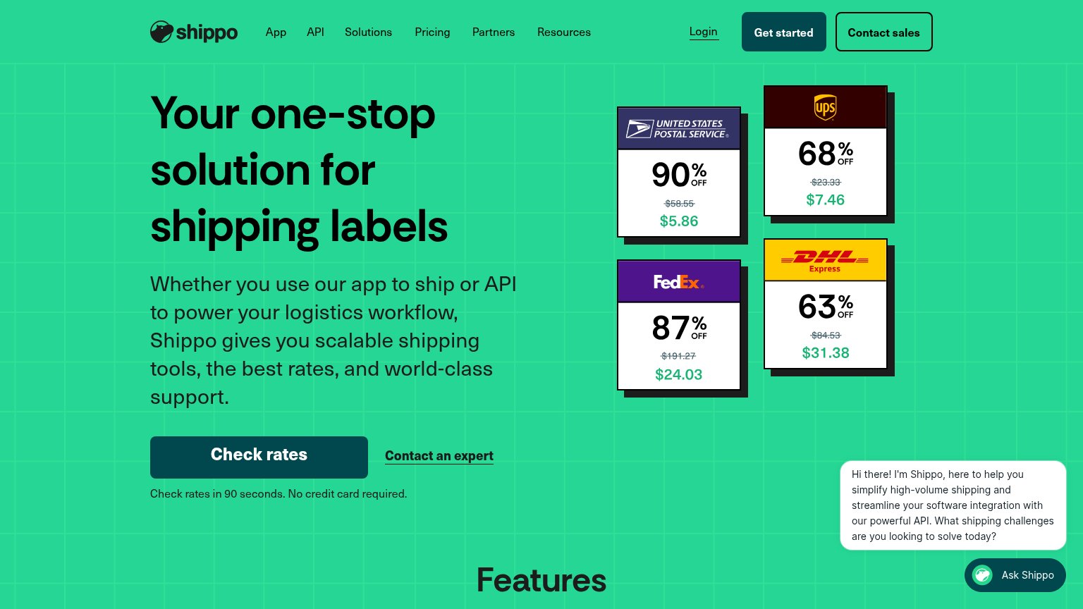
| Shippo | Carrier rate cards showing specific discounts: USPS "90% OFF $58.55 → $5.86", UPS "68% OFF $7.46", FedEx "87% OFF $24.03 |
| "Backed by Y Combinator" badge | |
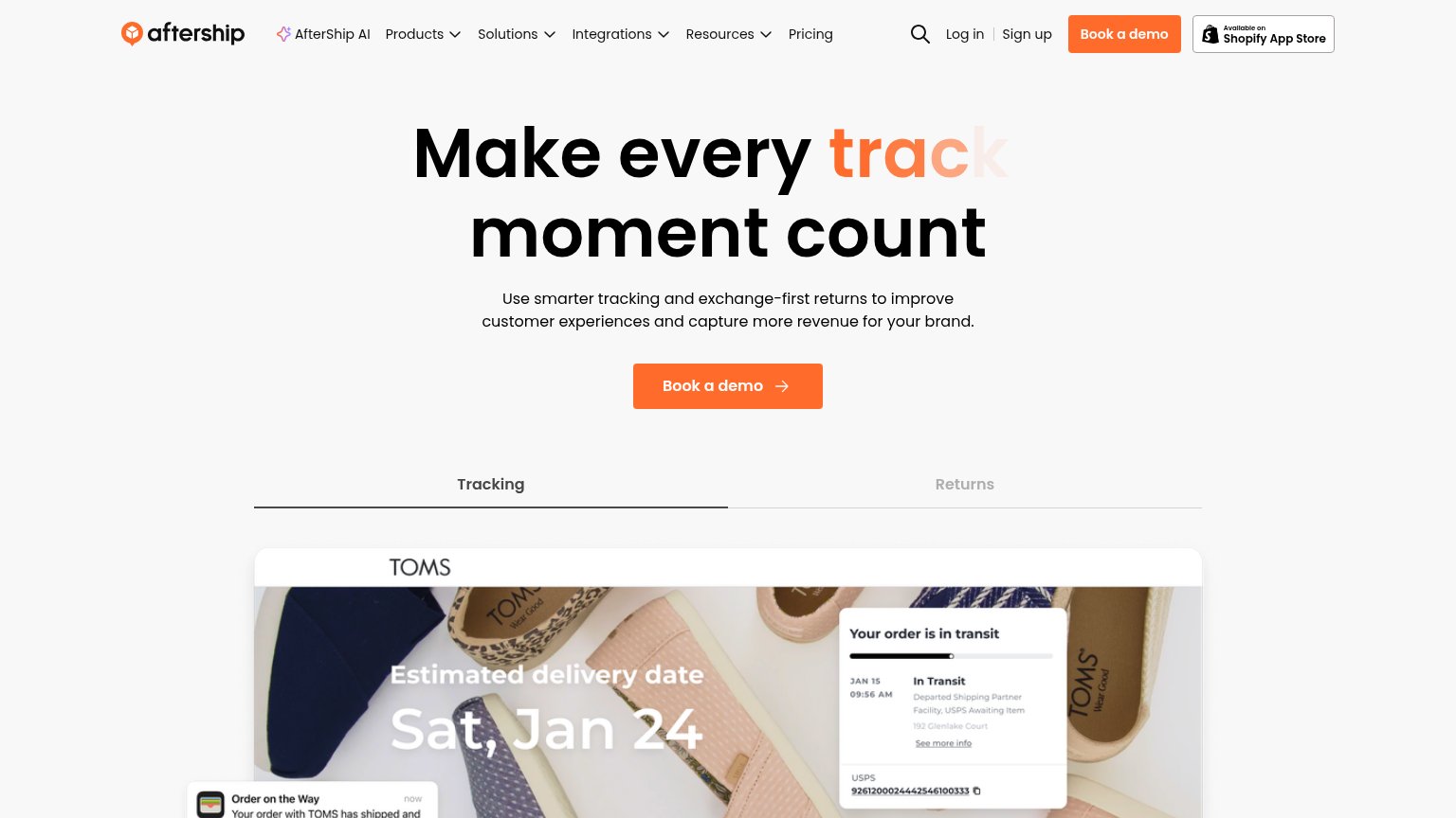
| TOMS-branded tracking demo showing "Estimated delivery date Sat, Jan 24" with a live "Your order is in transit" USPS sta | |
| Testimonial: "We cut our shipping costs by $1.5 million and reduced shipping speeds by half." — Ali Shahid, COO, Our Pla | |
| "No credit card required · Cancel anytime · Set up in minutes" reassurance row under the hero CTA | |
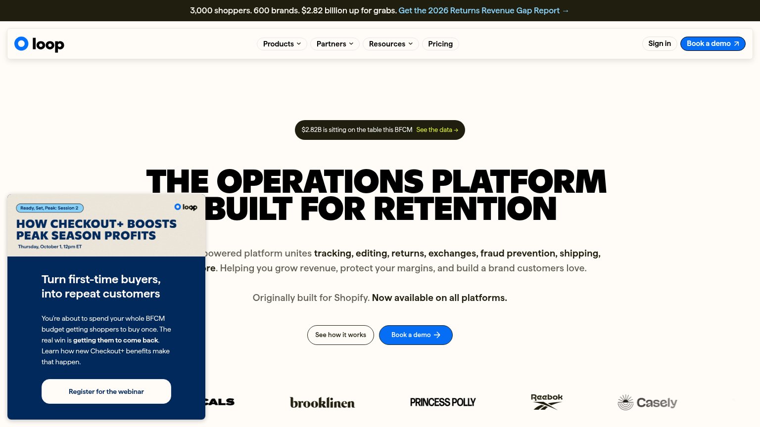
| Customer logo strip featuring Brooklinen, Princess Polly, Reebok, and Casely |
Information hierarchy
68FairDoes the design help or inhibit what the page is trying to say?
1234- Dueling header CTAs — "Get started" and "Contact sales" sit side by side at equal weight, splitting the fold's action before the visitor reaches "Check rates".
- Chat widget auto-opens — The Ask Shippo bubble fires unprompted in the scan path's exit corner, adding a fourth competing message to the fold.
- Carrier rate cards — Four same-weight price cards (USPS, UPS, FedEx, DHL) shout simultaneously with no reading order or summary framing.
- Six-item nav row — App, API, Solutions, Pricing, Partners, Resources plus Login give seven leak points before the hero CTA.
Mobile web
72FairThe phone experience as a first-class citizen.
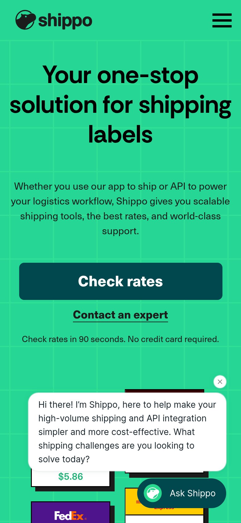
What works
What to improve
CTA
78FairCopy, size, verb, cost-feel — does the primary CTA earn the click?
How Shippo compares
Recommended rewrites
Value props
80StrongTitle, subtitle, hero — do they sell the product's true value?
Shippo’s headline
Your one-stop solution for shipping labels
Whether you use our app to ship or API to power your logistics workflow, Shippo gives you scalable shipping tools, the best rates, and world-class support.
Working
Could improve