
Your landing page’s weakest score is Mobile web.
How FMX ranks
Mobile web
42PoorThe phone experience as a first-class citizen.
 123
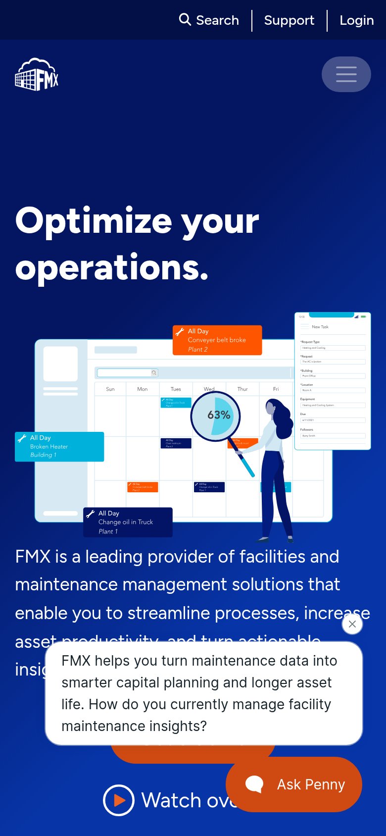
- Penny chat pop-up — Chat bubble overlay covers the primary CTA area entirely, hiding 'Get a demo' behind a dismissable card.
- Ask Penny bubble — Large orange chat launcher overlaps and obscures the 'Watch overview' link, competing with the real CTAs.
- Double-decker header — Utility bar (Search/Support/Login) stacks above the logo row, eating two header strips of the first viewport.
Trust
44PoorProof that the product is real, competent, and safe to try.

| Trust read | |
|---|---|
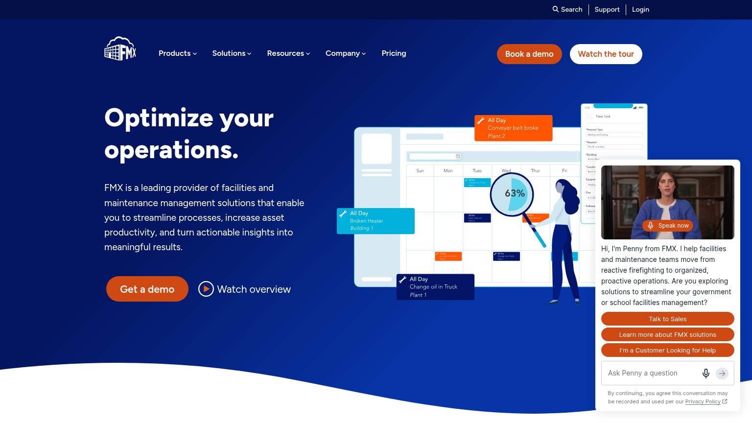
| FMX | Stylized product UI mockup showing a maintenance calendar with work orders and a mobile "New Task" request form |
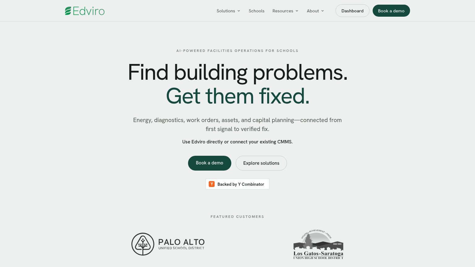
| "Featured Customers" logos: Palo Alto Unified School District and Los Gatos-Saratoga Union High School District | |
| SIEMENS logo in the site masthead | |
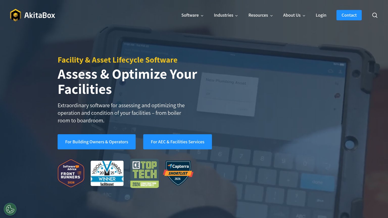
| Award badge row: Software Advice FrontRunners 2026, Vision Awards 2025 Winner, CE Top Tech 2024, Capterra Shortlist 2026 | |
| Functional "Find Your Space" search form with facility and location inputs |
Value props
52FairTitle, subtitle, hero — do they sell the product's true value?
FMX’s headline
Optimize your operations.
FMX is a leading provider of facilities and maintenance management solutions that enable you to streamline processes, increase asset productivity, and turn actionable insights into meaningful results.
Working
Could improve
Information hierarchy
58FairDoes the design help or inhibit what the page is trying to say?
What works
What to improve
CTA
68FairCopy, size, verb, cost-feel — does the primary CTA earn the click?
How FMX compares
Recommended rewrites