
Your landing page’s weakest score is Mobile web.
How Edviro ranks
Mobile web
62FairThe phone experience as a first-class citizen.
 1234
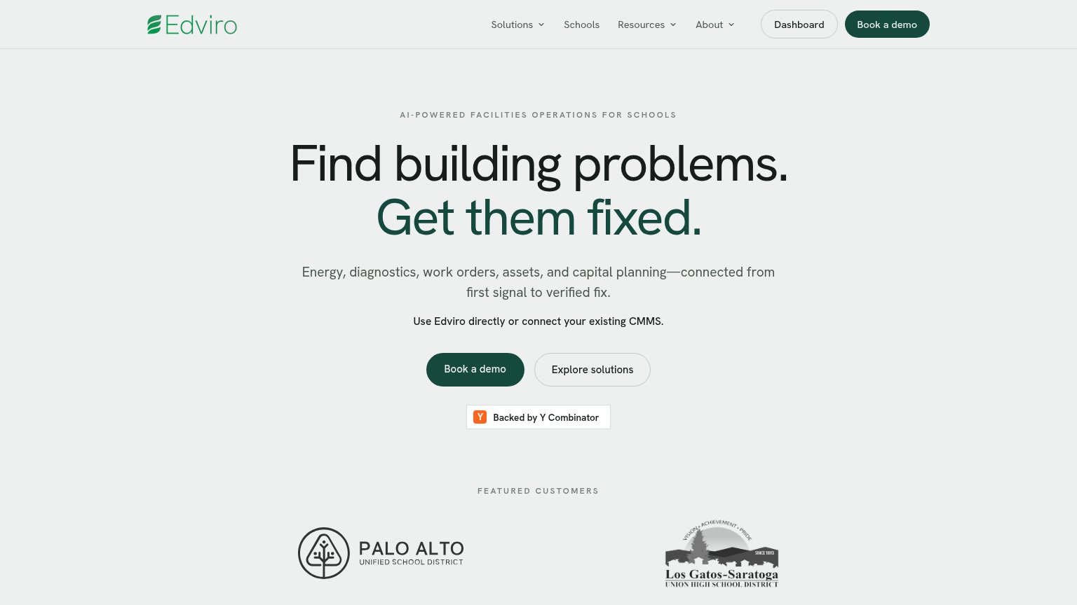
- Primary CTA below fold — Long stacked headline and two body paragraphs push 'Book a demo' out of the first mobile viewport.
- Oversized eyebrow text — AI-POWERED FACILITIES OPERATIONS FOR SCHOOLS wraps to two loud tracked-out lines, eating hero space before the headline.
- Two stacked body paragraphs — The four-line subhead plus the CMMS line stack six lines of copy between headline and CTA, delaying the tap.
- Book a demo width — Button sits at roughly 40% column width instead of a full-bleed thumb target.
CTA
68FairCopy, size, verb, cost-feel — does the primary CTA earn the click?

Problems
- 'Book' feels costly — implies sales call
- no value payoff in the label
- doesn't echo headline promise
Trust
68FairProof that the product is real, competent, and safe to try.
How Edviro compares
Trust read
Value props
76FairTitle, subtitle, hero — do they sell the product's true value?
Edviro’s headline
Find building problems. Get them fixed.
Energy, diagnostics, work orders, assets, and capital planning—connected from first signal to verified fix.
Working
Could improve
Information hierarchy
78FairDoes the design help or inhibit what the page is trying to say?
What works
What to improve