
Your landing page’s weakest score is Trust.
How Pequity ranks
- 1.
Pequity72
- 2.
Comprehensive70
- 3.
Openroll68
- 4.
Complete67
72Growth scoreupdated
category scores
category scoresShowHide
Trust
68FairProof that the product is real, competent, and safe to try.
| Trust read | |
|---|---|
| Pequity | "Pequity joins ADP" banner and "An ADP Company" logo lockup |
| Product screenshot showing agent workflow steps like "Exploring salary band structure and column names" | |
| G2 Winter 2026 badges: "High Performer," "Best Support," "Easiest To Do Business With" | |
| Compy agent product UI showing a real chat exchange: "Bands updated in table — I replaced all Engineering bands with upd |
Information hierarchy
72FairDoes the design help or inhibit what the page is trying to say?
 1234
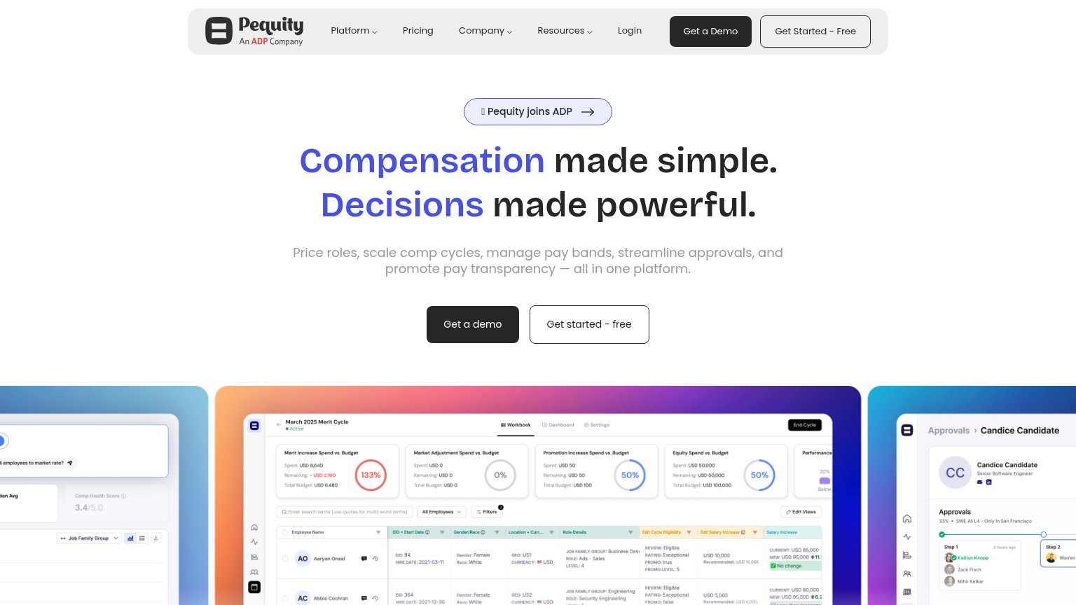
- Duplicate demo CTAs — "Get a Demo" in nav and "Get a demo" in hero are styled at identical dark weight, splitting the primary action across two targets.
- Paired hero buttons — "Get a demo" and "Get started - free" sit side by side at near-equal size, forcing a choice before either path wins.
- ADP announcement pill — The "Pequity joins ADP" pill with arrow sits directly above the headline and outranks it in the scan path, pulling clicks away from conversion.
- Dense product screenshot — The merit-cycle screenshot is packed with unreadable micro-text and stat cards that add cognitive load without communicating an outcome at this size.
CTA
72FairCopy, size, verb, cost-feel — does the primary CTA earn the click?
How Pequity compares
Recommended rewrites
Value props
72FairTitle, subtitle, hero — do they sell the product's true value?
Pequity’s headline
Compensation made simple. Decisions made powerful.
Price roles, scale comp cycles, manage pay bands, streamline approvals, and promote pay transparency — all in one platform.
Working
Could improve
Mobile web
76FairThe phone experience as a first-class citizen.
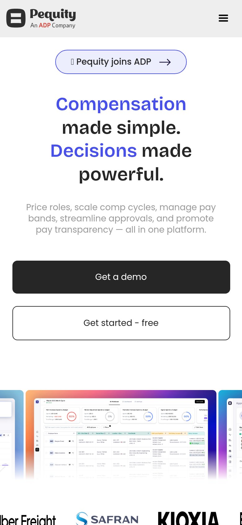
What works
What to improve