
Your landing page’s weakest score is Mobile web.
How Bluejay ranks
74Growth scoreupdated
category scores
category scoresShowHide
Mobile web
70FairThe phone experience as a first-class citizen.
 123
- Stacked dual CTAs — Two equal-weight buttons compete for the tap; neither is full-width or clearly primary.
- Start for Free button — Translucent fill on the busy pastel render leaves the label with weak contrast and low tap affordance.
- Two-line announcement bar — The pink banner wraps to two lines, pushing the hero down on an already-tight viewport.
Value props
72FairTitle, subtitle, hero — do they sell the product's true value?
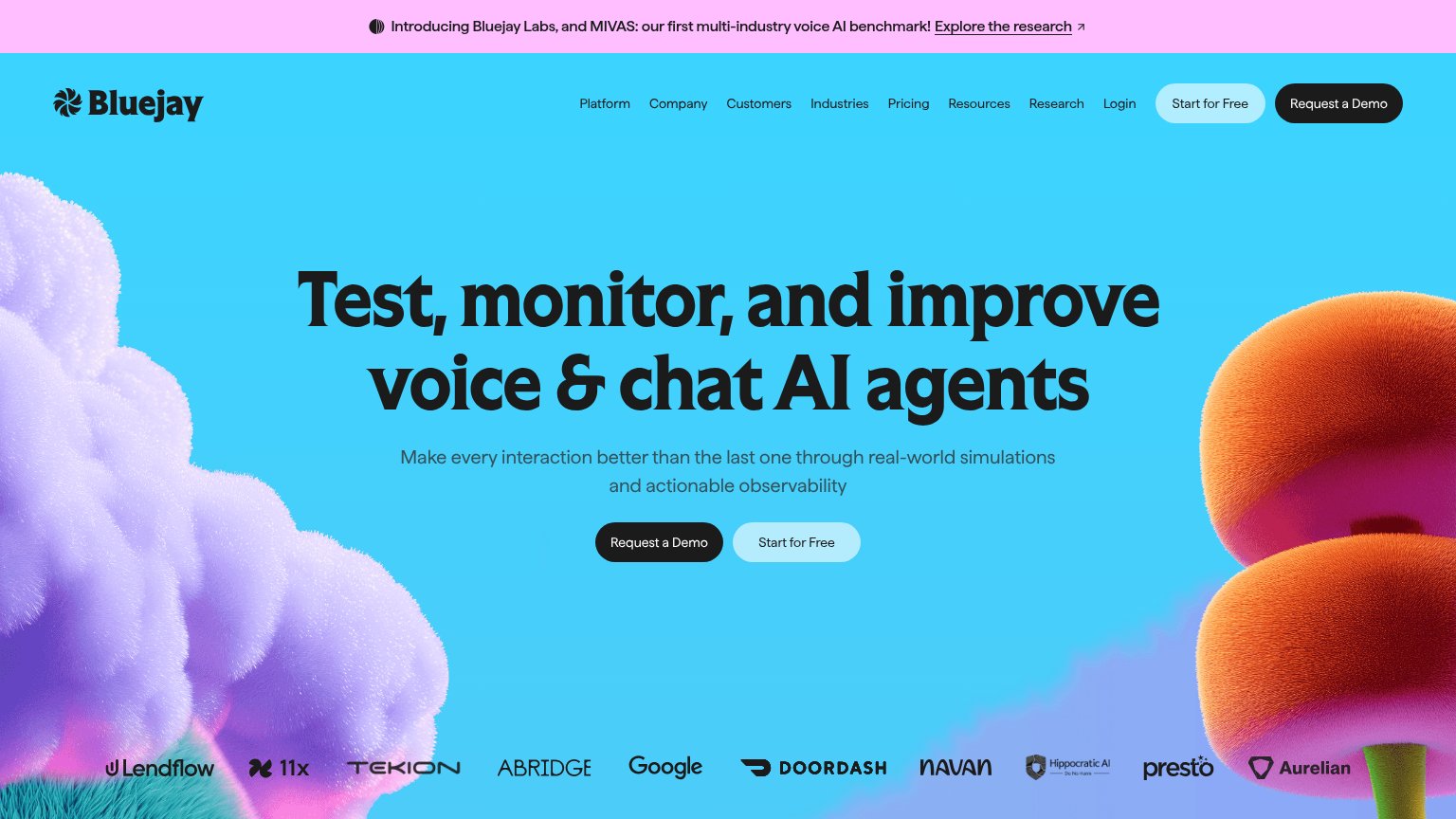
Bluejay’s headline sells
Test, monitor, and improve voice & chat AI agents
Make every interaction better than the last one through real-world simulations and actionable observability
Working
- Names the exact job and audience
- Subhead names the mechanism
- Big-name logos add instant proof
Could improve
- No numbers or concrete outcomes
- Hero art decorates, shows nothing
- No emotional stakes named
Trust
72FairProof that the product is real, competent, and safe to try.
How Bluejay compares
Trust read
Information hierarchy
76FairDoes the design help or inhibit what the page is trying to say?
What works
What to improve
CTA
78FairCopy, size, verb, cost-feel — does the primary CTA earn the click?
How Bluejay compares
Recommended rewrites