
Your landing page’s weakest score is Information hierarchy.
How GelSight ranks
62Growth scoreupdated
category scores
category scoresShowHide
Information hierarchy
52FairDoes the design help or inhibit what the page is trying to say?
 1234
- Steve Mould popup — Covers half the hero with dense text and an outbound Instagram link, burying the value prop.
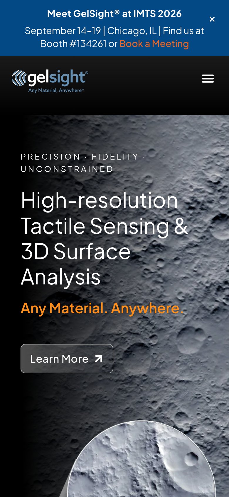
- IMTS banner block — Event banner plus three photo tiles consume the top third and outrank the headline with a competing 'Book a Meeting' exit.
- Learn More button — Primary CTA is clipped by the fold edge and styled as a low-contrast outline, invisible in a one-second scan.
- Popup Instagram link — Raw URL text pulls attention off-site before the visitor ever sees the primary action.
CTA
58FairCopy, size, verb, cost-feel — does the primary CTA earn the click?

Problems
- generic label, no payoff named
- ghost styling, weak visual weight
- clipped below desktop fold
- popup and banner compete for the click
Trust
58FairProof that the product is real, competent, and safe to try.
How GelSight compares
Trust read
Value props
68FairTitle, subtitle, hero — do they sell the product's true value?
GelSight’s headline
High-resolution Tactile Sensing & 3D Surface Analysis
Any Material. Anywhere.
Working
Could improve
Mobile web
72FairThe phone experience as a first-class citizen.
What works
What to improve