
Your landing page’s weakest score is Value props.
How Fuse AI ranks
46Growth scoreupdated
category scores
category scoresShowHide
Value props
28PoorTitle, subtitle, hero — do they sell the product's true value?
Working
- Y Combinator badge lends credibility
- 1,000+ companies claim adds proof
- Claude banner hints at real capability
Could improve
- Hero headline is entirely missing
- No visual shows the product working
- Announce bar carries the whole pitch
Information hierarchy
38PoorDoes the design help or inhibit what the page is trying to say?
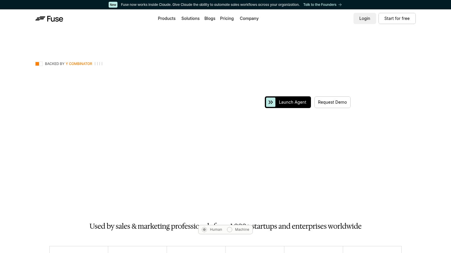 123
- Launch Agent placement — The primary CTA sits right-of-center in dead space, off the natural left-to-right scan path with no copy anchoring it.
- Announcement banner CTA — "Talk to the Founders" is the first clickable element visitors see and pulls attention away before the hero loads.
- Human/Machine toggle — An unlabeled toggle overlaps the social-proof line, garbling "Used by sales & marketing professionals" mid-sentence.
Trust
48PoorProof that the product is real, competent, and safe to try.
How Fuse AI compares
Trust read
Mobile web
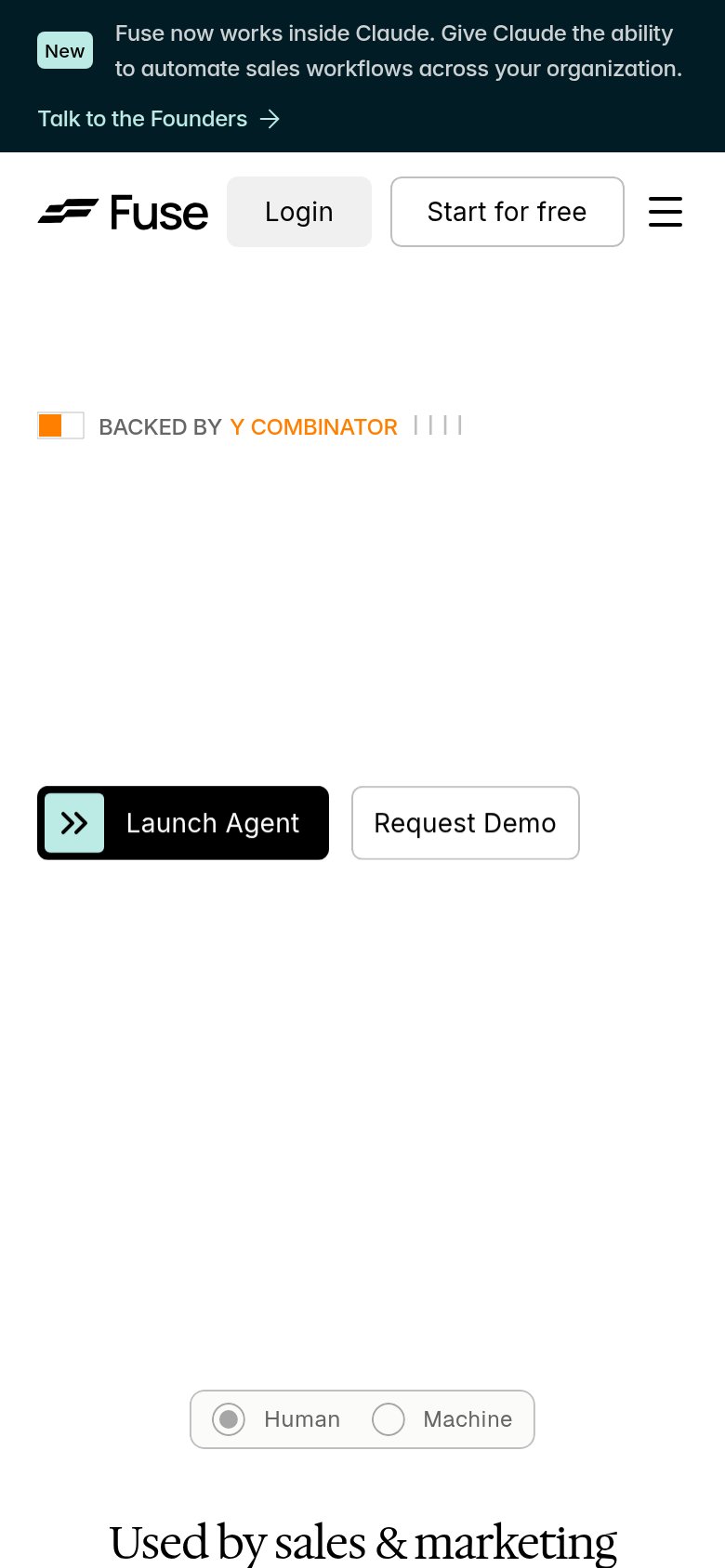
48PoorThe phone experience as a first-class citizen.
What works
What to improve
CTA
68FairCopy, size, verb, cost-feel — does the primary CTA earn the click?
How Fuse AI compares
Recommended rewrites