
Your landing page’s weakest score is Trust.
How Firecrawl ranks
Trust
68FairProof that the product is real, competent, and safe to try.
| Trust read | |
|---|---|
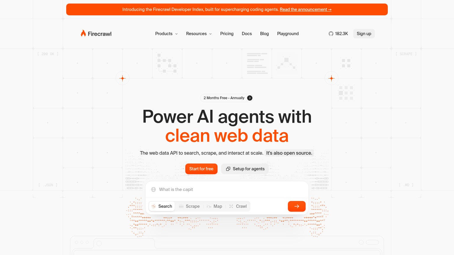
| Firecrawl | GitHub star count "182.3K" in the desktop navigation |
| "3,717 APIs live" counter with a browsable catalog of real endpoints (openrouter.ai, news.ycombinator.com, api.nhtsa.gov | |
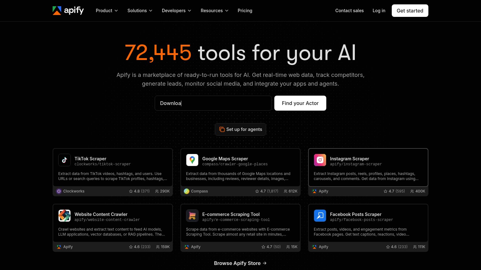
| Tool cards with review scores and usage counts, e.g. Google Maps Scraper "4.7 (1,817)" with 612K users | |
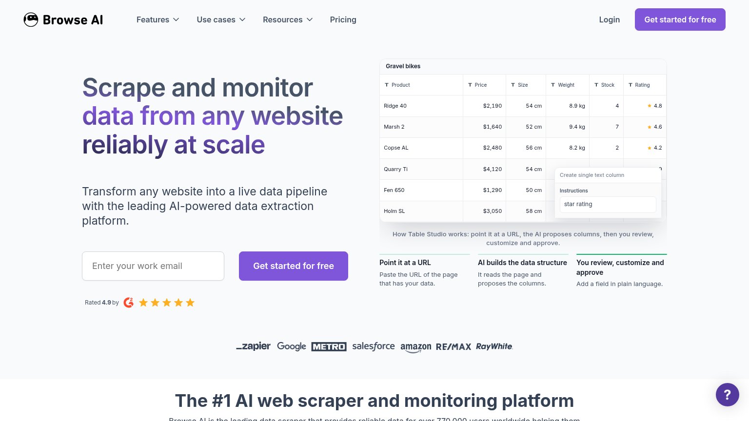
| "Rated 4.9 by" G2 badge with five stars next to the signup CTA | |
| Capterra 4.9 and G2 4.8 rating badges "based on 100+ reviews." under the signup CTAs | |
| Live product demo showing WEB SEARCH, EXTRACT, and KNOWLEDGE GRAPH steps with a real API response from kg.diffbot.com/kg |
Mobile web
76FairThe phone experience as a first-class citizen.
 123
- Announcement banner — Wraps to three lines and consumes ~12% of the fold, pushing the primary CTA to the bottom edge.
- 2 Months Free pill — Second promo message stacked above the headline competes with the main value statement.
- Search widget cut off — The interactive search demo is truncated at the fold, appearing broken rather than inviting.
Information hierarchy
78FairDoes the design help or inhibit what the page is trying to say?
What works
What to improve
Value props
82StrongTitle, subtitle, hero — do they sell the product's true value?
Firecrawl’s headline
Power AI agents with clean web data
The web data API to search, scrape, and interact at scale. It's also open source.
Working
Could improve
CTA
88StrongCopy, size, verb, cost-feel — does the primary CTA earn the click?
How Firecrawl compares
Recommended rewrites