
Your landing page’s weakest score is Mobile web.
How Browse AI ranks
78Growth scoreupdated
category scores
category scoresShowHide
Mobile web
68FairThe phone experience as a first-class citizen.
 12
- G2 rating row — Sits between the headline and the email capture, adding to the stack that displaces the CTA off-screen.
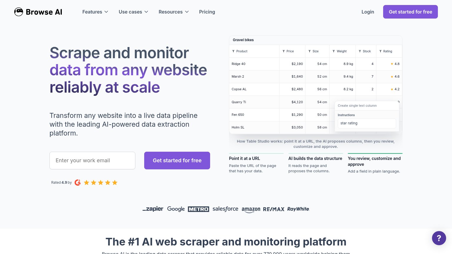
- Help bubble overlap — The floating ? button covers the product table preview's rating column.
Information hierarchy
78FairDoes the design help or inhibit what the page is trying to say?
 123
- Duplicate nav CTA — Same-weight purple "Get started for free" in the nav competes with the hero form's identical button.
- Nav dropdown cluster — Features, Use cases, Resources, Pricing plus Login give five exits before the visitor reaches the email field.
- Column popup overlay — The "Create single text column" popup covers table rows and splits attention within the product demo.
Value props
78FairTitle, subtitle, hero — do they sell the product's true value?
Browse AI’s headline
Scrape and monitor data from any website reliably at scale
Transform any website into a live data pipeline with the leading AI-powered data extraction platform.
Working
Could improve
CTA
84StrongCopy, size, verb, cost-feel — does the primary CTA earn the click?
How Browse AI compares
Recommended rewrites
Trust
84StrongProof that the product is real, competent, and safe to try.
How Browse AI compares
Trust read