
Your landing page’s weakest score is Value props.
How Tock ranks
67Growth scoreupdated
category scores
category scoresShowHide
Value props
58FairTitle, subtitle, hero — do they sell the product's true value?
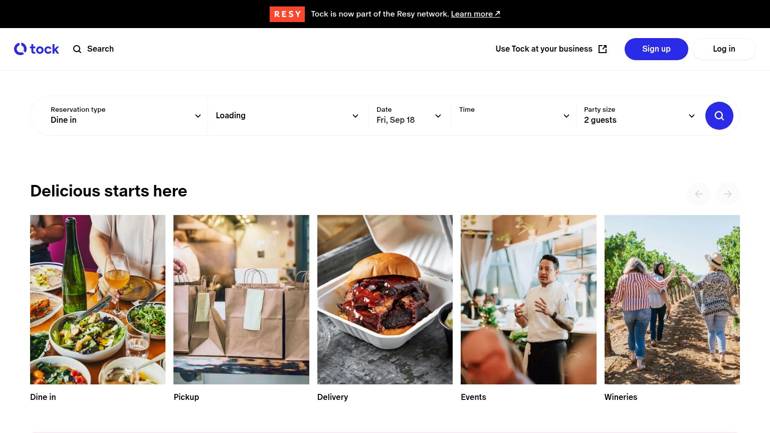
Tock’s headline vague
Delicious starts here
Working
- Warm, appetite-driven tone
- Category cards clarify use cases
- Search bar shows the product in action
Could improve
- Headline never says what Tock is
- No subhead adds specifics
- No numbers or proof points
Trust
58FairProof that the product is real, competent, and safe to try.
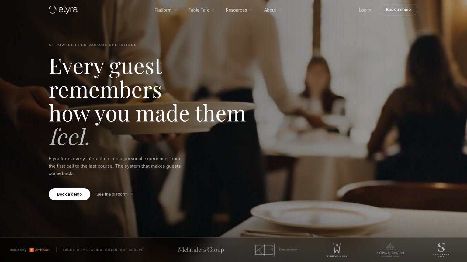

| Trust read | |
|---|---|
| Tock | "Tock is now part of the Resy network." banner at the top of the page |
| "Trusted by leading restaurant groups" logo strip (Melanders Group, Wedholms Fisk, Sjöpaviljongen, Stockholm Fisk) with | |
| implicit context SevenRooms may benefit from pre-existing familiarity among its target audience. | |
| "Trusted by over 70,000 restaurants" usage-count banner | |
| "Tock is now part of the Resy network." announcement bar | |
| Tablet in the desktop hero showing Superb's POS interface in real use |
Information hierarchy
68FairDoes the design help or inhibit what the page is trying to say?
What works
What to improve
CTA
72FairCopy, size, verb, cost-feel — does the primary CTA earn the click?
How Tock compares
Recommended rewrites
Mobile web
78FairThe phone experience as a first-class citizen.
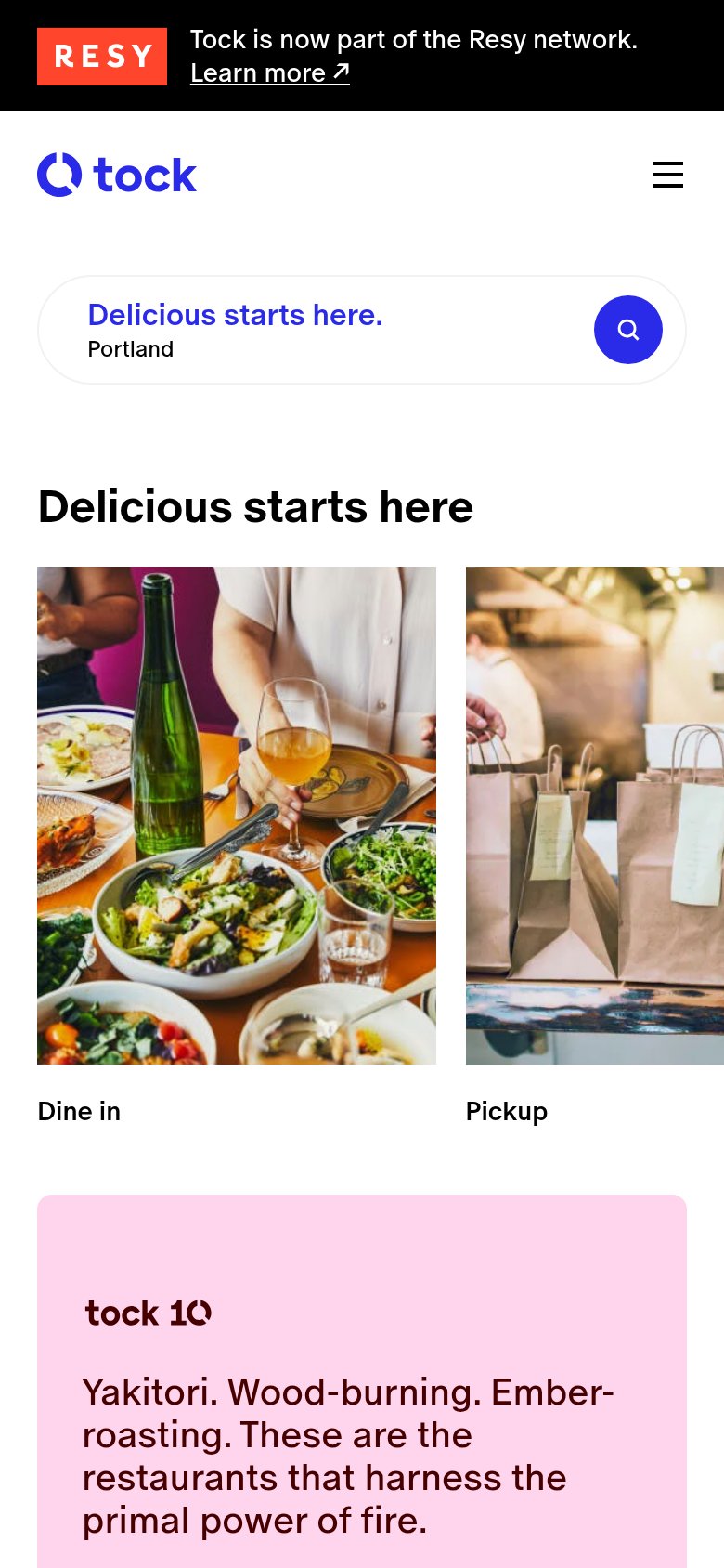
What works
What to improve