
Your landing page’s weakest score is Mobile web.
How End Close ranks
Mobile web
42PoorThe phone experience as a first-class citizen.
 123
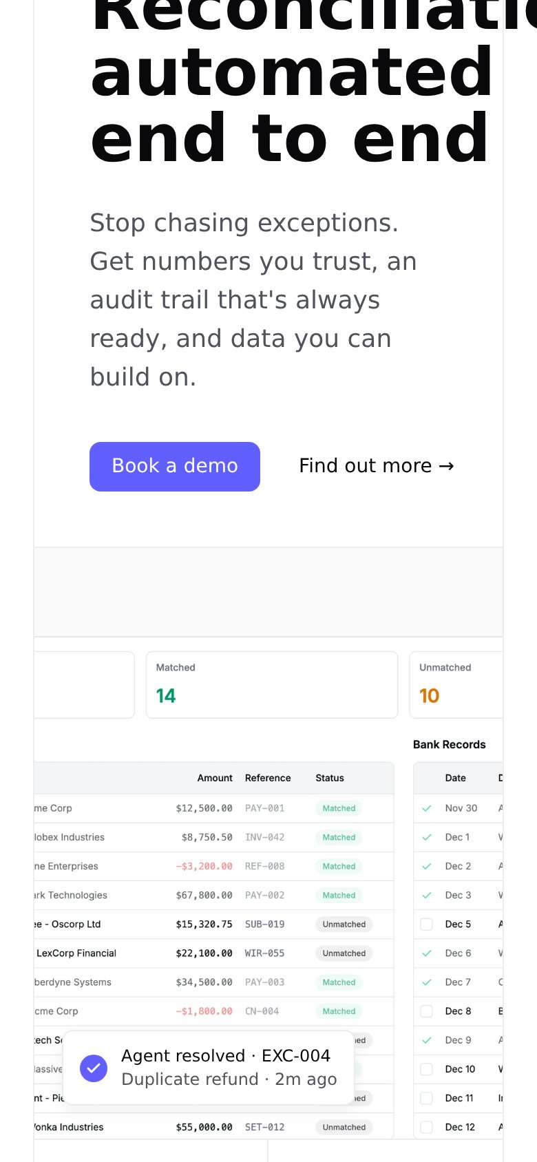
- Clipped hero headline — "Reconciliation" is cut off at the right edge — desktop type never scaled for the phone viewport.
- Overflowing dashboard mockup — The reconciliation table bleeds off both sides; stat cards and columns are truncated and unreadable.
- Small demo button — "Book a demo" keeps desktop proportions instead of a full-width thumb-friendly tap target.
Trust
52FairProof that the product is real, competent, and safe to try.


| Trust read | |
|---|---|
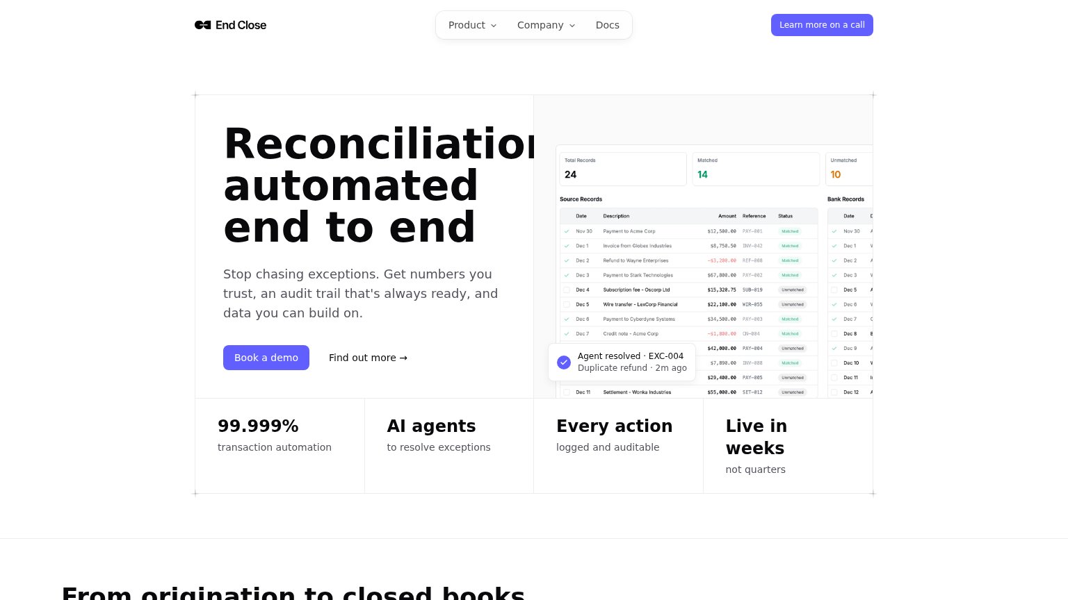
| End Close | Reconciliation product UI with matched/unmatched records and "Agent resolved · EXC-004 / Duplicate refund · 2m ago" toas |
| Product screenshot of the agent generating a "Working Paper Summary: COGS (Cost of Goods Sold) Journal Entry Calculation | |
| "Trusted by 3,500+ global companies" logo bar (lululemon, DoorDash, Shopify, HubSpot, Roblox, Twilio) | |
| "Built with Google AI" disclosure under the AI question bar | |
| "Trusted By 1500+ Finance Teams Of All Sizes" above a logo wall including Adobe, Siemens, Unilever, Nike, Nestlé, Starbu | |
| No visible trust signal identified. |
CTA
64FairCopy, size, verb, cost-feel — does the primary CTA earn the click?
How End Close compares
Recommended rewrites
Information hierarchy
68FairDoes the design help or inhibit what the page is trying to say?
What works
What to improve
Value props
86StrongTitle, subtitle, hero — do they sell the product's true value?
End Close’s headline
Reconciliation automated end to end
Stop chasing exceptions. Get numbers you trust, an audit trail that's always ready, and data you can build on.
Working
Could improve