
Your landing page’s weakest score is Information hierarchy.
How FloQast ranks
70Growth scoreupdated
category scores
category scoresShowHide
Information hierarchy
64FairDoes the design help or inhibit what the page is trying to say?
 1234
- Chat widget panel — Auto-expanded chat with its own 'Schedule a demo' button covers the product visual and competes with the hero CTAs.
- Book/Watch Demo pair — Two identically styled green buttons at equal weight split the primary action; neither reads as THE next step.
- Nav Get a Demo — A third same-green demo button in the header duplicates the hero CTAs, tripling the demo path styling.
- Utility nav links — EARN CPE / SUPPORT / LOGIN plus six nav items add exit paths before the value prop registers.
CTA
64FairCopy, size, verb, cost-feel — does the primary CTA earn the click?
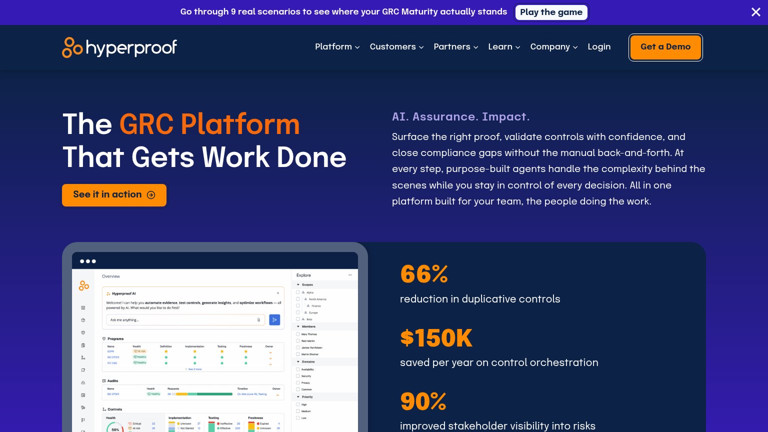
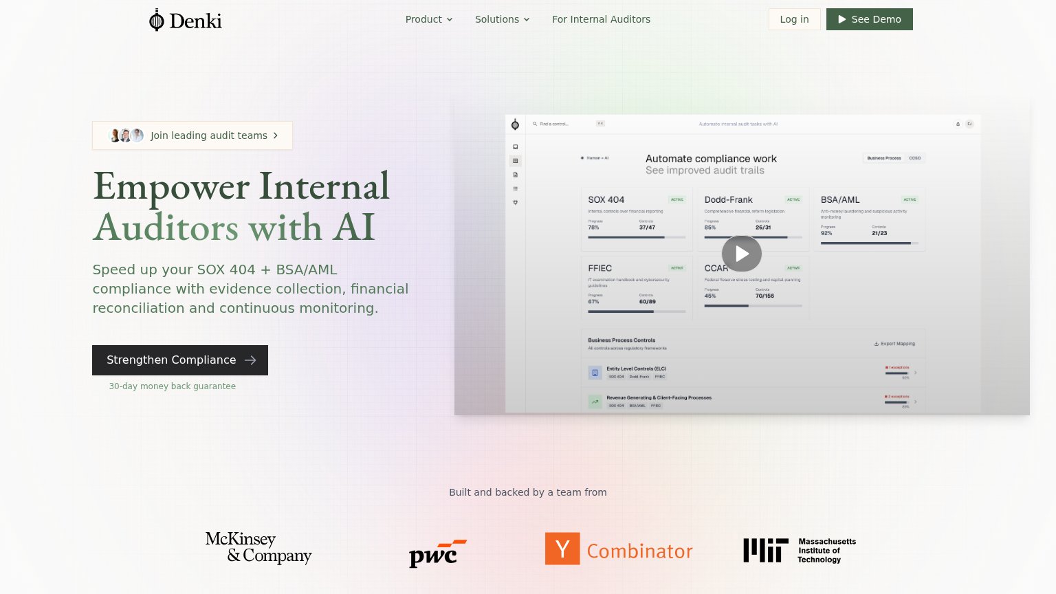
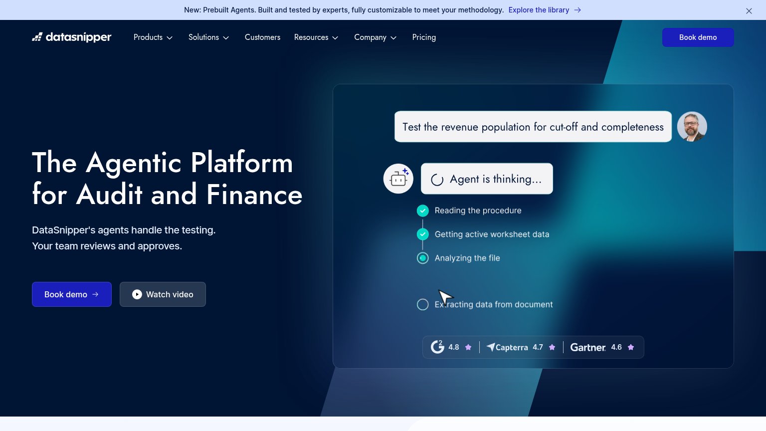
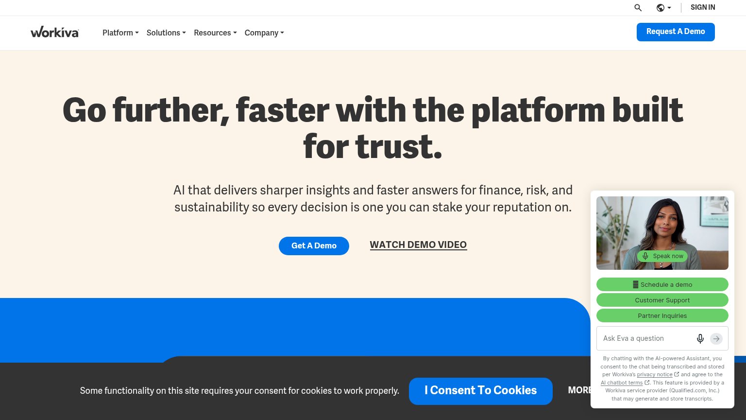
Problems
- booking a demo feels costly
- three demo labels on one fold
- twin CTAs share size and color
- nav says 'Get a Demo' instead
Value props
72FairTitle, subtitle, hero — do they sell the product's true value?
FloQast’s headline
Accounting Workflow Automation
Less manual work. More control. AI built by accountants for accountants.
Working
Could improve
Mobile web
72FairThe phone experience as a first-class citizen.

What works
What to improve
Trust
78FairProof that the product is real, competent, and safe to try.
How FloQast compares
Trust read