
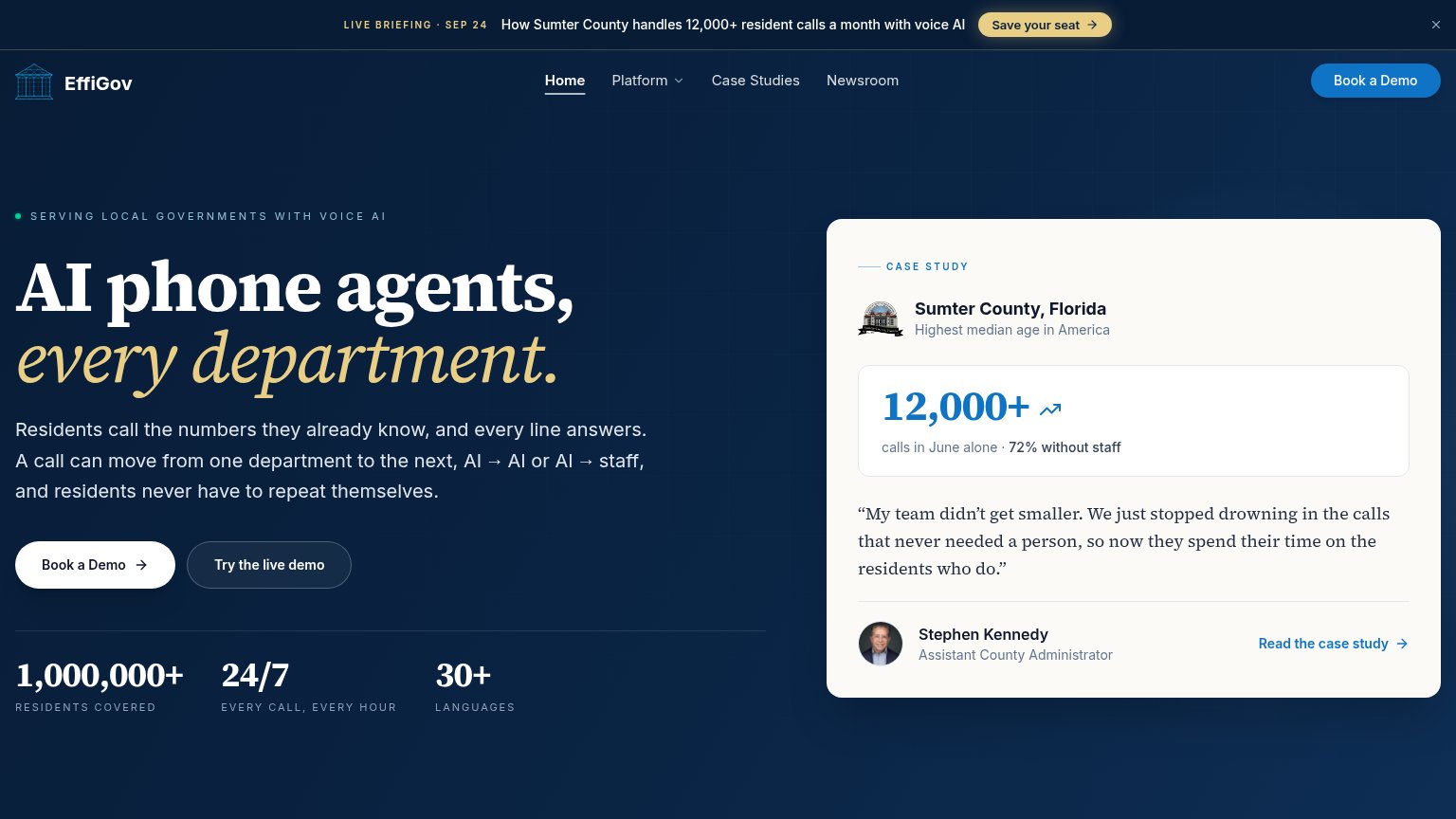
Your landing page’s weakest score is CTA.
How EffiGov ranks
CTA
72FairCopy, size, verb, cost-feel — does the primary CTA earn the click?
Problems
- 'Book' feels committal, sales-gated
- cheaper 'Try the live demo' demoted
- no header language echo
Mobile web
72FairThe phone experience as a first-class citizen.
 1234
- Hero headline block — Scales down too little — four tall lines push the primary CTA below the first viewport.
- Live briefing promo bar — Sticky promo deck stacks on top of the nav, spending header height on a secondary offer.
- Six-line body paragraph — Desktop-length copy wraps into six lines, further delaying the tap target.
- Wrapped eyebrow text — Letter-spaced label breaks onto two lines and adds vertical bloat above the headline.
Information hierarchy
76FairDoes the design help or inhibit what the page is trying to say?
What works
What to improve
Trust
78FairProof that the product is real, competent, and safe to try.
How EffiGov compares
Trust read
Value props
86StrongTitle, subtitle, hero — do they sell the product's true value?
EffiGov’s headline
AI phone agents, every department.
Residents call the numbers they already know, and every line answers. A call can move from one department to the next, AI → AI or AI → staff, and residents never have to repeat themselves.
Working
Could improve