
Your landing page’s weakest score is Mobile web.
How D-Orbit ranks
43Growth scoreupdated
category scores
category scoresShowHide
Mobile web
32PoorThe phone experience as a first-class citizen.
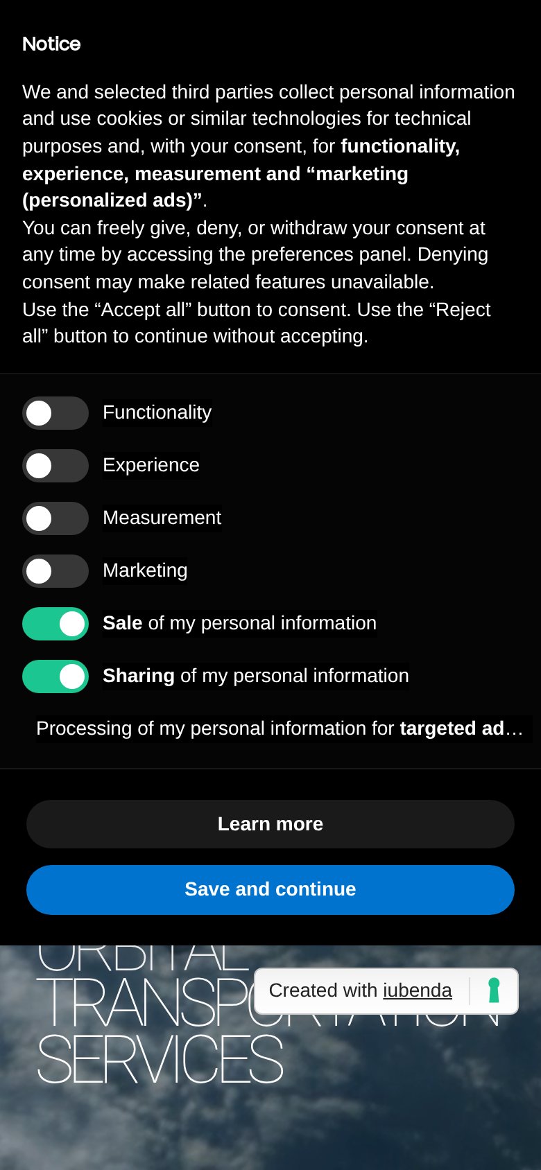 123
- Truncated toggle label — "Processing… for targeted ad…" cuts off mid-sentence and has no visible toggle control.
- Dense consent copy block — Six lines of legal prose plus seven toggle rows is desktop-density content crammed into a phone column.
- iubenda badge overlap — "Created with iubenda" badge sits directly on top of the wrapped hero headline text.
Information hierarchy
42PoorDoes the design help or inhibit what the page is trying to say?
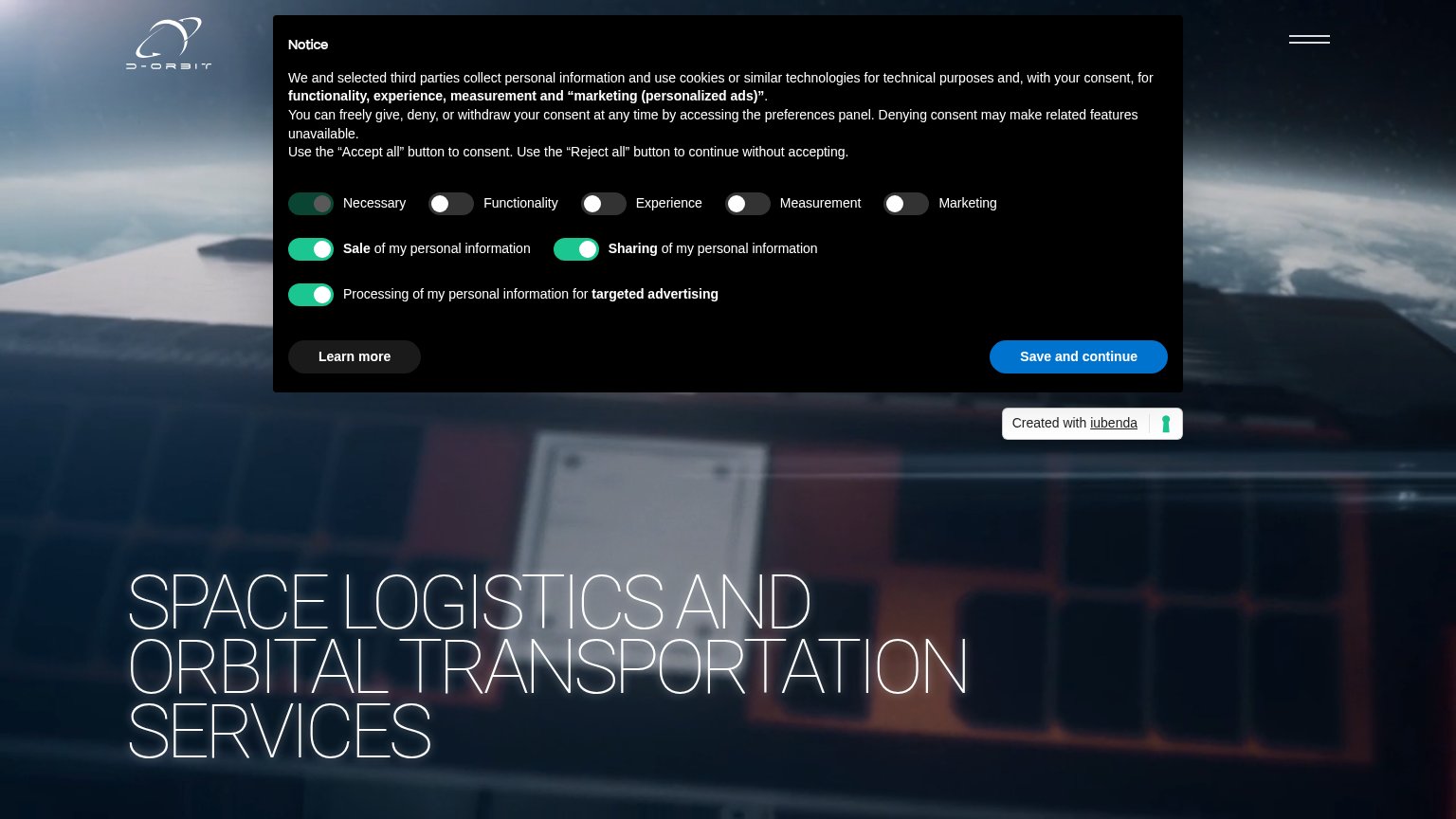 1234
- Cookie consent panel — Seven-toggle modal dominates the fold and outranks the headline and any conversion path.
- Hero headline text — Thin-stroke, low-contrast type nearly disappears into the bright satellite imagery behind it.
- Save and continue button — The only high-contrast button in the fold belongs to the consent flow, not the product.
- Hamburger menu icon — Navigation is hidden behind a burger with no visible CTA to replace it in the header.
CTA
42PoorCopy, size, verb, cost-feel — does the primary CTA earn the click?
How D-Orbit compares
Recommended rewrites
Trust
42PoorProof that the product is real, competent, and safe to try.
How D-Orbit compares
Trust read
Value props
58FairTitle, subtitle, hero — do they sell the product's true value?
D-Orbit’s headline
SPACE LOGISTICS AND ORBITAL TRANSPORTATION SERVICES
Working
Could improve