
Your landing page’s weakest score is Value props.
How Diligent ranks
69Growth scoreupdated
category scores
category scoresShowHide
Value props
62FairTitle, subtitle, hero — do they sell the product's true value?
Diligent’s headline vague
See clearly. Protect confidently. Act boldly.
GRC expertise + AI that knows what matters, sharpens every judgement, and translates strategy into forward momentum.
Working
- Hero shows real product UI in action
- Strong enterprise logo wall for trust
- Mobile fold names GRC + Gartner Leader
Could improve
- Desktop headline fits any brand
- No numbers or concrete outcomes
- Gartner proof missing from desktop fold
Information hierarchy
64FairDoes the design help or inhibit what the page is trying to say?
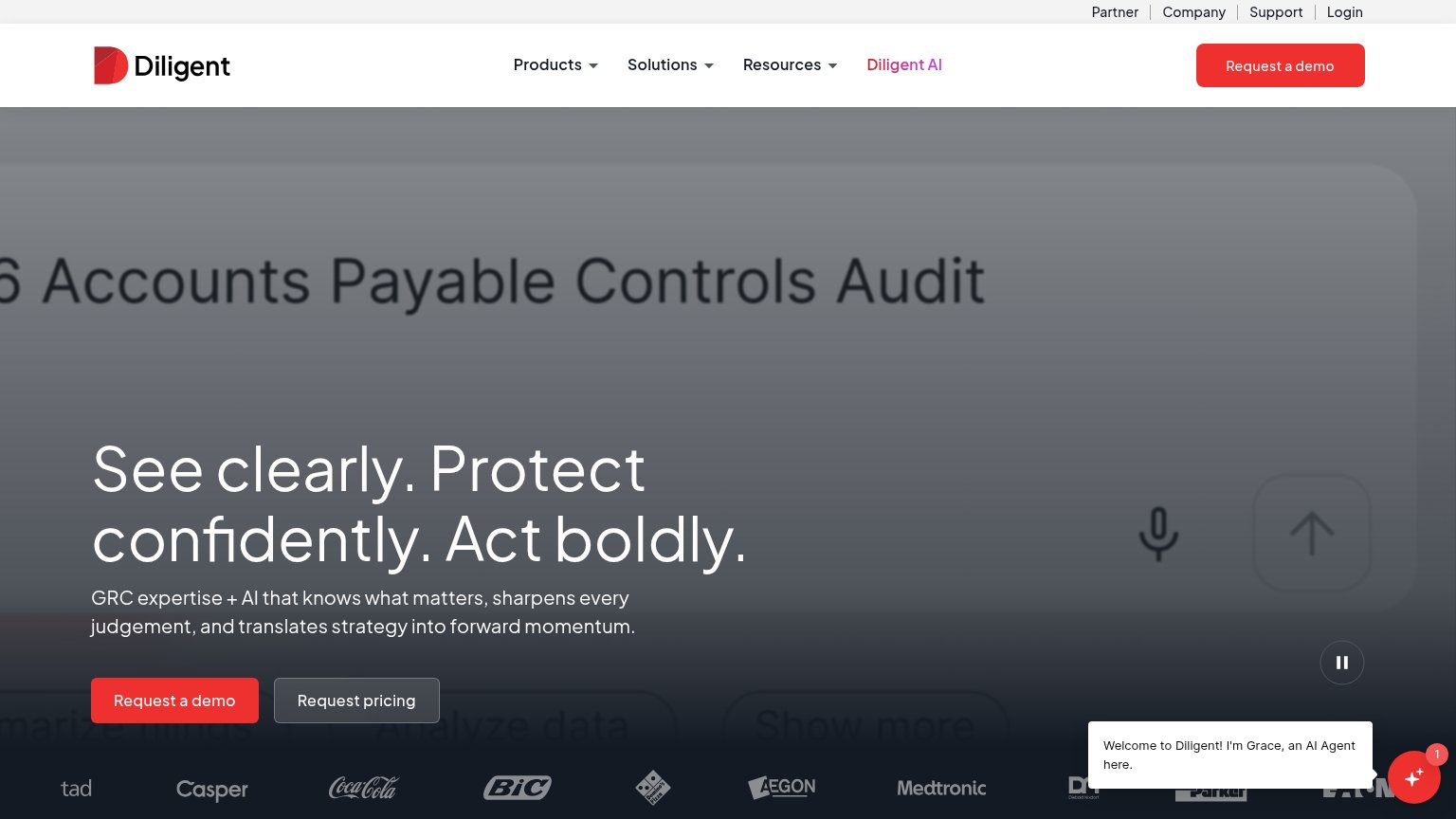 1234
- Headline over video text — White headline sits atop the video's own large 'Accounts Payable Controls Audit' text, forcing two same-scale text layers to compete.
- Duplicate demo CTAs — 'Request a demo' appears in both the nav and the hero at equal weight, splitting the primary action across two red buttons.
- AI agent chat widget — 'Grace' chat bubble with a notification badge pops into the fold and pulls attention away from the hero CTA pair.
- Utility nav row — Partner, Company, Support, Login plus three dropdown menus stack seven exit paths above the CTA.
CTA
68FairCopy, size, verb, cost-feel — does the primary CTA earn the click?
How Diligent compares
Recommended rewrites
Mobile web
72FairThe phone experience as a first-class citizen.

What works
What to improve
Trust
78FairProof that the product is real, competent, and safe to try.
How Diligent compares
Trust read