
Your landing page’s weakest score is Information hierarchy.
How DEV Community (dev.to) ranks
- 1.
daily.dev73
- 2.
Hashnode72
- 3.
DEV Community (dev.to)64
- 4.
Hacker News54
- 5.
Lobsters52
- 6.
args36
64Growth scoreupdated
category scores
category scoresShowHide
Information hierarchy
54FairDoes the design help or inhibit what the page is trying to say?
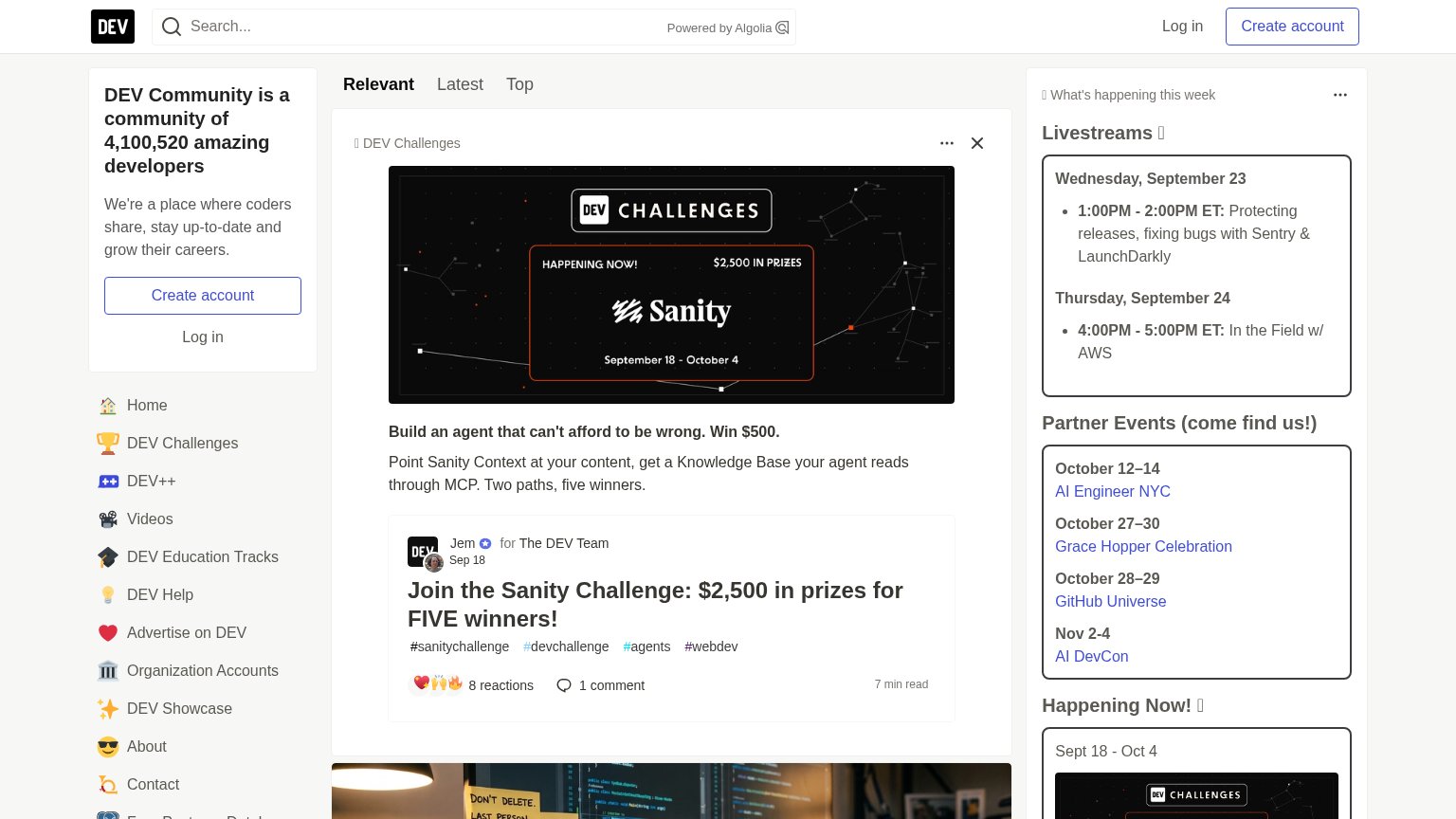 1234
- Left sidebar nav stack — Twelve+ equal-weight links (Home, Videos, About, Contact…) leak attention before any content is read.
- Right sidebar event panels — Livestreams and Partner Events panels add a third competing column with five more outbound links.
- Sidebar Create account button — Primary CTA is a small outlined button that duplicates the header CTA and blends into the sidebar.
- Sanity Challenge billboard — A promotional partner banner is the largest fold element, outranking DEV's own value proposition.
Value props
62FairTitle, subtitle, hero — do they sell the product's true value?
DEV Community (dev.to)’s headline undersells
DEV Community is a community of 4,100,520 amazing developers
We're a place where coders share, stay up-to-date and grow their careers.
Working
- 4,100,520 members is specific proof
- Names the true product: a community
- Audience (coders) is instantly clear
Could improve
- Subhead is generic, no concrete outcome
- No emotional hook for joining
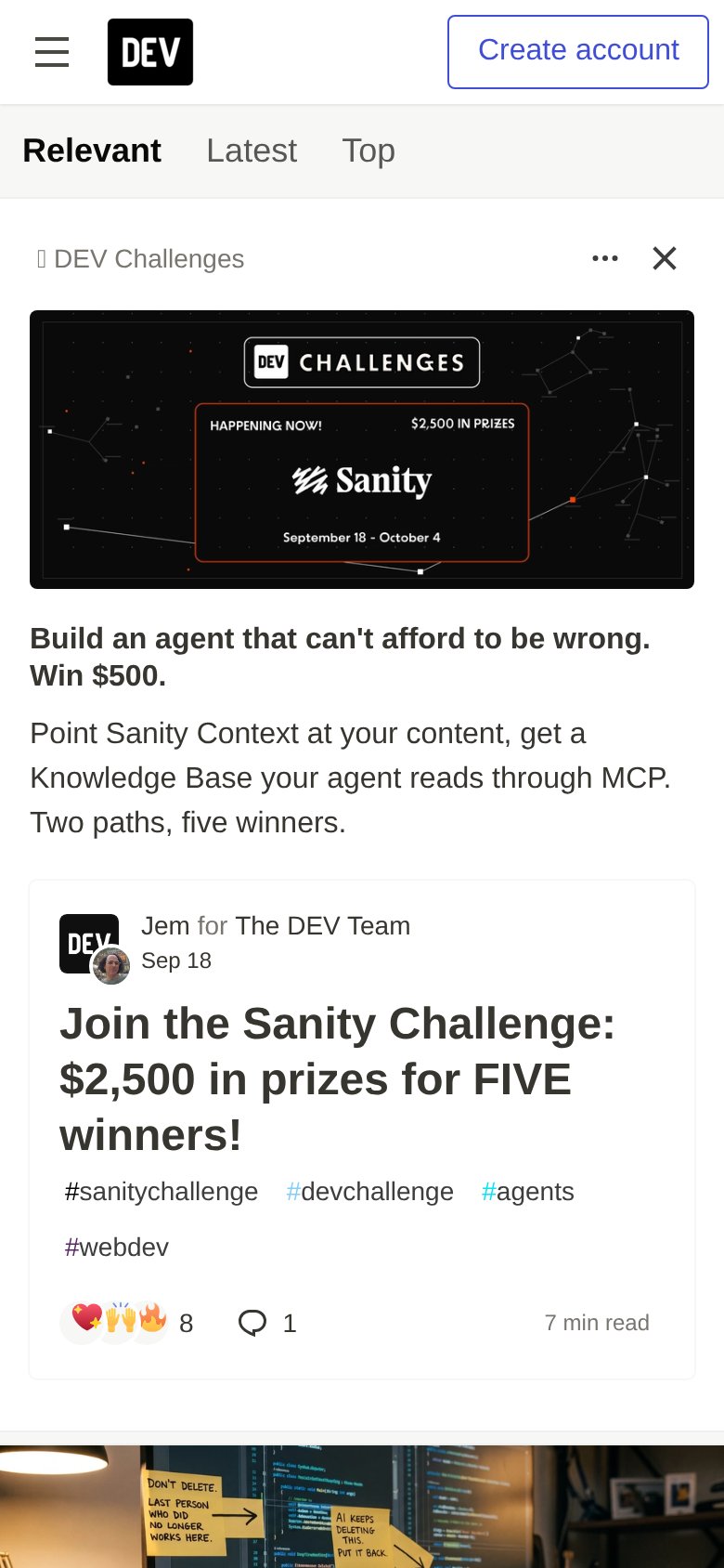
- Mobile fold hides the value prop entirely
Mobile web
62FairThe phone experience as a first-class citizen.
What works
What to improve
CTA
63FairCopy, size, verb, cost-feel — does the primary CTA earn the click?
How DEV Community (dev.to) compares
Recommended rewrites
Trust
78FairProof that the product is real, competent, and safe to try.
How DEV Community (dev.to) compares
Trust read