
Your landing page’s weakest score is Information hierarchy.
How Dealpath ranks
73Growth scoreupdated
category scores
category scoresShowHide
Information hierarchy
72FairDoes the design help or inhibit what the page is trying to say?
 123
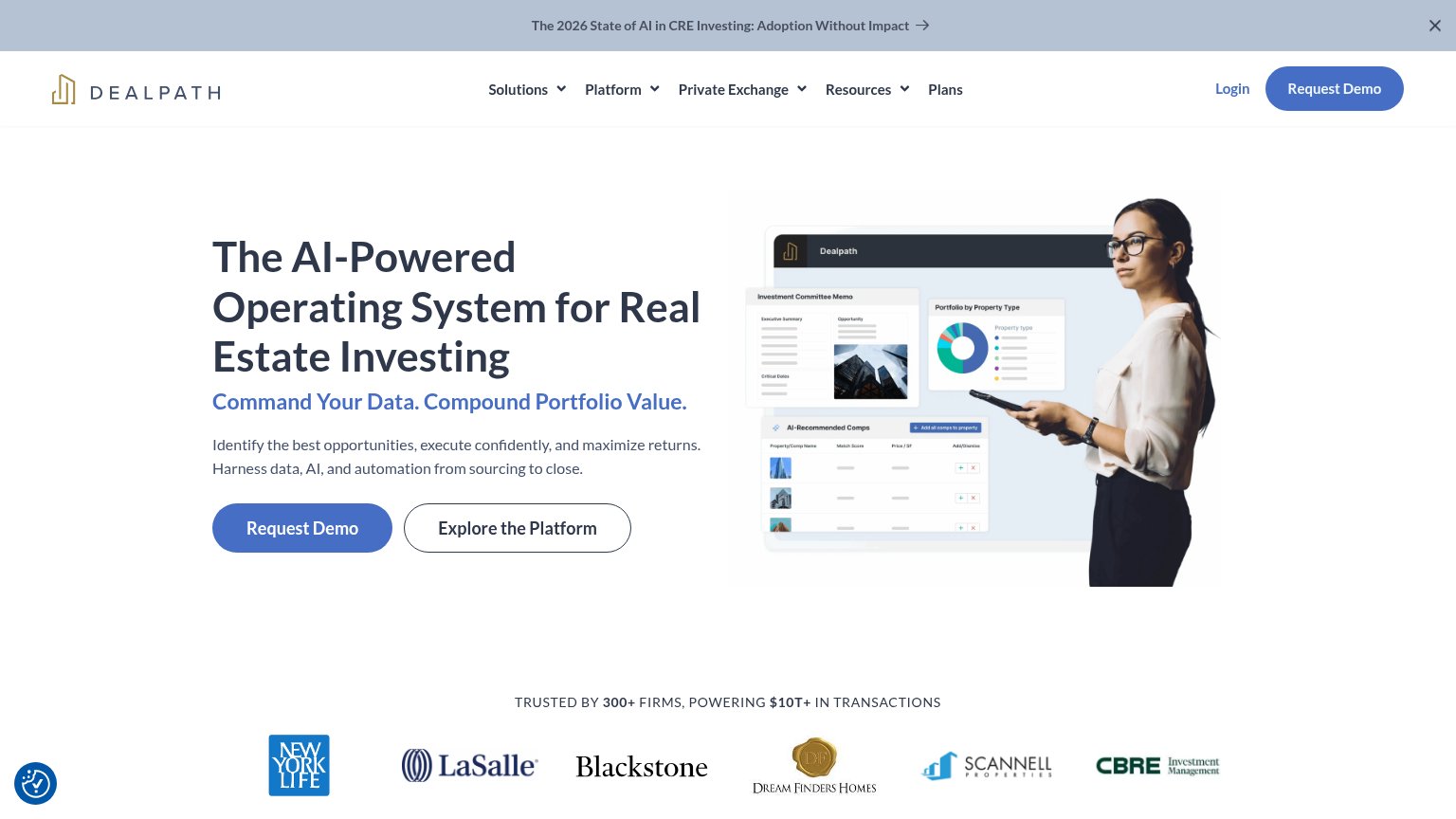
- Announcement banner — The '2026 State of AI' banner is the first element in the scan path and pulls attention to a content exit before the headline.
- Explore the Platform button — Outlined secondary CTA sits at nearly the same size and position as 'Request Demo', splitting the click decision.
- Nav dropdown row — Five nav items, four with dropdowns, plus Login create multiple exit paths competing with the demo CTA.
CTA
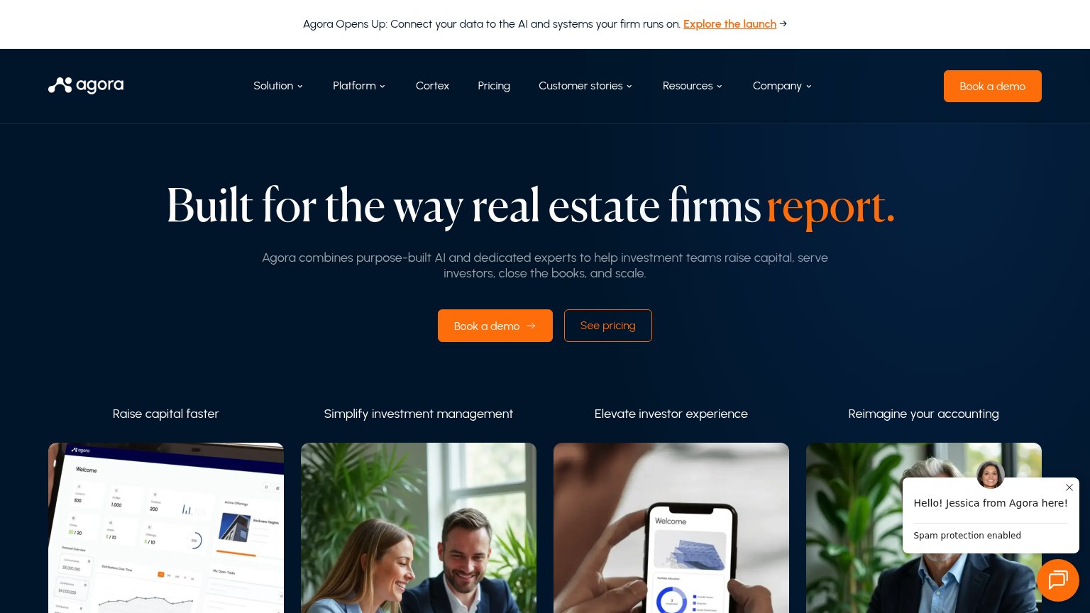
72FairCopy, size, verb, cost-feel — does the primary CTA earn the click?
Problems
- 'Request' feels costly, sales-gated
- no echo of headline promise
- no low-friction product entry
Value props
72FairTitle, subtitle, hero — do they sell the product's true value?
Dealpath’s headline
The AI-Powered Operating System for Real Estate Investing
Command Your Data. Compound Portfolio Value.
Working
Could improve
Mobile web
72FairThe phone experience as a first-class citizen.
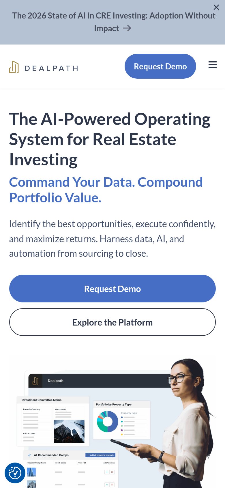
What works
What to improve
Trust
78FairProof that the product is real, competent, and safe to try.
How Dealpath compares
Trust read