
Your landing page’s weakest score is Mobile web.
How Darktrace ranks
50Growth scoreupdated
category scores
category scoresShowHide
Mobile web
36PoorThe phone experience as a first-class citizen.
 1234
- Cookie consent banner — Dead blocker covers the bottom half of the fold and buries the register CTA, with 'Accept All Cookies' styled as the biggest button on the page.
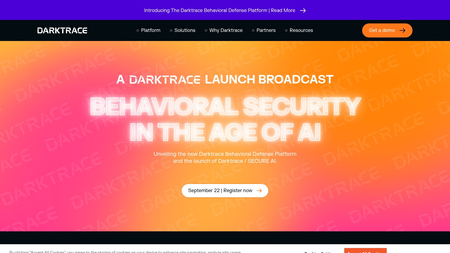
- Neon headline block — 'BEHAVIORAL SECURITY IN THE AGE OF AI' wraps into four oversized lines that consume most of the viewport and push the CTA off-screen.
- Truncated subhead text — 'and the launch of Darktrace / SECURE AI' is clipped mid-line behind the cookie banner, reading as broken.
- Eyebrow headline stack — 'A DARKTRACE LAUNCH BROADCAST' wraps into four lines of mixed sizes, doubling the headline stack before the value statement even starts.
Value props
42PoorTitle, subtitle, hero — do they sell the product's true value?
Darktrace’s headline vague
BEHAVIORAL SECURITY IN THE AGE OF AI
Unveiling the new Darktrace Behavioral Defense Platform and the launch of Darktrace / SECURE AI.
Working
- Concrete date CTA: September 22 | Register now
- Names the new platform and SECURE AI
- Bold, high-energy launch framing
Could improve
- No outcome or benefit stated anywhere
- Event promo replaces product value prop
- "Age of AI" phrasing fits any vendor
Trust
42PoorProof that the product is real, competent, and safe to try.
How Darktrace compares
Trust read
Information hierarchy
64FairDoes the design help or inhibit what the page is trying to say?
What works
What to improve
CTA
68FairCopy, size, verb, cost-feel — does the primary CTA earn the click?
How Darktrace compares
Recommended rewrites