
Your landing page’s weakest score is CTA.
How Abnormal AI ranks
CTA
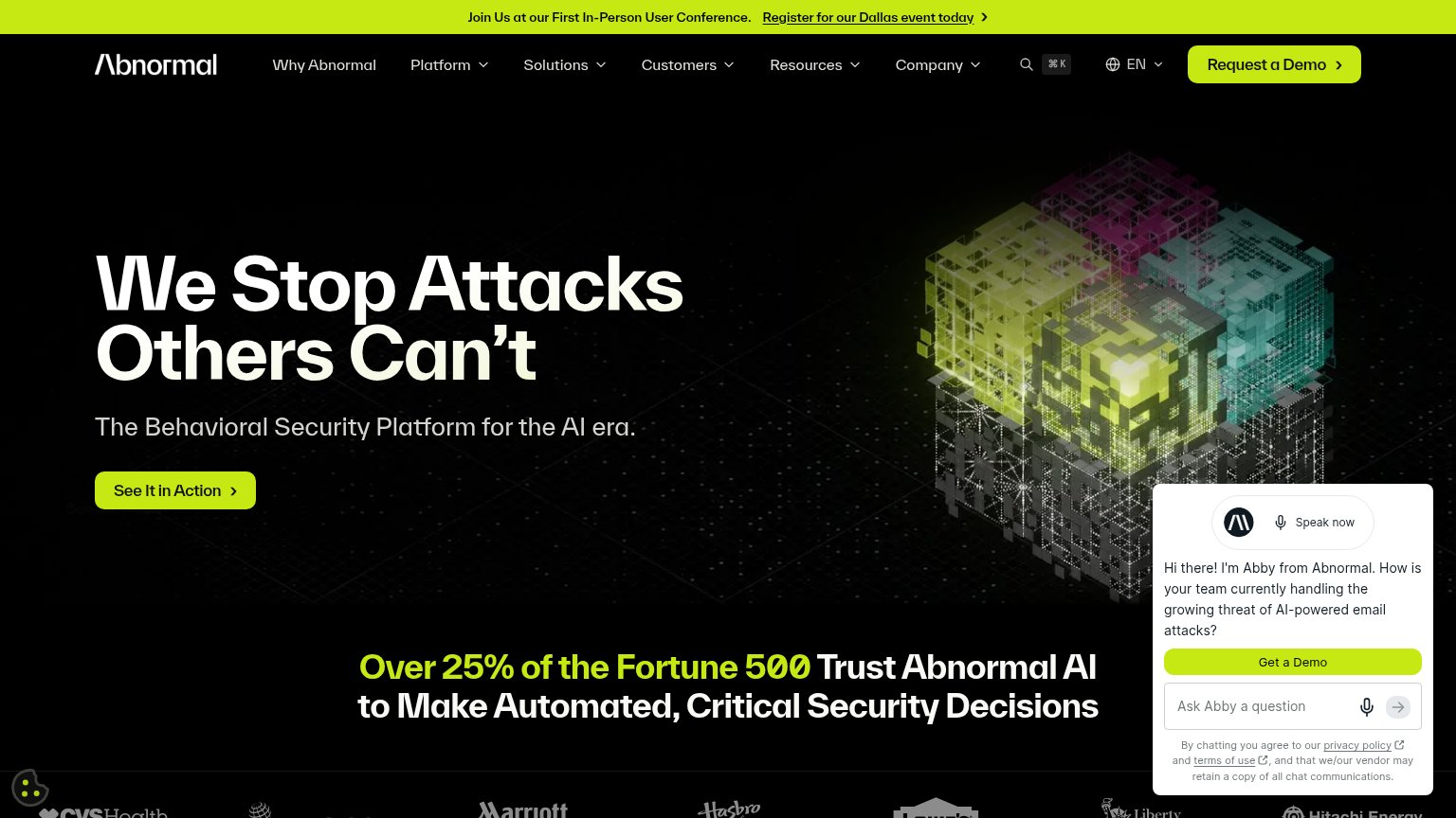
68FairCopy, size, verb, cost-feel — does the primary CTA earn the click?
Problems
- passive verb 'See', not 'Get'/'Start'
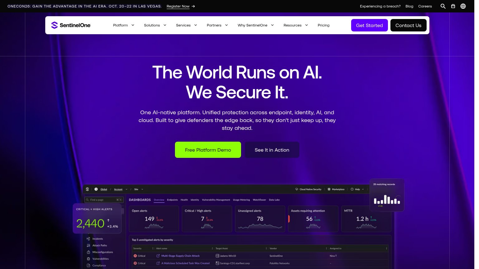
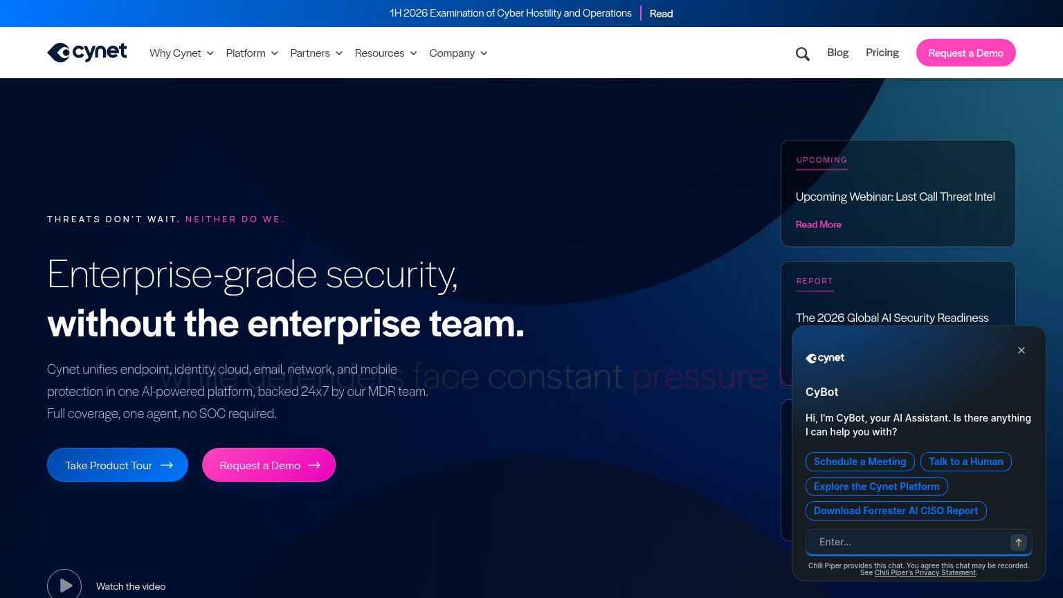
- three demo labels compete on one fold
- 4 words, over the 3-word ideal
- ambiguous: video, tour, or sales call?
Mobile web
72FairThe phone experience as a first-class citizen.
 123
- Abby chat overlay — Chat message intrudes into the first viewport, crowding the fold and adding a tap blocker between the visitor and the page.
- Truncated banner link — "Register for our Dallas event" runs off the right edge of the viewport, signaling the promo bar was not rebuilt for mobile widths.
- See It in Action button — Primary CTA keeps desktop proportions at roughly half the column width instead of a thumb-friendly near-full-bleed button.
Information hierarchy
76FairDoes the design help or inhibit what the page is trying to say?
What works
What to improve
Trust
76FairProof that the product is real, competent, and safe to try.
How Abnormal AI compares
Trust read
Value props
78FairTitle, subtitle, hero — do they sell the product's true value?
Abnormal AI’s headline
We Stop Attacks Others Can't
The Behavioral Security Platform for the AI era.
Working
Could improve