
Your landing page’s weakest score is Value props.
How CrowdStrike ranks
56Growth scoreupdated
category scores
category scoresShowHide
Value props
42PoorTitle, subtitle, hero — do they sell the product's true value?
CrowdStrike’s headline vague
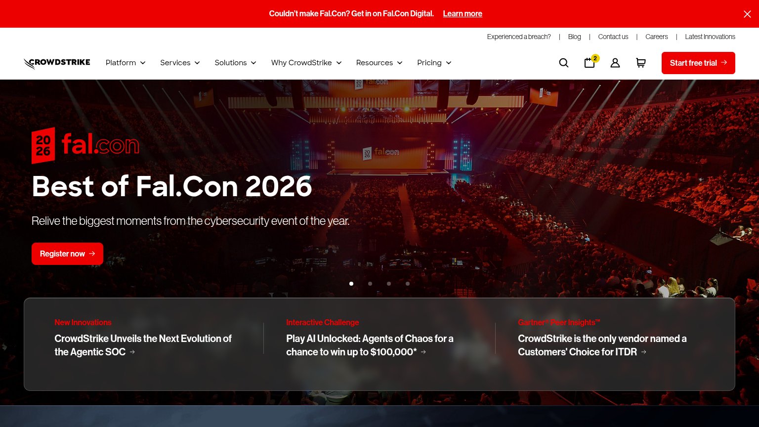
Best of Fal.Con 2026
Relive the biggest moments from the cybersecurity event of the year.
Working
- Clear CTA: "Register now"
- Proof point: Gartner Peer Insights card
- Brand energy from event imagery
Could improve
- Hero sells an event, not the product
- No breach-stopping outcome named
- Zero numbers or specifics in the fold
Information hierarchy
58FairDoes the design help or inhibit what the page is trying to say?
 1234
- Register now button — Same red weight as the header's Start free trial, splitting the fold between event registration and product trial.
- Three-card news ticker — Three equal-weight linked headlines add a third competing message layer inside the first viewport.
- Fal.Con Digital banner — Top-of-page red bar with its own Learn more link siphons the first glance before the value prop.
- Utility link row — Five exit links (Blog, Careers, Contact us, etc.) sit above the nav, inflating leak paths before any message lands.
Trust
58FairProof that the product is real, competent, and safe to try.
How CrowdStrike compares
Trust read
Mobile web
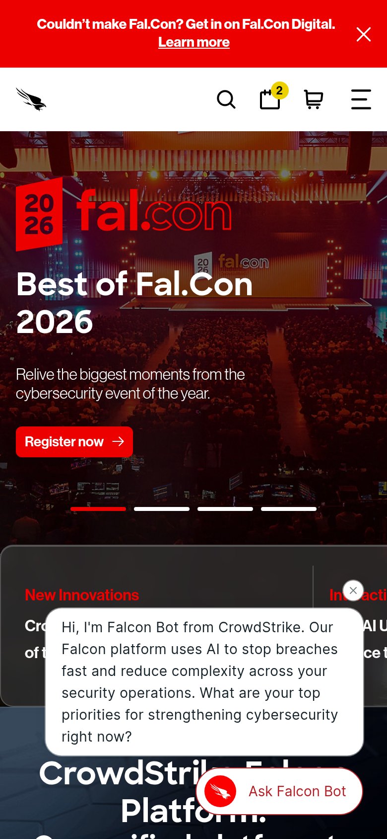
58FairThe phone experience as a first-class citizen.
What works
What to improve
CTA
66FairCopy, size, verb, cost-feel — does the primary CTA earn the click?
How CrowdStrike compares
Recommended rewrites