
Your landing page’s weakest score is Information hierarchy.
How Convex ranks
76Growth scoreupdated
category scores
category scoresShowHide
Information hierarchy
72FairDoes the design help or inhibit what the page is trying to say?
 1234
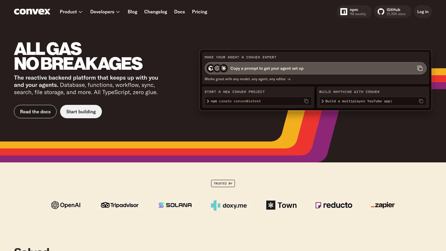
- Dual equal-weight CTAs — "Read the docs" and "Start building" share identical size and prominence, so neither reads as the primary action.
- Agent prompt panel — Three stacked copy-actions rival the hero CTAs in size and contrast, splitting the fold into five competing actions.
- npm and GitHub badges — Two outbound social-proof chips sit at top-right in the natural scan path, leaking clicks off-site before the CTA is seen.
- Six-link nav row — Product, Developers, Blog, Changelog, Docs, and Pricing all carry equal weight, adding exit paths above the conversion.
CTA
76FairCopy, size, verb, cost-feel — does the primary CTA earn the click?
Problems
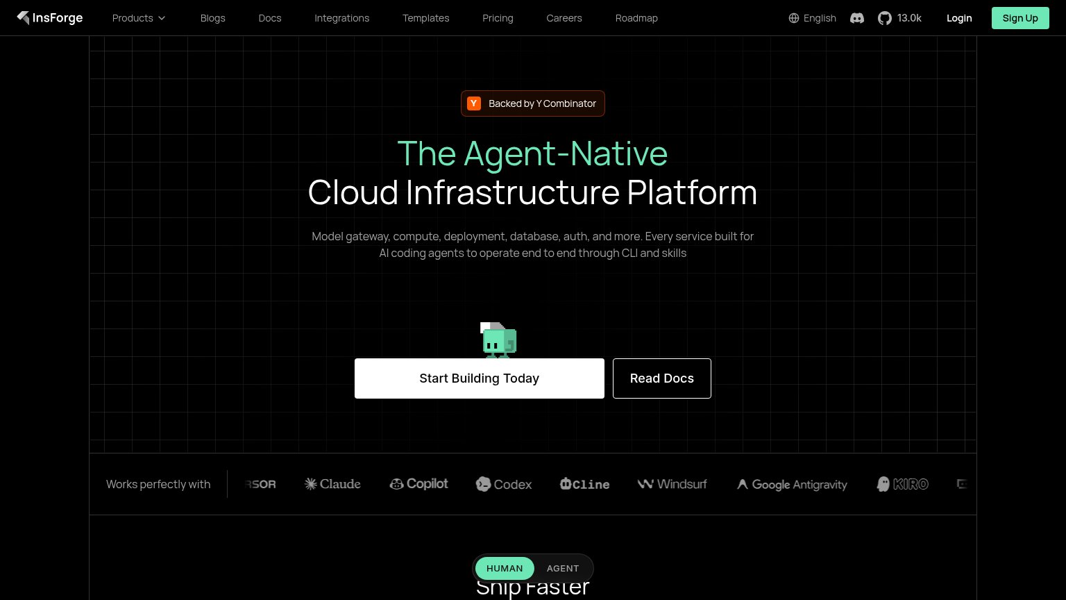
- desktop hero splits focus 2 buttons
- prompt boxes copy, don't run
- no payoff hint beyond 'building'
- equal visual weight with secondary
Mobile web
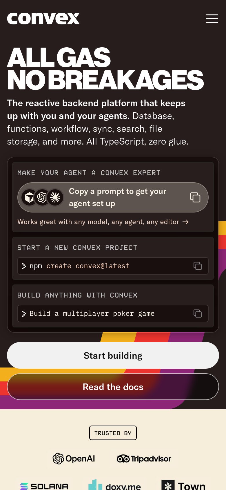
76FairThe phone experience as a first-class citizen.
What works
What to improve
Value props
78FairTitle, subtitle, hero — do they sell the product's true value?
Convex’s headline
ALL GAS NO BREAKAGES
The reactive backend platform that keeps up with you and your agents. Database, functions, workflow, sync, search, file storage, and more. All TypeScript, zero glue.
Working
Could improve
Trust
78FairProof that the product is real, competent, and safe to try.
How Convex compares
Trust read