
Your landing page’s weakest score is Mobile web.
How Appwrite ranks
Mobile web
62FairThe phone experience as a first-class citizen.
 1234
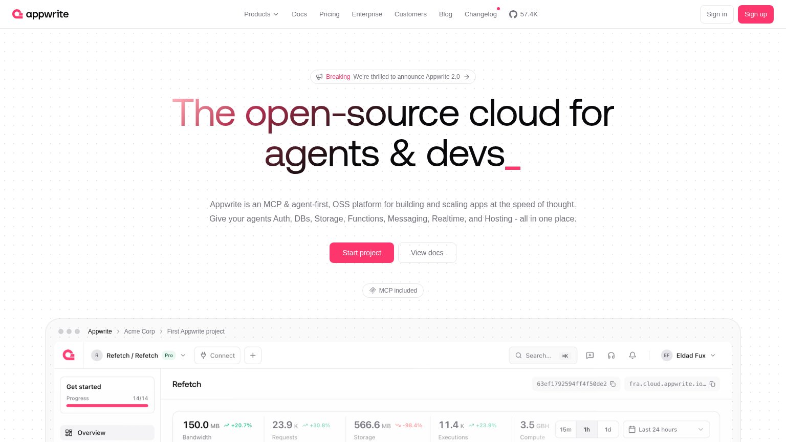
- Primary CTA below fold — "Start project" sits at ~1000px, pushed down by the long two-paragraph subhead so it is not visible on first paint.
- Four-line subheadline paragraph — Seven-item feature list wraps into six dense lines of body copy, burying the value statement and displacing the CTA.
- Half-width CTA pair — "Start project" and "View docs" share one row at desktop proportions instead of a full-bleed stacked primary button.
- Illegible dashboard screenshot — The desktop console screenshot is shrunk to phone width, rendering all its labels and charts unreadable.
Trust
68FairProof that the product is real, competent, and safe to try.
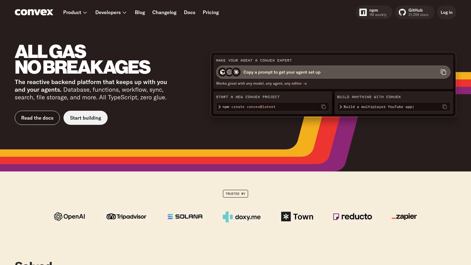
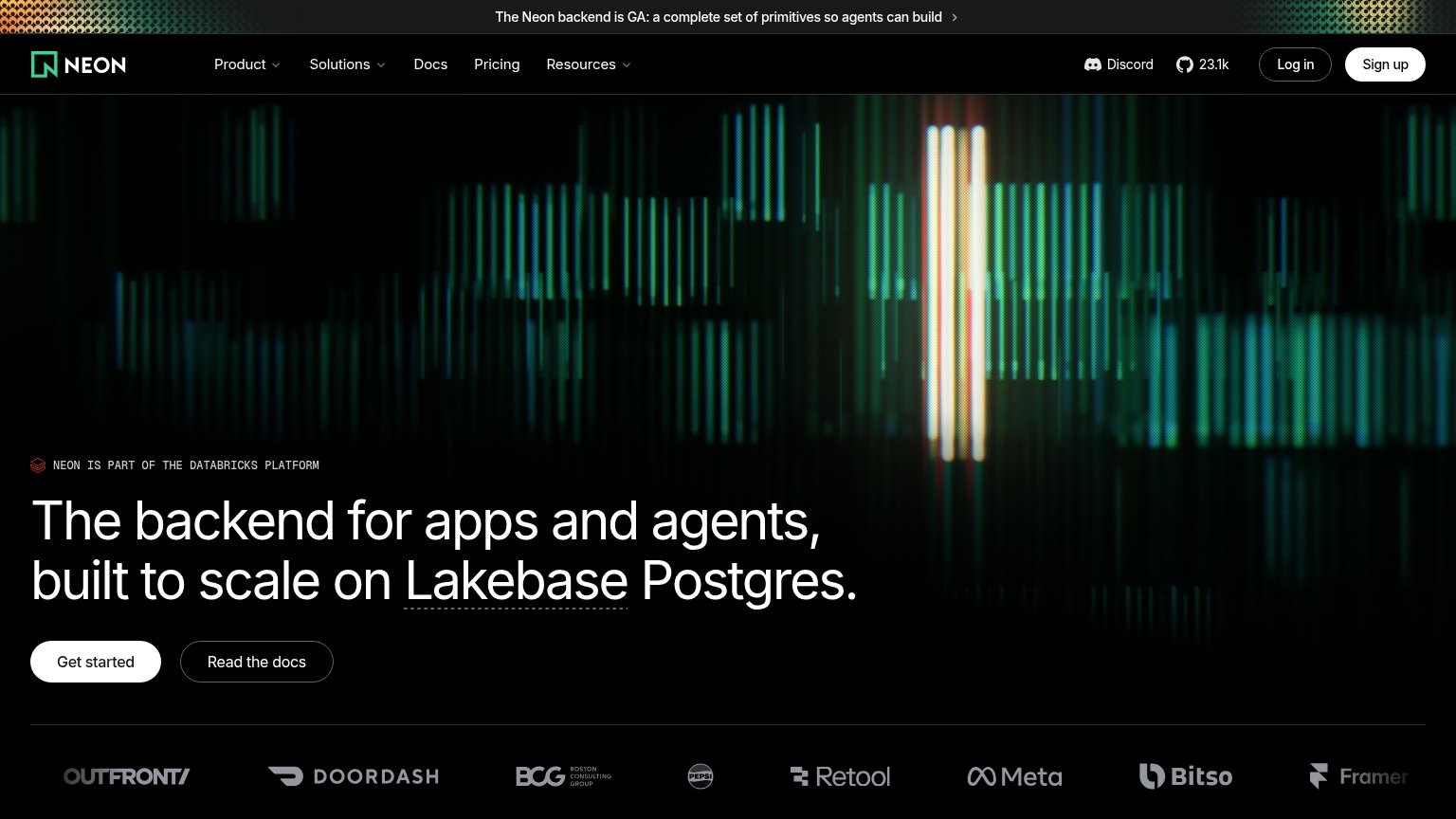
| Trust read | |
|---|---|
| Appwrite | Real product dashboard showing usage metrics ("150.0 MB Bandwidth +20.7%", "23.9K Requests", "11.4K Executions") |
| "Backed by Y Combinator" badge above the hero headline | |
| "110K" GitHub star count in the desktop navigation | |
| GitHub badge showing "21,358 stars" and npm badge showing "1M weekly" in the header | |
| Customer logo wall (Doordash, BCG, Pepsi, Retool, Meta, Bitso, Framer) below the hero CTA | |
| "Designed for the complete app development lifecycle, backed by Google, and trusted by millions of..." copy line |
Information hierarchy
72FairDoes the design help or inhibit what the page is trying to say?
What works
What to improve
CTA
72FairCopy, size, verb, cost-feel — does the primary CTA earn the click?
How Appwrite compares
Recommended rewrites
Value props
78FairTitle, subtitle, hero — do they sell the product's true value?
Appwrite’s headline
The open-source cloud for agents & devs_
Appwrite is an MCP & agent-first, OSS platform for building and scaling apps at the speed of thought. Give your agents Auth, DBs, Storage, Functions, Messaging, Realtime, and Hosting - all in one place.
Working
Could improve