
Your landing page’s weakest score is CTA.
How Cognosos ranks
CTA
42PoorCopy, size, verb, cost-feel — does the primary CTA earn the click?
Problems
- no hero CTA button at all
- only nav links and Login visible
- segment cards look like headings
- no path to demo or trial
Trust
48PoorProof that the product is real, competent, and safe to try.
| Trust read | |
|---|---|
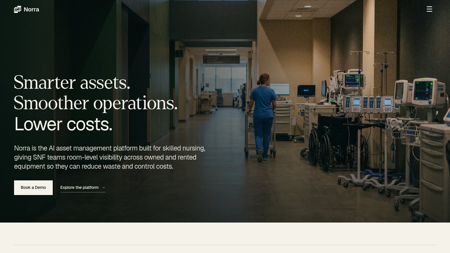
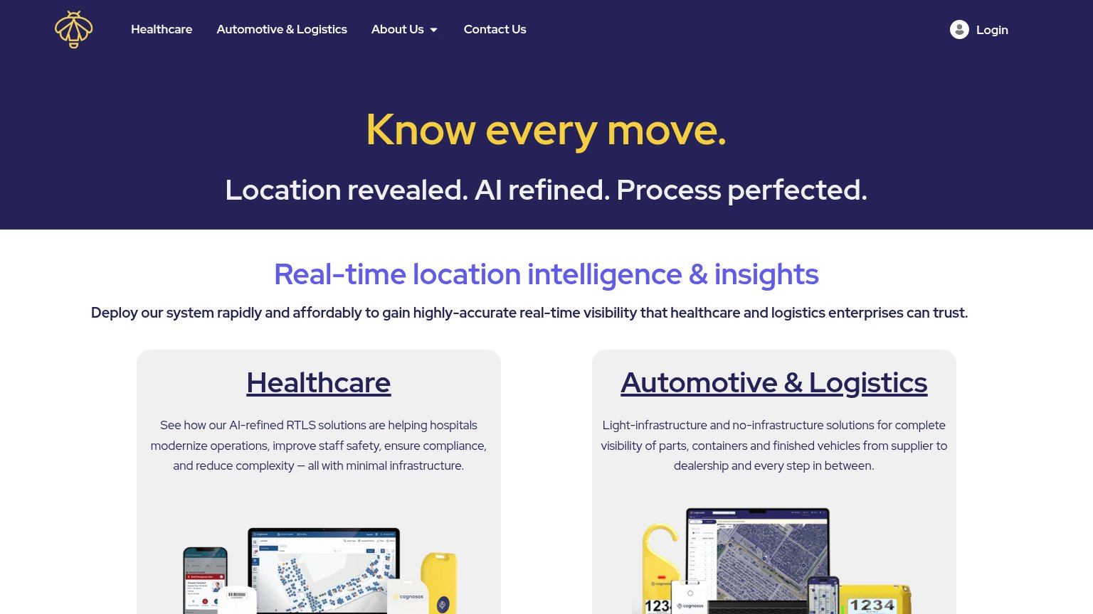
| Cognosos | Real product shots: RTLS dashboard with facility map, mobile app UI, and yellow Cognosos tracking tags in the Healthcare |
| No visible trust signal identified. | |
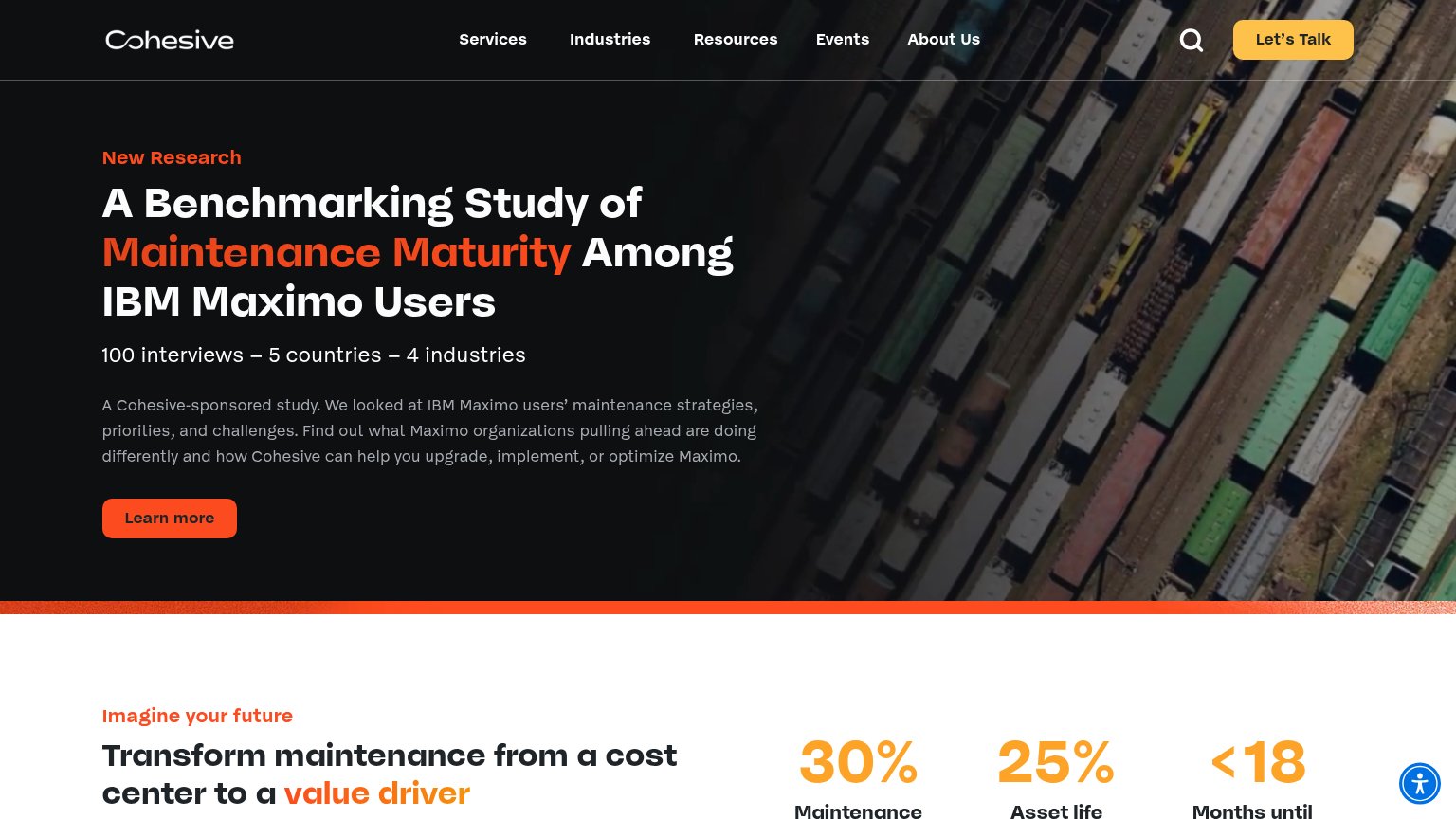
| "100 interviews – 5 countries – 4 industries" research study stat line | |
| No visible trust signal identified. | |
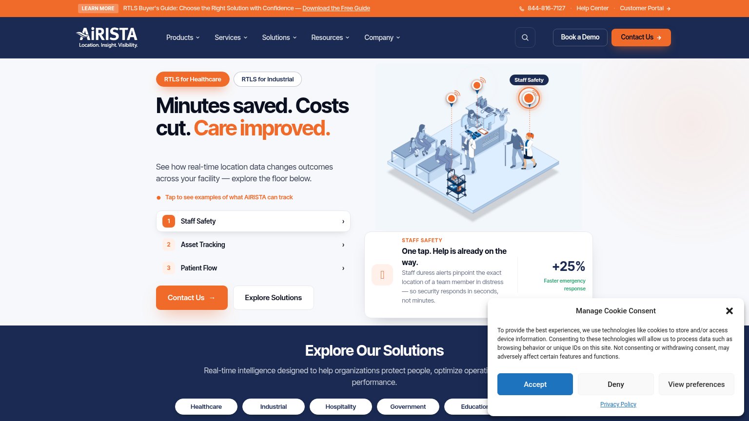
| "+25% Faster emergency response" stat beside the Staff Safety demo card | |
| No visible trust signal identified. |
Information hierarchy
58FairDoes the design help or inhibit what the page is trying to say?
What works
What to improve
Mobile web
58FairThe phone experience as a first-class citizen.
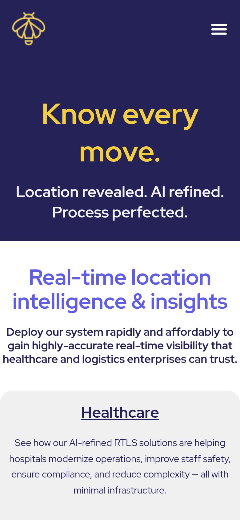
What works
What to improve
Value props
62FairTitle, subtitle, hero — do they sell the product's true value?
Cognosos’s headline
Know every move.
Location revealed. AI refined. Process perfected.
Working
Could improve