
Your landing page’s weakest score is Trust.
How AiRISTA ranks
Trust
52FairProof that the product is real, competent, and safe to try.
| Trust read | |
|---|---|
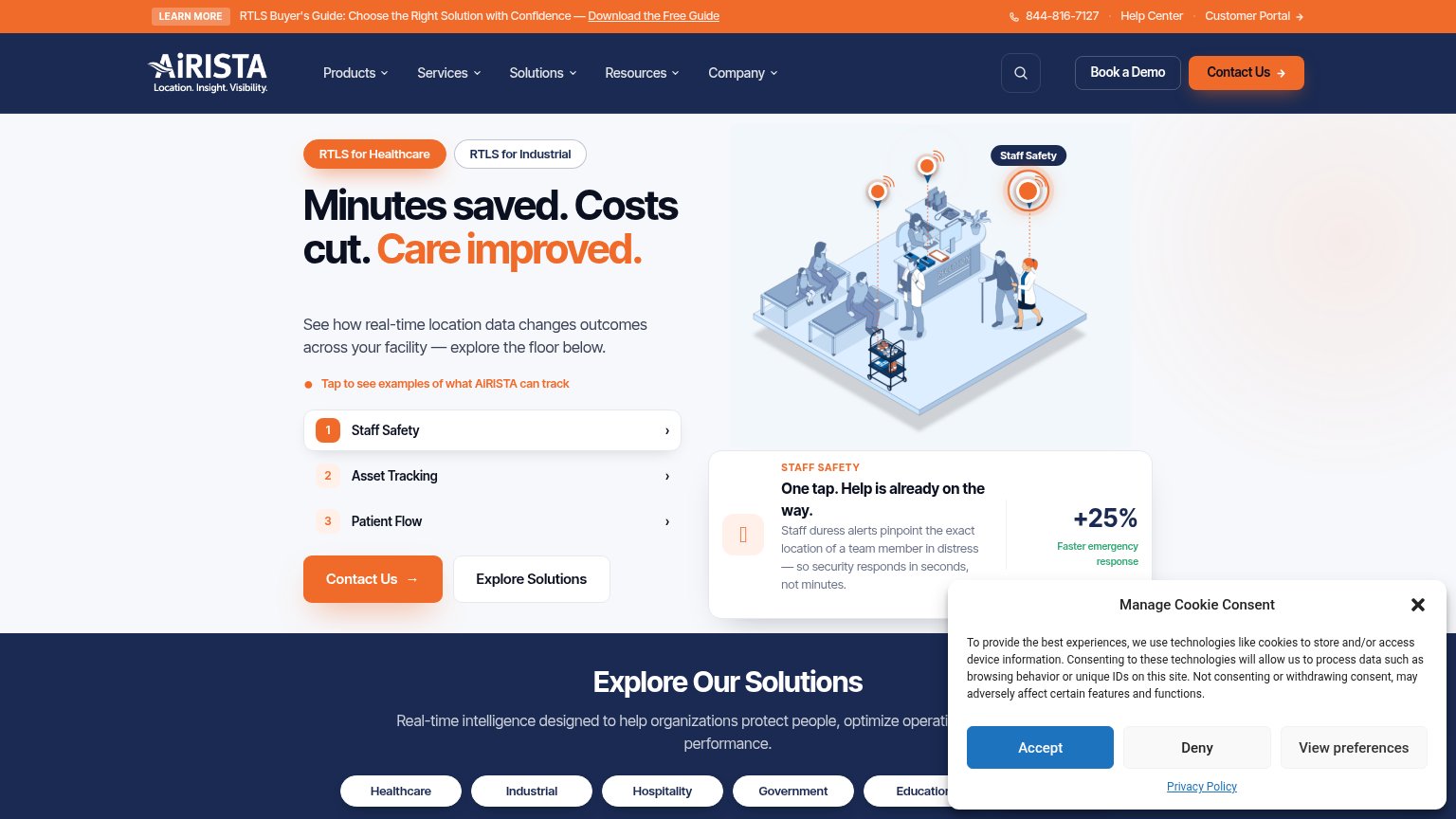
| AiRISTA | "+25% Faster emergency response" stat beside the Staff Safety demo card |
| No visible trust signal identified. | |
| "100 interviews – 5 countries – 4 industries" research study stat line | |
| Real product shots: RTLS dashboard with facility map, mobile app UI, and yellow Cognosos tracking tags in the Healthcare | |
| No visible trust signal identified. | |
| No visible trust signal identified. |
Mobile web
54FairThe phone experience as a first-class citizen.
 123
- Cookie consent wall — Covers two-thirds of the viewport with three dead buttons that do no conversion work.
- Hero illustration area — Fills the fold where a CTA should sit; no Contact Us button is reachable in the first viewport.
- Tap prompt line — Invites tapping a floor plan that the consent dialog half-hides, stranding the interaction.
CTA
56FairCopy, size, verb, cost-feel — does the primary CTA earn the click?
How AiRISTA compares
Recommended rewrites
Information hierarchy
62FairDoes the design help or inhibit what the page is trying to say?
What works
What to improve
Value props
78FairTitle, subtitle, hero — do they sell the product's true value?
AiRISTA’s headline
Minutes saved. Costs cut. Care improved.
See how real-time location data changes outcomes across your facility — explore the floor below.
Working
Could improve