
Your landing page’s weakest score is Trust.
How Codag ranks
72Growth scoreupdated
category scores
category scoresShowHide
Trust
62FairProof that the product is real, competent, and safe to try.

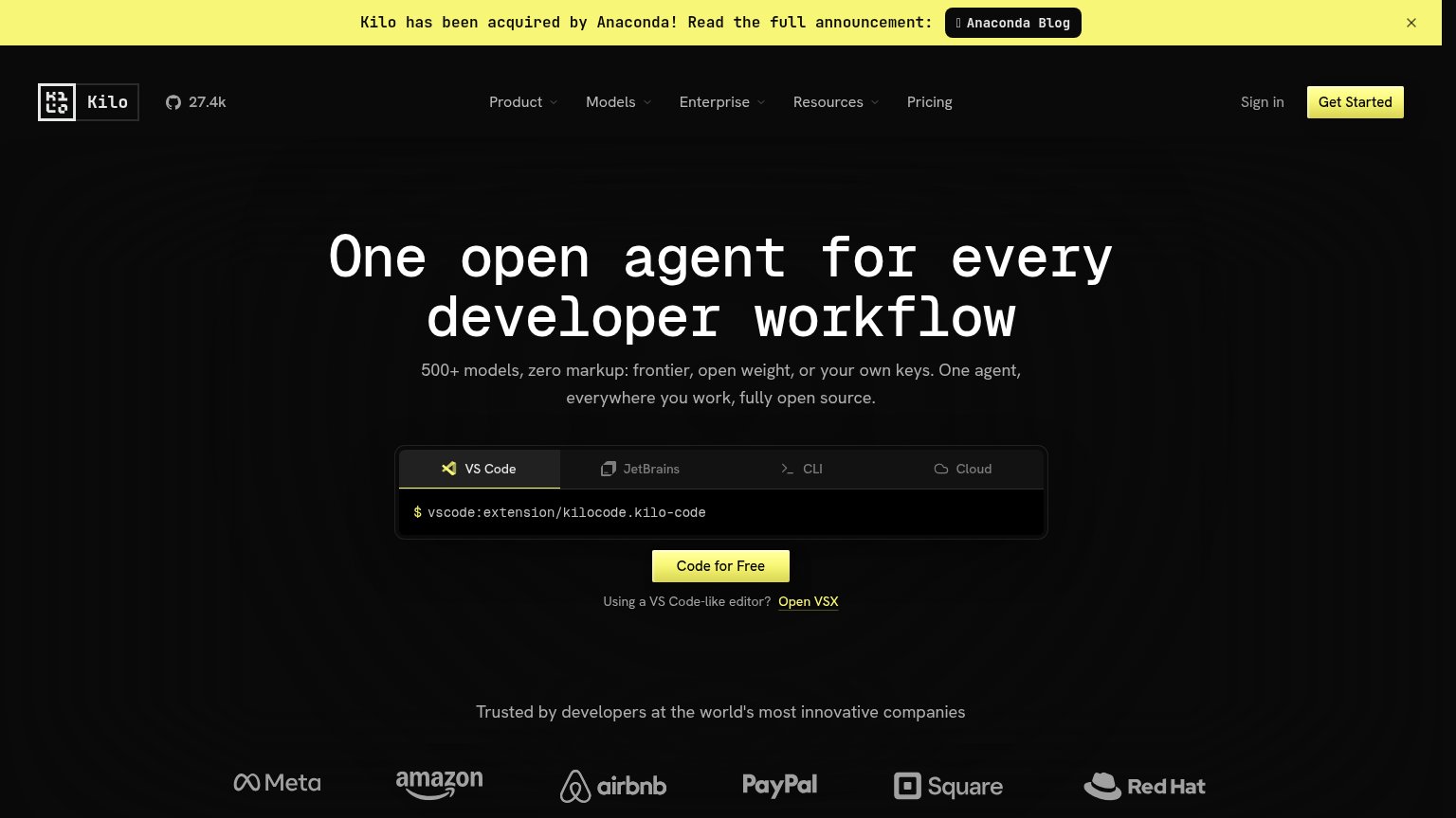
| Trust read | |
|---|---|
| Codag | "Backed by Y Combinator" badge above the hero headline |
| "Trusted by developers at the world's most innovative companies" logo strip with Meta, Amazon, Airbnb, PayPal, Square, a | |
| Author list with "Microsoft Corporation" affiliation and {hjiang, qianhuiwu, xufang.luo}@microsoft.com emails plus linke | |
| 5%+ accuracy gains | 30%+ cost savings | 2x faster dev cycles |
Information hierarchy
68FairDoes the design help or inhibit what the page is trying to say?
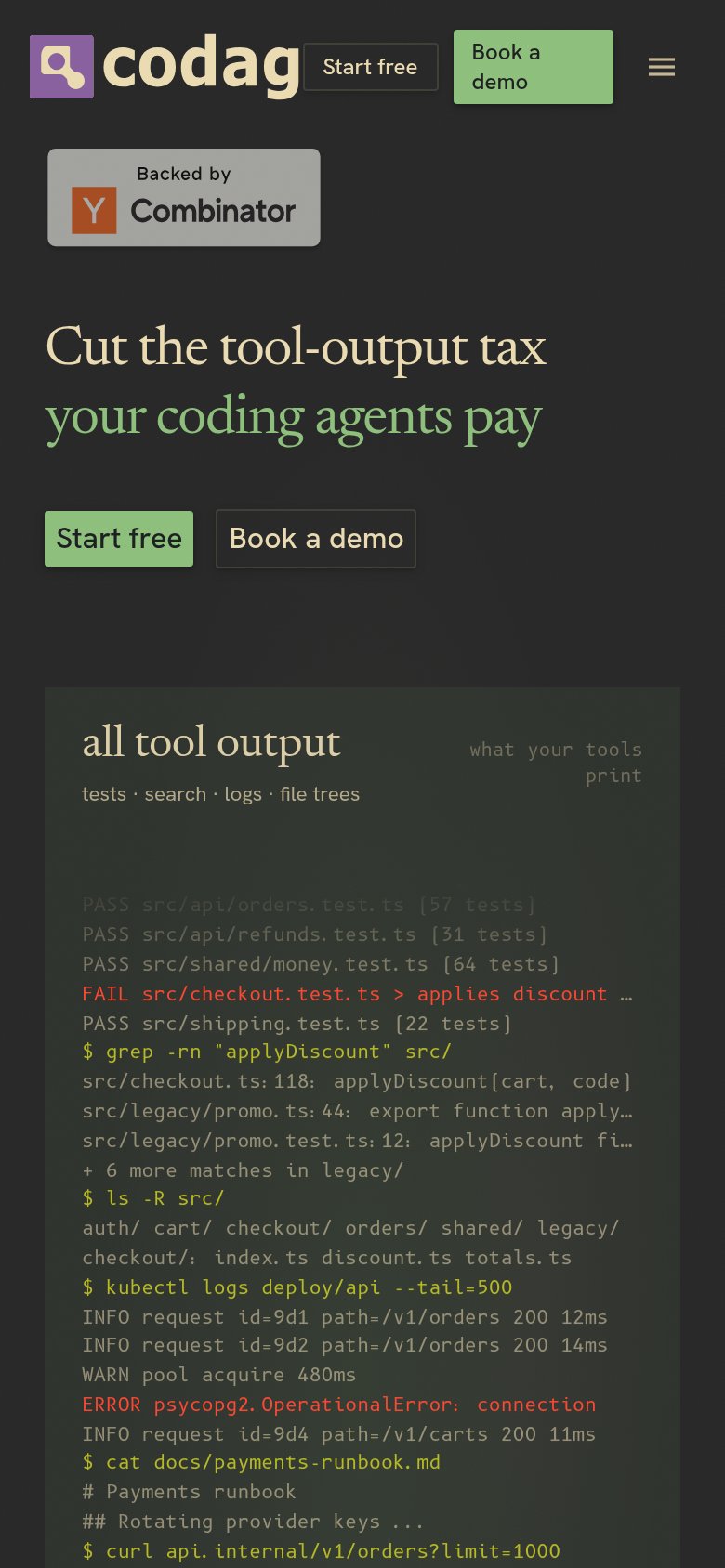
1234- Duplicate CTA pairs — "Start free" and "Book a demo" appear twice at equal weight (nav and hero), splitting the primary action four ways.
- Left-panel log wall — The "all tool output" panel renders ~20 lines of dense terminal text that competes with the headline for first scan.
- Y Combinator badge — The light-grey badge sits directly above the headline and outranks it in contrast, interrupting the scan path to the value prop.
- ~75% compression label — The core proof metric is set in small, low-contrast type between the panels and is easy to miss entirely.
Mobile web
72FairThe phone experience as a first-class citizen.
What works
What to improve
Value props
78FairTitle, subtitle, hero — do they sell the product's true value?
Codag’s headline
Cut the tool-output tax your coding agents pay
Working
Could improve
CTA
82StrongCopy, size, verb, cost-feel — does the primary CTA earn the click?
How Codag compares
Recommended rewrites