
Your landing page’s weakest score is Mobile web.
How LLMLingua (Microsoft) ranks
- 1.
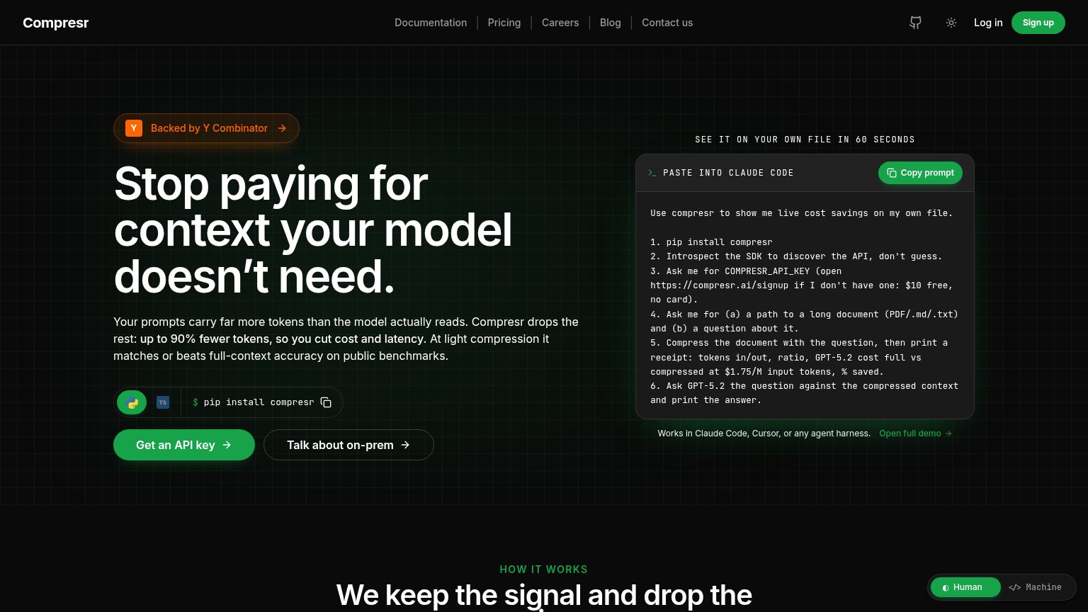
Compresr74
- 2.
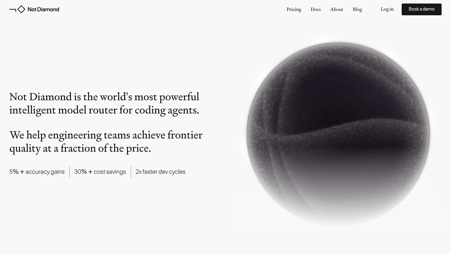
Not Diamond62
- 3.
LLMLingua (Microsoft)55
Mobile web
42PoorThe phone experience as a first-class citizen.
 123
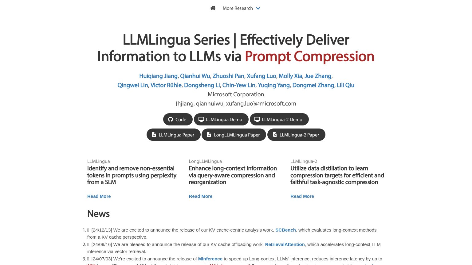
- Giant wrapping headline — The desktop headline barely scaled down, wrapping into eight cramped lines that consume most of the first viewport.
- Author name list — Twelve linked author names stack into seven lines of blue links, pushing every action button below the fold.
- Half-size CTA buttons — "Code" and "LLMLingua Demo" sit at the fold edge as small side-by-side pills instead of full-width tappable buttons.
CTA
52FairCopy, size, verb, cost-feel — does the primary CTA earn the click?
Problems
- no action verb — reads as a label
- six equal buttons, no dominant CTA
- no payoff or value in the copy
- competing 'Read More' links below
Information hierarchy
58FairDoes the design help or inhibit what the page is trying to say?
What works
What to improve
Value props
62FairTitle, subtitle, hero — do they sell the product's true value?
LLMLingua (Microsoft)’s headline
LLMLingua Series | Effectively Deliver Information to LLMs via Prompt Compression
Working
Could improve
Trust
62FairProof that the product is real, competent, and safe to try.
How LLMLingua (Microsoft) compares
Trust read