
Your landing page’s weakest score is Information hierarchy.
How CIENCE ranks
74Growth scoreupdated
category scores
category scoresShowHide
Information hierarchy
68FairDoes the design help or inhibit what the page is trying to say?
 1234
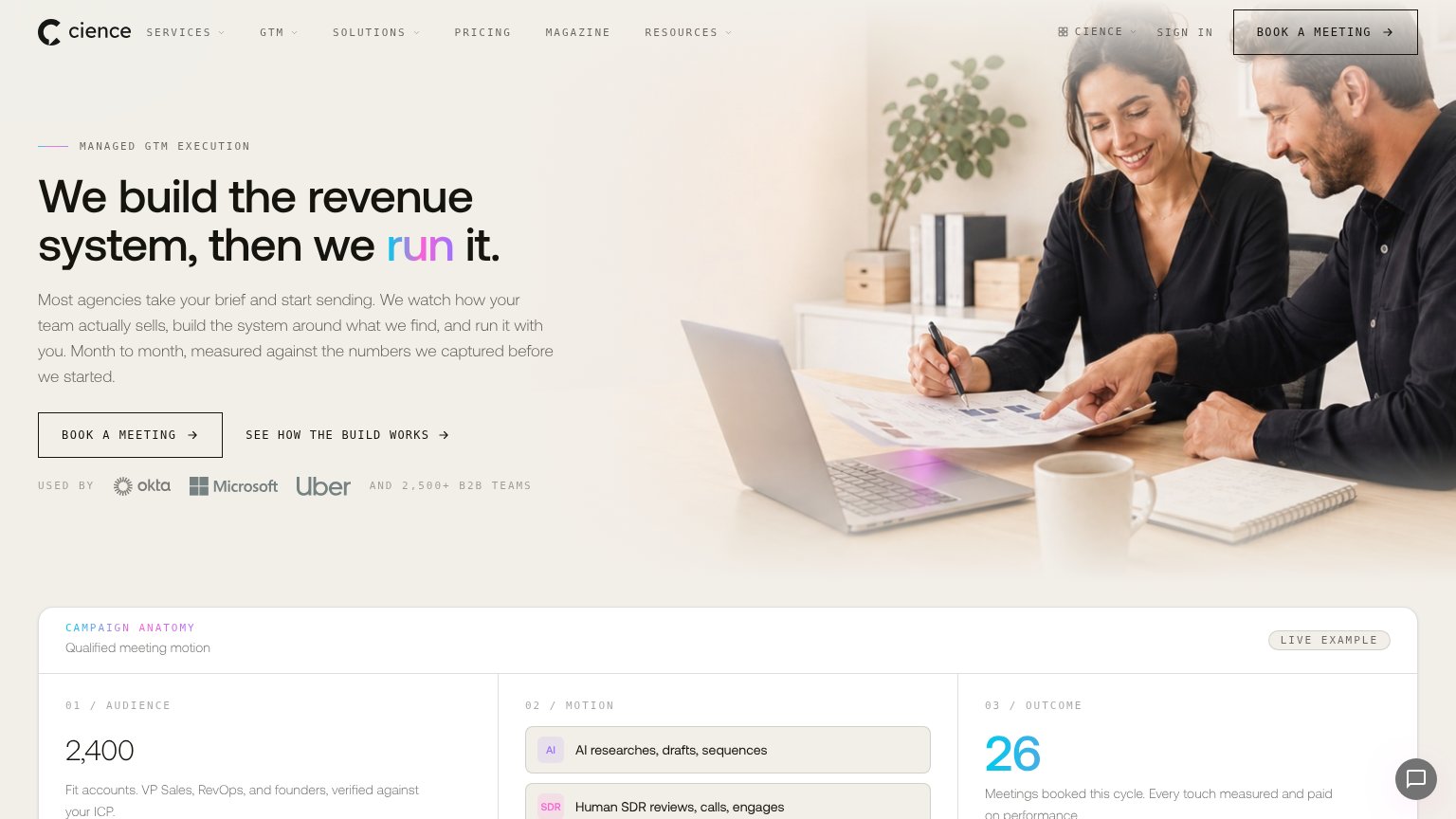
- Duplicate BOOK A MEETING — Header and hero both carry 'BOOK A MEETING' at similar visual weight, splitting attention on the same action instead of concentrating it in one place.
- Six-item dropdown nav — SERVICES, GTM, SOLUTIONS, PRICING, MAGAZINE, RESOURCES plus SIGN IN offer nine-plus exits above the fold, all competing with the conversion path.
- Hero BOOK A MEETING — Outlined, low-contrast ghost styling makes the primary action blend into the pale background instead of anchoring the scan path.
- Campaign anatomy strip — The 'CAMPAIGN ANATOMY' module is cut mid-content at the fold line, introducing a third numeric-heavy beat before the hero argument finishes.
CTA
70FairCopy, size, verb, cost-feel — does the primary CTA earn the click?
Problems
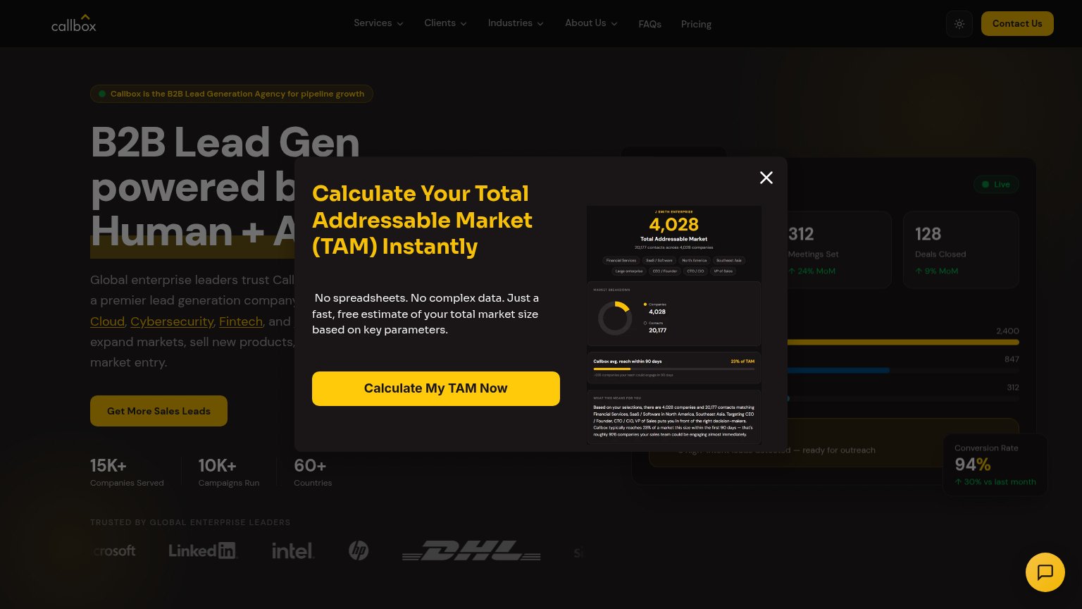
- meeting = high-cost, salesy click
- no value promised for the click
- hero button smaller than headline pull
- secondary link feels cheaper to click
Trust
76FairProof that the product is real, competent, and safe to try.
How CIENCE compares
Trust read
Mobile web
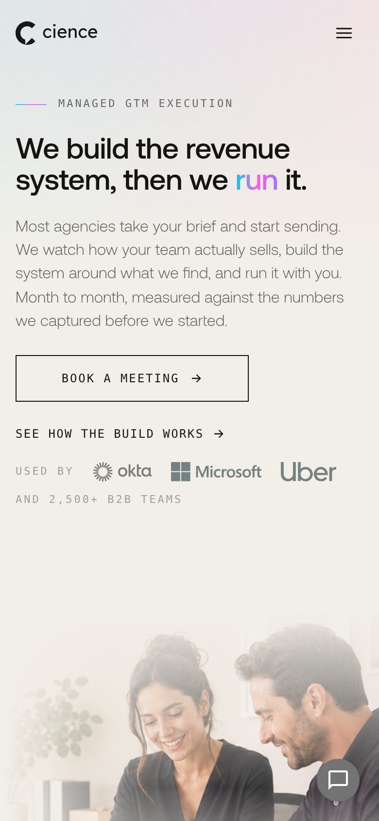
76FairThe phone experience as a first-class citizen.
What works
What to improve
Value props
82StrongTitle, subtitle, hero — do they sell the product's true value?
CIENCE’s headline
We build the revenue system, then we run it.
Most agencies take your brief and start sending. We watch how your team actually sells, build the system around what we find, and run it with you. Month to month, measured against the numbers we captured before we started.
Working
Could improve