
Your landing page’s weakest score is Mobile web.
How Callbox ranks
60Growth scoreupdated
category scores
category scoresShowHide
Mobile web
42PoorThe phone experience as a first-class citizen.
 12
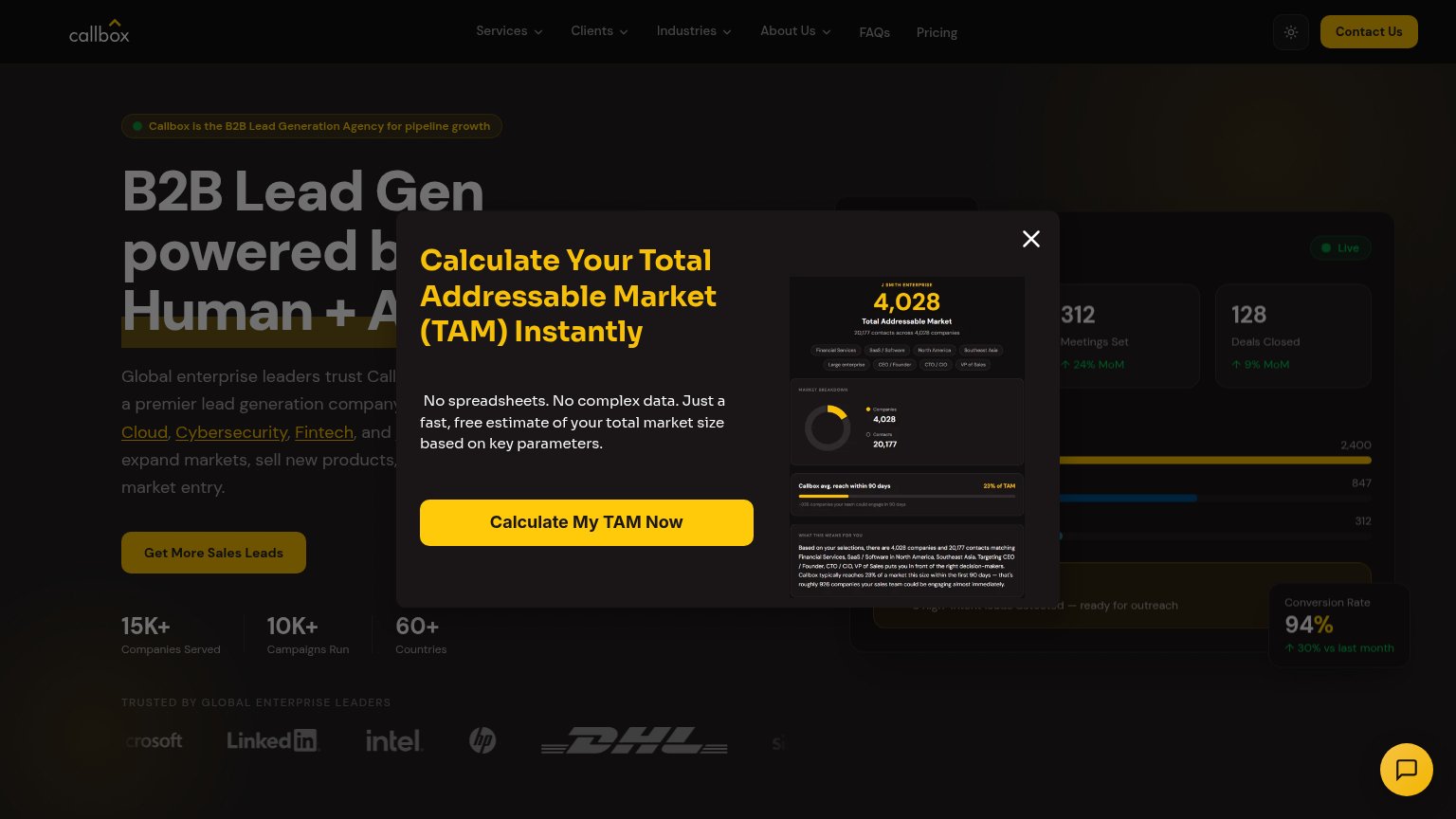
- Modal report mockup — Long dashboard screenshot stretches the modal past the fold, burying its own close context.
- Chat bubble — Large yellow chat launcher overlaps modal content and adds a second competing tap target.
Information hierarchy
48PoorDoes the design help or inhibit what the page is trying to say?
 1234
- TAM calculator modal — Interstitial covers the headline and hero CTA, forcing a dismissal before the value prop can land.
- Contact Us button — Second high-emphasis dark button competes with 'Get More Sales Leads' for the primary action.
- Navigation dropdown row — Five dropdown menus plus FAQs and Pricing create seven exit paths above the primary CTA.
- Get More Sales Leads — Low-contrast dark-on-dark styling and modal overlap make the primary CTA nearly invisible.
Value props
68FairTitle, subtitle, hero — do they sell the product's true value?
Callbox’s headline
B2B Lead Gen powered by Human + AI
Global enterprise leaders trust Callbox, a premier lead generation company... Cloud, Cybersecurity, Fintech... expand markets, sell new products... market entry.
Working
Could improve
Trust
68FairProof that the product is real, competent, and safe to try.
How Callbox compares
Trust read
CTA
72FairCopy, size, verb, cost-feel — does the primary CTA earn the click?
How Callbox compares
Recommended rewrites