
Your landing page’s weakest score is Trust.
How ChurnZero ranks
Trust
48PoorProof that the product is real, competent, and safe to try.
| Trust read | |
|---|---|
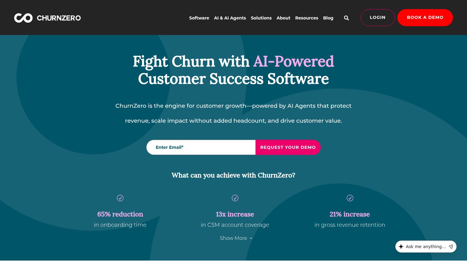
| ChurnZero | "65% reduction in onboarding time" / "13x increase in CSM account coverage" / "21% increase in gross revenue retention" |
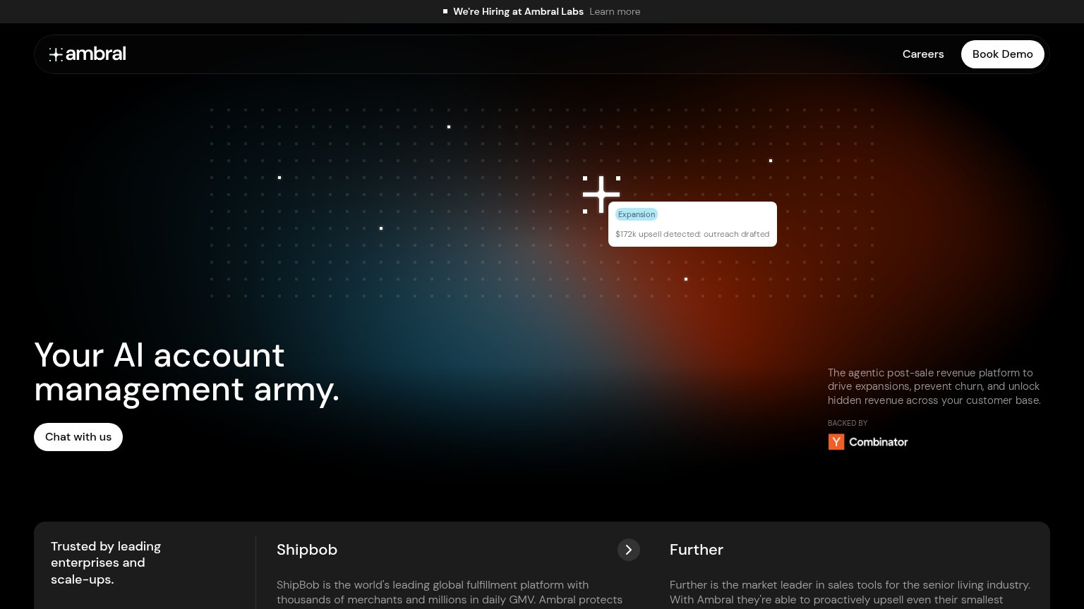
| "BACKED BY" Y Combinator badge in the hero | |
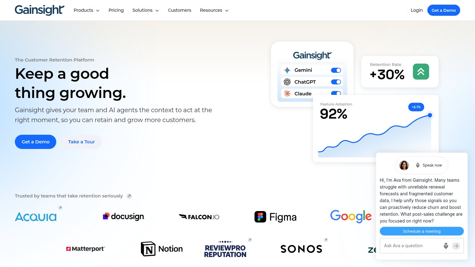
| Customer logo wall (Docusign, Figma, Google, Notion, Sonos) under "Trusted by teams that take retention seriously" | |
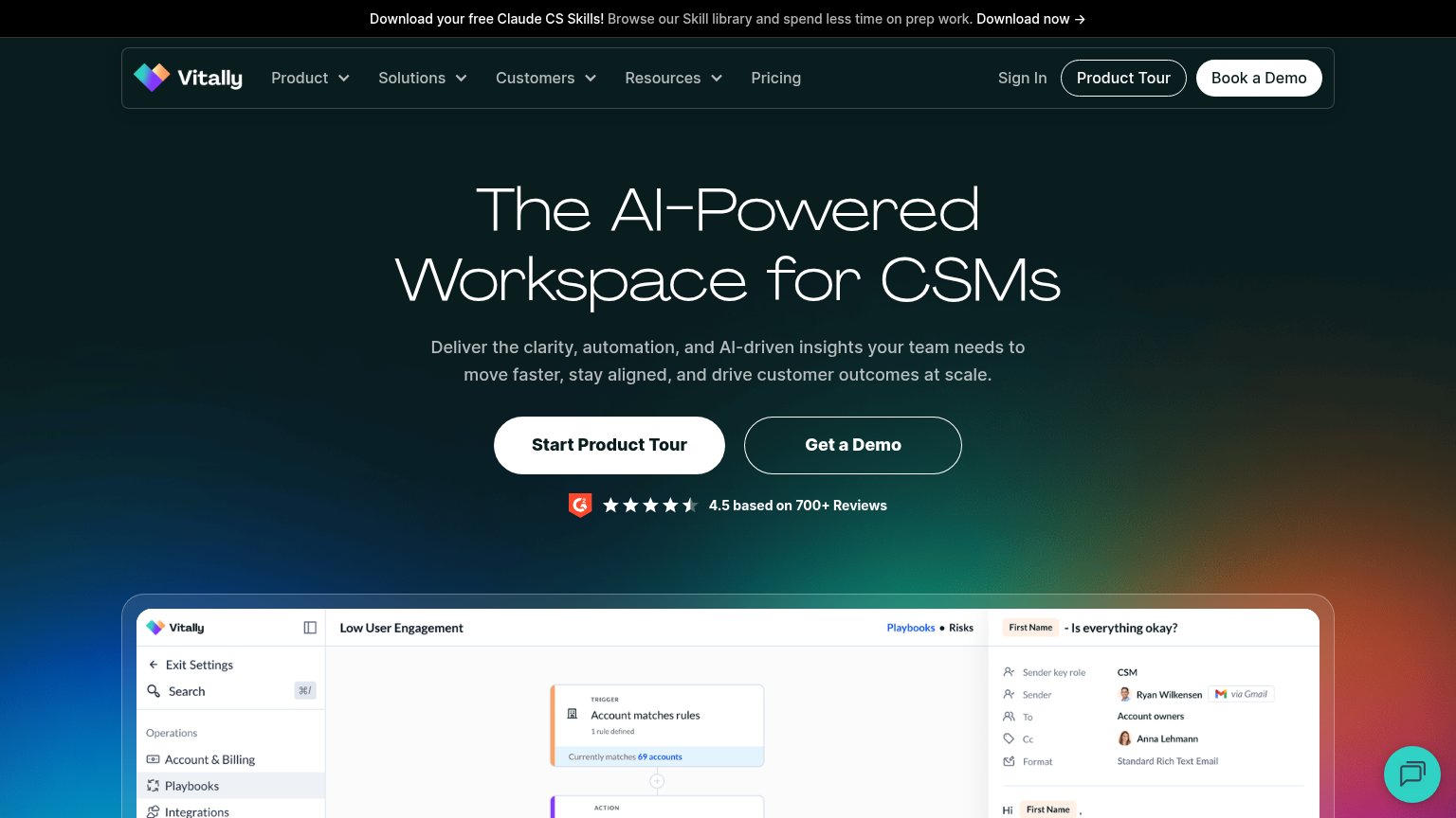
| G2 badge with "4.5 based on 700+ Reviews" directly under the hero CTAs | |
| "After over 15 years as a leader in Customer Success" longevity claim in the hero subhead | |
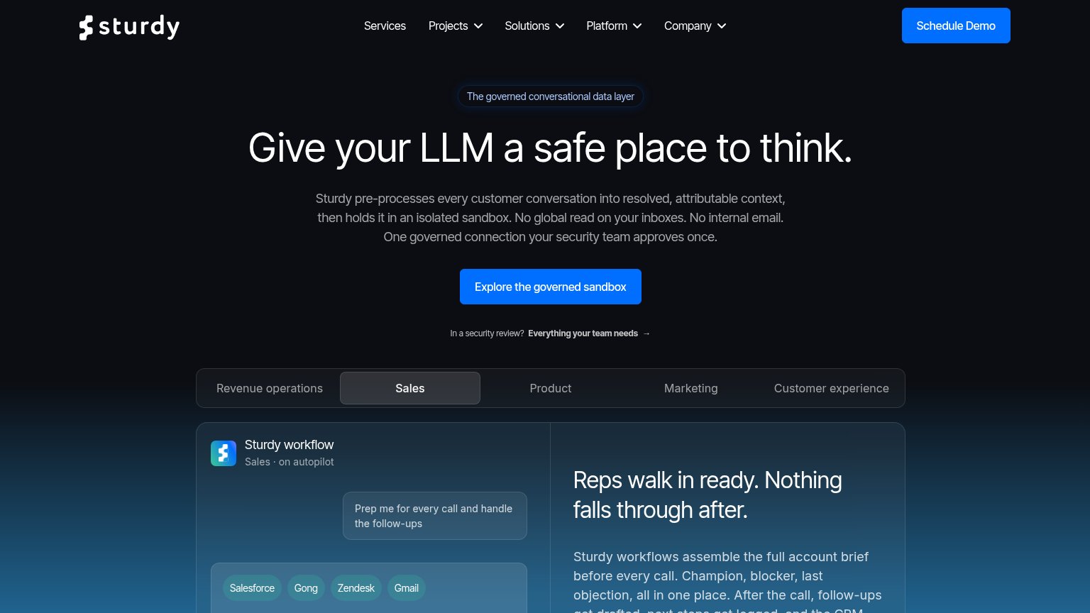
| Sturdy workflow demo panel with Salesforce, Gong, Zendesk, and Gmail integration chips |
Mobile web
62FairThe phone experience as a first-class citizen.
 123
- Six-line subheadline paragraph — Desktop-length copy barely scaled down, eating half the fold and pushing the demo form to the viewport edge.
- Side-by-side demo form — Email input squeezed to under half the column width beside the button instead of stacking full-width.
- Oversized serif headline — Headline wraps to three tall lines at near-desktop size, crowding the phone column.
CTA
72FairCopy, size, verb, cost-feel — does the primary CTA earn the click?
How ChurnZero compares
Recommended rewrites
Information hierarchy
76FairDoes the design help or inhibit what the page is trying to say?
What works
What to improve
Value props
82StrongTitle, subtitle, hero — do they sell the product's true value?
ChurnZero’s headline
Fight Churn with AI-Powered Customer Success Software
ChurnZero is the engine for customer growth—powered by AI Agents that protect revenue, scale impact without added headcount, and drive customer value.
Working
Could improve