
Your landing page’s weakest score is Value props.
How Lonza Bioscience ranks
52Growth scoreupdated
category scores
category scoresShowHide
Value props
48PoorTitle, subtitle, hero — do they sell the product's true value?
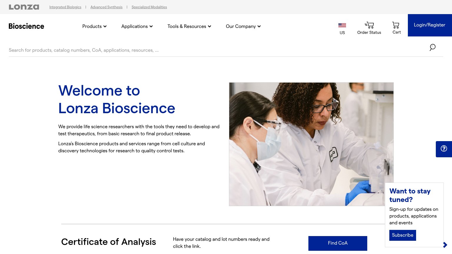
Lonza Bioscience’s headline undersells
Welcome to Lonza Bioscience
We provide life science researchers with the tools they need to develop and test therapeutics, from basic research to final product release.
Working
- Subhead names the exact audience
- States full research-to-release span
- Second line lists concrete offerings
Could improve
- Headline says nothing about value
- No numbers or proof points in fold
- Hero image decorates, not demonstrates
Mobile web
48PoorThe phone experience as a first-class citizen.
 12
- Oversized hero headline — "Welcome to Lonza Bioscience" wraps into three giant lines eating a third of the viewport with no CTA in sight.
- Double-decker corporate header — Gray Lonza bar with three division links stacks above the Bioscience header, pushing content down before the hero starts.
CTA
52FairCopy, size, verb, cost-feel — does the primary CTA earn the click?
How Lonza Bioscience compares
Recommended rewrites
Information hierarchy
54FairDoes the design help or inhibit what the page is trying to say?
What works
What to improve
Trust
58FairProof that the product is real, competent, and safe to try.
How Lonza Bioscience compares
Trust read