
Your landing page’s weakest score is Mobile web.
How Bioptimus ranks
Mobile web
54FairThe phone experience as a first-class citizen.
 123
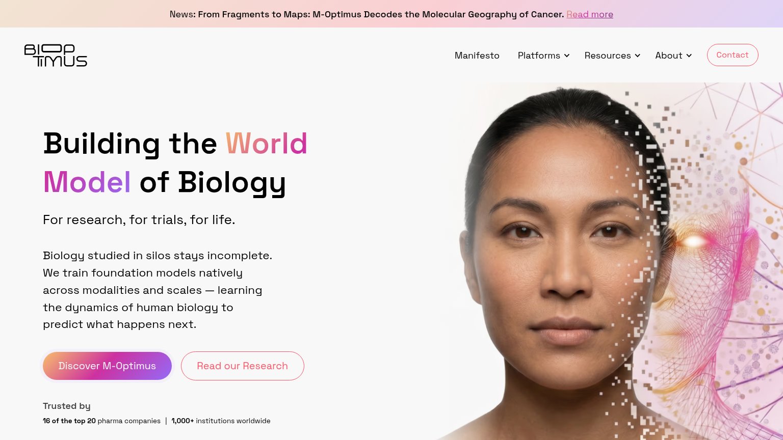
- Hero image block — Full-width image eats half the viewport and pushes the headline and CTA below the fold.
- Three-line news banner — Announcement wraps to three lines and claims the top fifth of the screen before any product message.
- Body text clipping — Paragraph lines like 'modalities and' run to the screen edge, hinting at overflow with no right padding.
Trust
62FairProof that the product is real, competent, and safe to try.
| Trust read | |
|---|---|
| Bioptimus | "Trusted by 16 of the top 20 pharma companies | 1,000+ institutions worldwide" |
| "Backed by Y Combinator" badge beneath the ANTO wordmark | |
| No visible trust signal identified. | |
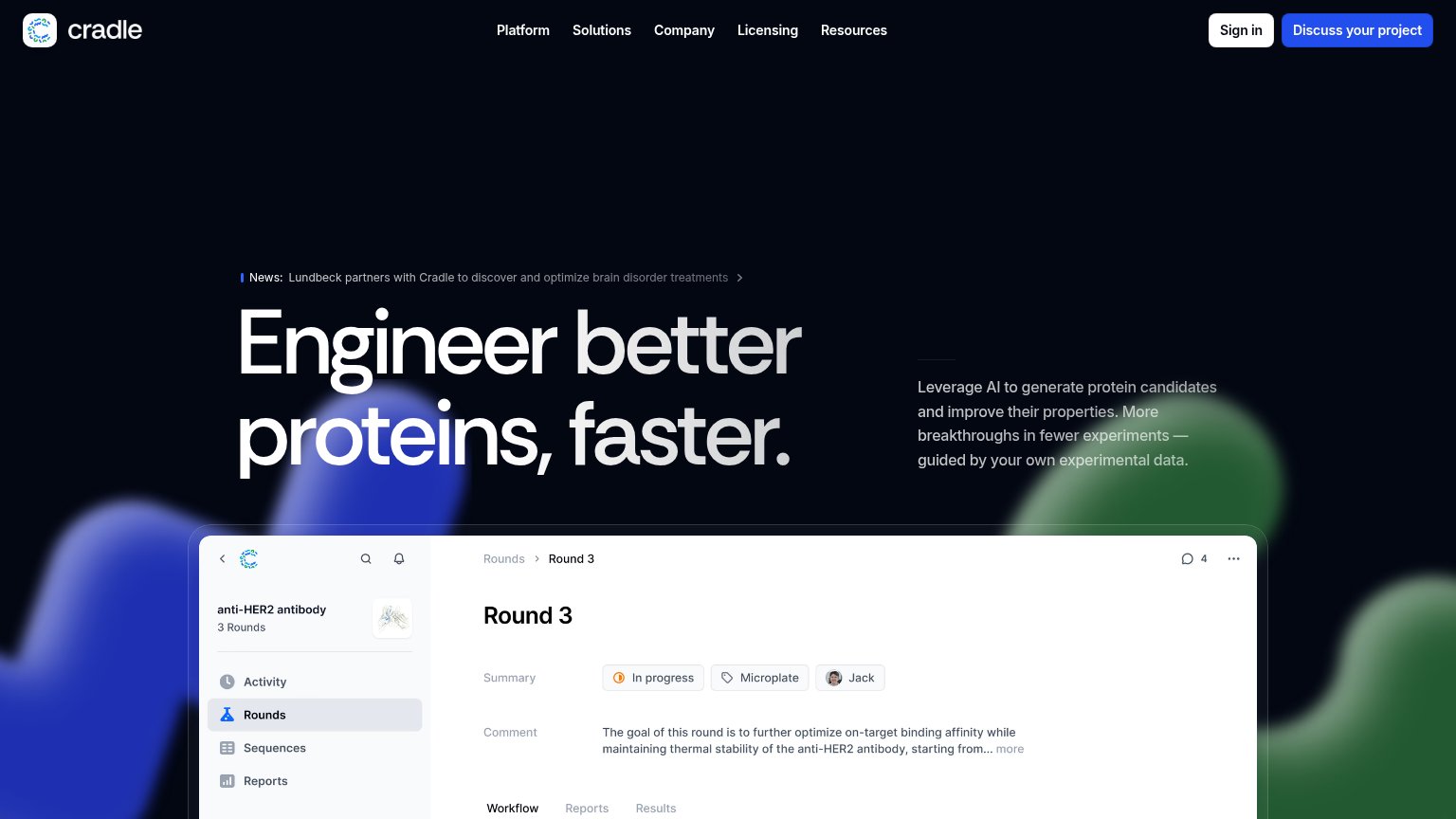
| News bar: "Lundbeck partners with Cradle to discover and optimize brain disorder treatments" | |
| "EvolutionaryScale is joining forces with Biohub. Learn more at biohub.org" announcement bar |
CTA
68FairCopy, size, verb, cost-feel — does the primary CTA earn the click?
How Bioptimus compares
Recommended rewrites
Value props
68FairTitle, subtitle, hero — do they sell the product's true value?
Bioptimus’s headline
Building the World Model of Biology
For research, for trials, for life.
Working
Could improve
Information hierarchy
78FairDoes the design help or inhibit what the page is trying to say?
What works
What to improve