
Your landing page’s weakest score is Trust.
How Exist ranks
Trust
38PoorProof that the product is real, competent, and safe to try.
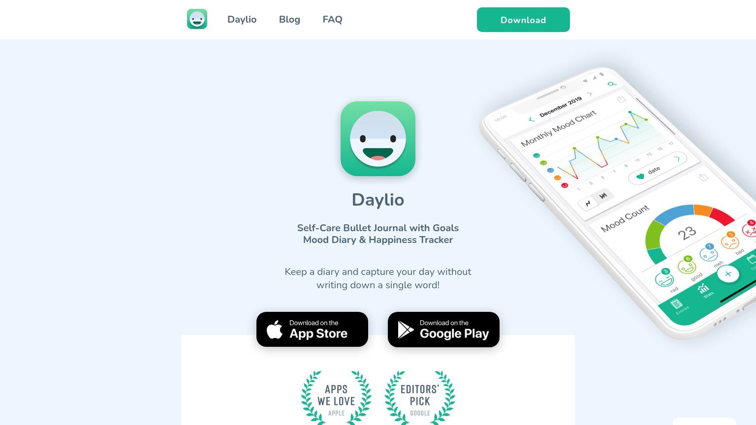
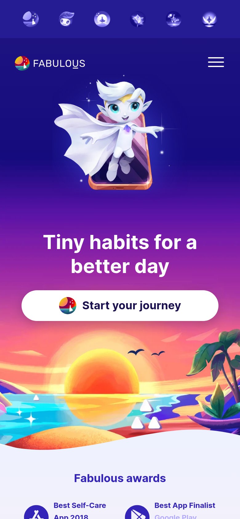
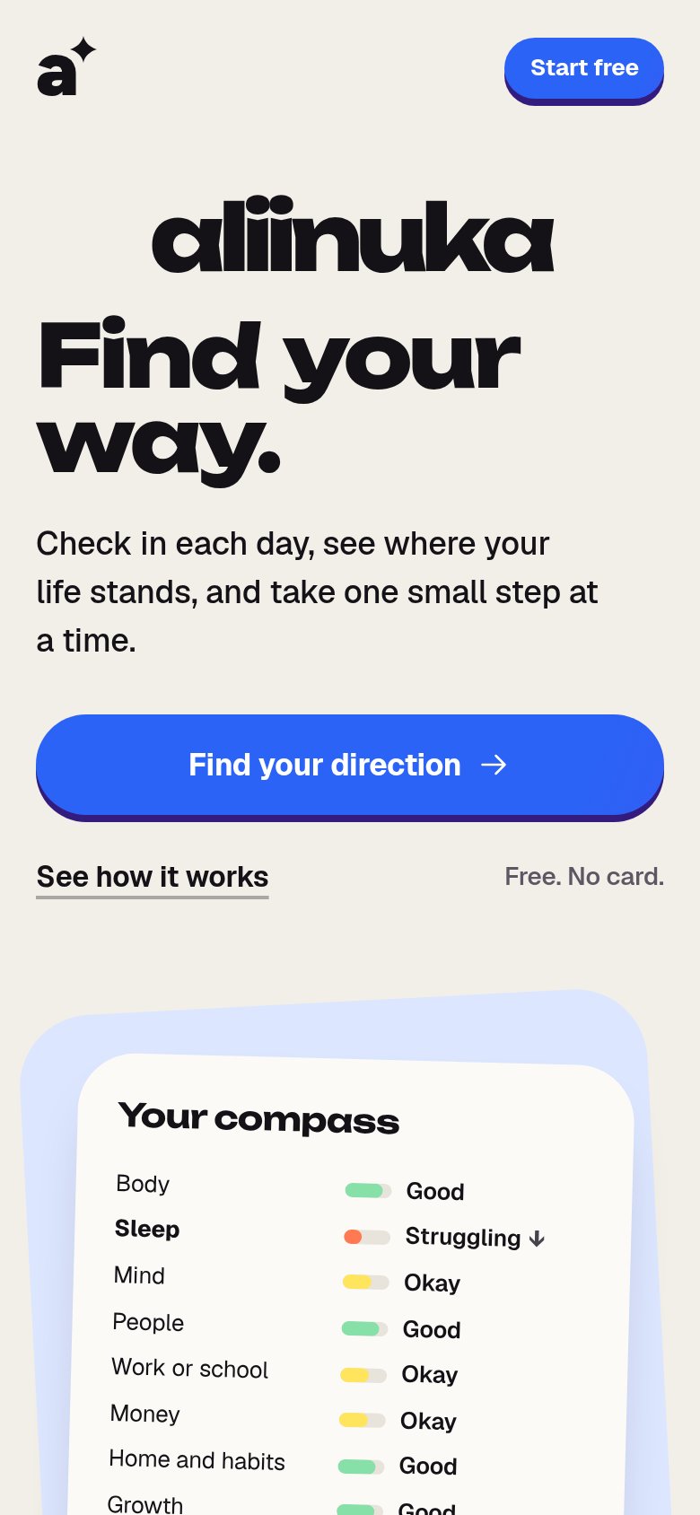
| Trust read | |
|---|---|
| Exist | No visible trust signal identified. |
| "Your compass" product UI card showing life-area status bars (e.g., "Sleep — Struggling") | |
| Apple 'Apps We Love' and Google 'Editors' Pick' award laurels | |
| No visible trust signal identified. | |
| No visible trust signal identified. | |
| "Fabulous awards" section citing "Best App Finalist — Google Play" (mobile capture) |
Mobile web
42PoorThe phone experience as a first-class citizen.
 123
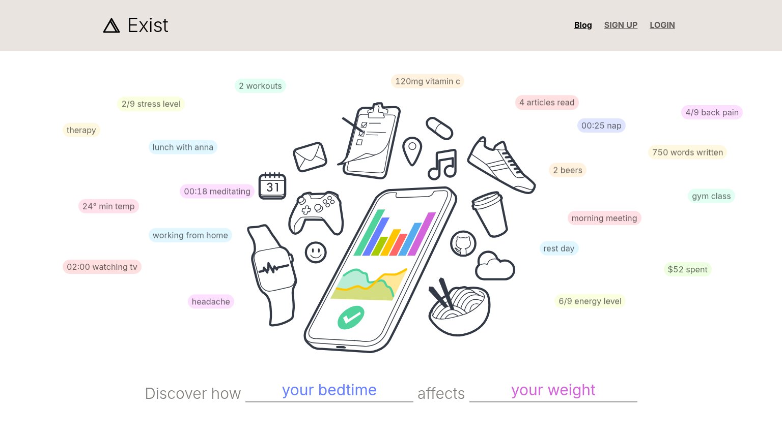
- Illustration tag pile-up — Data tags like "lunch with", "orning meeting" and "750 words wri" are clipped and overlap the phone illustration, reading as broken layout.
- Oversized hero illustration — The illustration consumes roughly 60% of the viewport, pushing the value statement to the very bottom edge.
- Headline awkward wrap — "Discover how Exist's mood / affects Exist's productivity" breaks mid-sentence with misaligned underlined blanks, hurting scanability.
CTA
44PoorCopy, size, verb, cost-feel — does the primary CTA earn the click?
How Exist compares
Recommended rewrites
Information hierarchy
58FairDoes the design help or inhibit what the page is trying to say?
What works
What to improve
Value props
72FairTitle, subtitle, hero — do they sell the product's true value?
Exist’s headline
Discover how your bedtime affects your weight
Working
Could improve